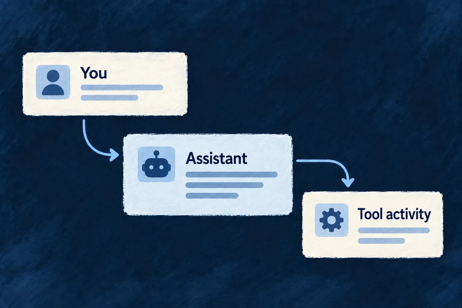




Wildo.ai Coming soon

Reuse the engineering

Put development effort into your business logic while shared packages supply recurring application mechanisms.

Identity · billing · files · notifications · reusable UI

A new business product should not require a new implementation of every recurring engineering concern.

Wildo puts shared behavior in a maintained engine and gives developers and AI the methods to use it. Your application can carry less repeated machinery and more of the decisions that make it valuable.

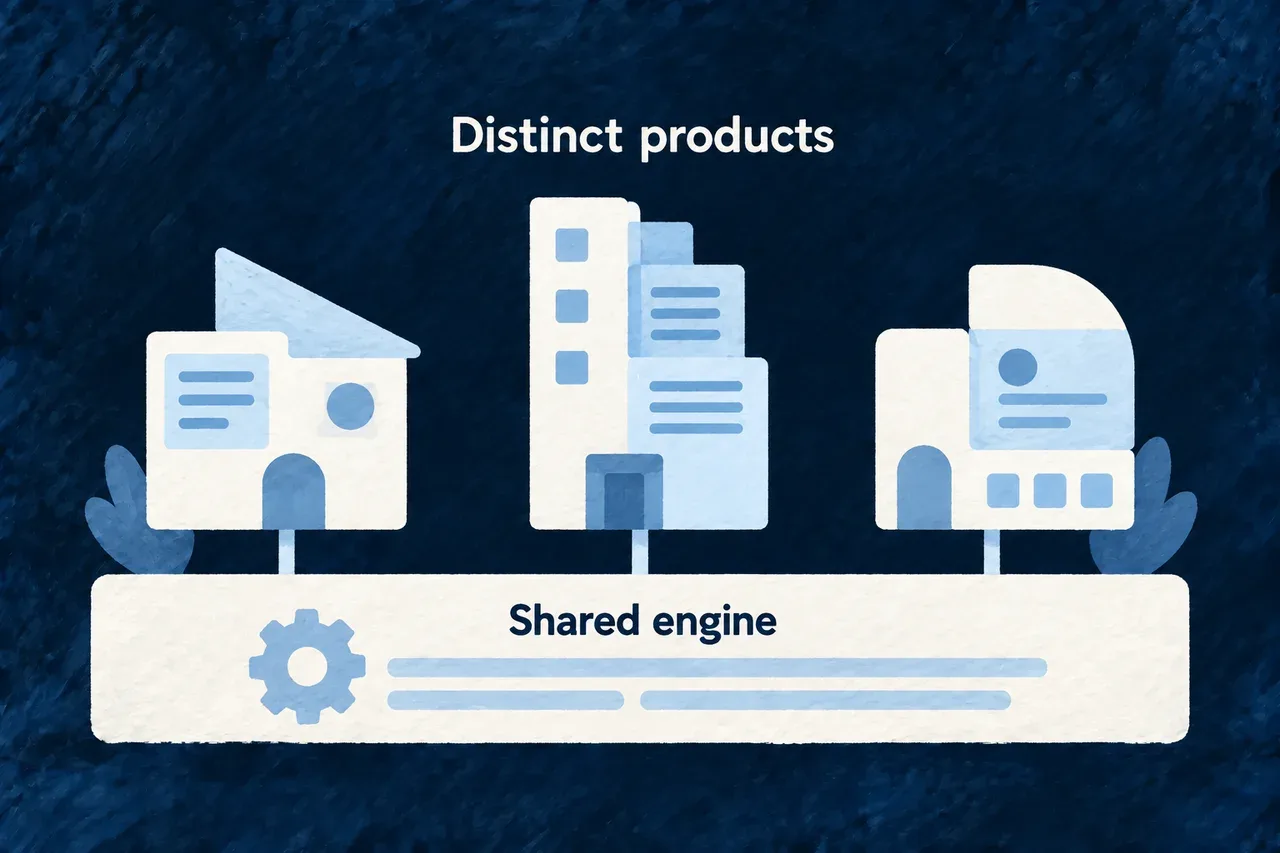
Different application structures built upon one shared engine.

Reuse the engineering, the knowledge and the work around it

Shared behavior has a shared owner

Authentication, resource operations, standard forms, communication and other recurring mechanisms live in framework packages. Applications declare how they use them and add their own behavior.

A correction therefore has a common place to land. Teams adopt an engine version and verify their application against it, instead of maintaining a separately generated copy of the same subsystem in every project.

A craftsperson workbench with one carefully maintained blue engine component below three distinct ivory application structures.
  • One place to improve: Recurring mechanisms have a shared implementation and maintenance home.
  • Less duplicated application code: Use engine behavior instead of maintaining another independent subsystem.
  • Deliberate adoption of updates: Review framework changes against your application’s own journeys.

Avoid rebuilding the surroundings of each feature

The repetitive work is not confined to backend code. A field needs a control, a label and appropriate feedback. An email needs content, layout, language and delivery. A new service needs configuration and a place to run.

Wildo combines reusable components with tools that prepare application-specific artifacts. The engine supplies common machinery; generated labels, templates and deployment material have concrete homes in the project. See the frontend foundation and development tools.

An ivory field card at center surrounded by a form control, a word label, a gentle validation mark, an envelope and a configuration sheet. Delicate blue threads reveal all the useful surroundings of a seemingly small feature.
  • Beyond the first control: Fields bring wording, feedback and interaction responsibilities with them.
  • Prepared application assets: Generation workflows provide concrete labels, templates and deployment material.
  • Fewer disconnected implementations: Shared contracts connect the recurring work around a feature.

Reduce what the agent must rediscover

An agent should not have to discover the consequences of a foreign key, a new enum or a database column from scratch each time. Wildo’s guidance records complete changes and connects their instructions to framework contracts.

The same principle applies to product meaning. A resource’s purpose and constraints can inform implementation, wording and documentation. Reusing that understanding reduces separate explanations that can drift apart.

A single open ivory source book on a navy background sending fine painted threads to three different work sheets: implementation sketch, language cards and documentation booklet.
  • 100+ framework skill documents: Authoring guidance records recurring changes and their connected consequences.
  • Preserve the product meaning: Resource purpose can inform implementation, wording and documentation.
  • Less repeated reconstruction: Agents receive existing knowledge instead of inferring everything anew.

Keep the specific part worth owning

The goal is a smaller application-owned implementation surface: the workflows, rules, views and integrations that serve this product. It is also a smaller collection of repeated decisions to review and maintain.

A bespoke interaction still deserves bespoke code. A useful business module can later be shared across applications. Reuse should make specialization easier, rather than make every product look and behave alike.

A distinctive blue sculpted application piece being fitted into an ivory foundation. Nearby a small reusable component tray.
  • Focus on customer value: Keep attention on workflows, rules and distinctive interactions.
  • Bespoke where it matters: Custom code expresses behavior the shared engine cannot decide.
  • Reuse useful business modules: Review common product contributions for adoption across applications.

Example: Add a customer-facing status

The application defines the status and its business meaning, decides which transitions are allowed and chooses how it appears. Standard controls and validation use the declaration; the labelling workflow prepares its wording. The team concentrates on what the status means for its customers.

Distinguish inherited behavior from generated artifacts

Reuse has several ownership models

Kind of workWhere it livesHow it changes
Shared runtime behaviorEngine dependencyAdopt and verify a framework version
Application behaviorApplication sourceChange the product implementation
Prepared labels or templatesApplication artifactUse the owning generation or authoring workflow
Reusable business moduleVersioned source contributionReview integration and deliberate updates
Agent guidanceDelivered framework knowledgeRefresh the installed knowledge assets

A generated artifact is not a second implementation of the entire engine. Conversely, changing a dependency does not automatically regenerate every application-owned file.

Measure the code that the application actually owns

The extension model reduces repeated application code by using shared services and rendering contracts. A numerical reduction depends on the product, its customization and the comparison baseline; a short application is not by itself evidence of complete behavior.

Inspect both the code omitted because the engine supplies it and the application checks that demonstrate it is being used correctly. The resource guides and framework knowledge provide that deeper view.

Explore the underlying mechanisms

Build screens around the work people do

Start with working forms and record views, then compose the workspace your product needs. Fields, operations and related records provide the shared basis for browsing, editing and acting on information.

Wildo supplies the standard interaction machinery. You choose the hierarchy, the useful measures and the moments that need a tailored screen.

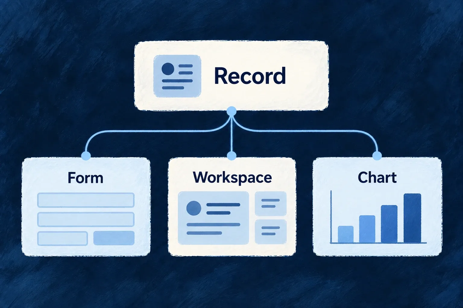
A record supports a form, a composed workspace and a chart.

From everyday actions to a complete workspace

Make routine work feel consistent

Forms, lists and detail views use the same resource contracts. Field presentation, validation and save feedback keep familiar actions coherent across screens.

Put useful context beside the work

Combine related records, charts and custom sections where they help a decision. Extend one operation or build a dedicated workspace without duplicating every standard surface.

Help people know what comes next

Guidance, meaningful badges and availability messages explain the next action. Billing and assistant components give specialized interactions their own clear place.

Example: Give a task room to become real work

A person finds a task in a filtered collection, changes its checklist in place and inspects related tasks beside a progress chart. The application chooses that arrangement; the resource controls, save feedback and related-record context remain connected.

For engineers

Begin with the registered resource behavior

The shared module registers the schema-backed resource configurations and relationships. The frontend module then contributes their UI behaviors, layouts and views. Wonder Todos’ actual frontend module shows the separate contributions; imports are omitted:

const tasksManagerFrontendModule: FrontendModule = {
  moduleId: 'tasks-manager',
  resourceUIBehavior: moduleResourcesUIBehavior,
  compositeViews: moduleAppLevelViewsCompositeViews,
  // Getting-started onboarding embedded on the home dashboard.
  onboardingViews: homeOnboardingViews,
  // Triggered guidance — the complement to the document above, not a second copy
  // of it. See the file for why the first list is the moment it fires on.
  guidanceFlows: moduleGuidanceFlows,
  ...moduleAppShellModuleConfig,
};

resourceUIBehavior controls fields and operation surfaces. compositeViews contributes app-level combinations. onboardingViews and guidanceFlows have separate jobs: the former describes content, the latter when guidance is offered. The module itself must be present in the frontend application’s module registry.

Override the part that needs a product decision

NeedAuthoring surfaceBehavior to retain
A different control or value presentationResource fields display/edit configurationSchema, labels, validation and surrounding field feedback
A better order or groupinglayout.edit, layout.display, layout.summaryStandard operation host and field controls
Several connected surfaces togetherComposite view and dedicated embedsEach embedded resource’s operation and relationship context
One operation with a tailored interactionIts typed customViewOperation and navigation context; explicitly compose the retained runtime
A workspace with temporary working stateExecution view with a declared anchorParticipation resolution and local/delegated operation navigation
A screen without one owning operationRegistered full custom viewView context; data loading and interaction become application responsibilities

A registered view does not create its backend operation. Presentation gates do not replace backend authorization. A custom host also decides which inserted views it renders; it should not expect charts and composites to appear automatically around arbitrary React content.

Connect specialized surfaces at both ends

Charts need the shared query definition in the backend chart registry and a frontend chart/view placement. A query-driven badge needs its shared definition and a navigation reference. Billing widgets need configured billing state and provider actions. An assistant view needs an exposed backend system, not only conversation components.

For forms, individual field autosave is an opt-in on update-like records. For read reuse, the cache requires live scope coverage before serving a stored result. Keeping these mechanisms in their standard runtime preserves the conditions that make their behavior reliable.

Follow the specific contract when extending

Use working forms for field composition and submission, custom operation screens for host replacement, and composite views for related content. The detailed entries below explain the configuration, registration and consumer for each choice.

Build everyday record screens

Give records a complete working interface Mechanism

People can browse a collection, inspect a record and act on it through a connected set of standard screens. Search, filters, pagination and available actions use the resource’s declarations.

Choose which operations become pages and which open within the current screen. The interface follows that choice rather than treating every action as another destination.

Example: Edit without losing the collection

A task collection offers selection and bulk actions. Creating a task opens an overlay; reading or editing an existing task can have its own address.
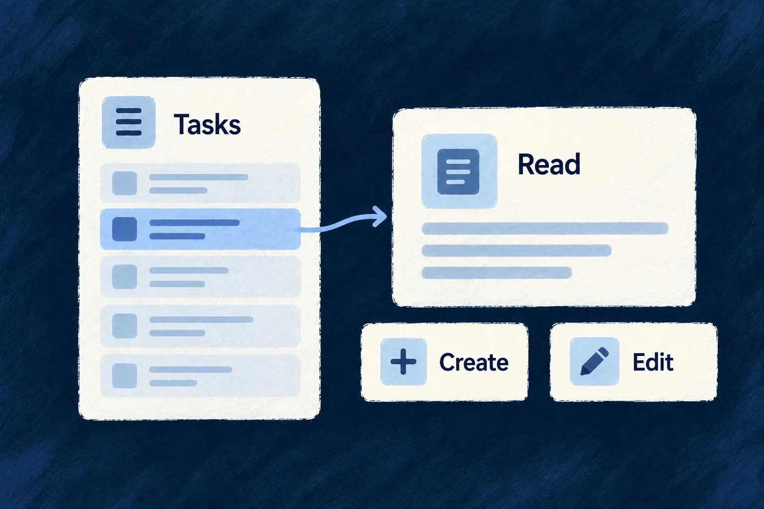
A selected list record leads to reading, creation and editing views.
For engineers
Expose the operation deliberately

The shared resource configuration must declare each operation first. The frontend views map chooses its surface; it does not create backend operations or grant access to them.

Wonder Todos makes this choice in todos.ui-behavior.tsx. This is a selected part of its views array; unrelated custom actions are omitted:

[Op.CREATE, { surface: ResourceOperationFrontendSurface.EMBEDDED }],
[Op.READ, {
  surface: ResourceOperationFrontendSurface.ADDRESSABLE,
  customView: TodoReadCustomView,
}],
[Op.LIST, {
  surface: ResourceOperationFrontendSurface.ADDRESSABLE,
  // Dogfood the collection capabilities: selectable cards/table surface the
  // bulk operations declared on the todos config (change-status, assign,
  // delete, …) via the shared bulk bar; per-card actions sit in the top-end
  // corner instead of the mid-row default.
  collectionDisplayConfig: {
    selectable: true,
    cardActionPlacement: { vertical: VerticalPlacement.TOP, horizontal: HorizontalPlacement.END },
  },
}],
[Op.SEARCH, { surface: ResourceOperationFrontendSurface.EMBEDDED }],
[Op.UPDATE, { surface: ResourceOperationFrontendSurface.ADDRESSABLE }],
[Op.DELETE, { surface: ResourceOperationFrontendSurface.EMBEDDED }],

ADDRESSABLE gives an operation a route where its configured path supports one. EMBEDDED keeps it inside a host such as an overlay. In this resource, create deliberately stays embedded because its core path would otherwise collide with the list path. Do not turn every entry into an addressable page mechanically.

Reuse the collection behavior

collectionDisplayConfig.selectable enables the selection surface. Cards and tables share selection state; filtering clears the selection, while pagination can retain it. The bulk toolbar resolves actual bulk operations from the resource rather than assuming every per-record action accepts several records.

The standard collection toolbar joins search, filter state, sorting and action presentation. Quick-filter tabs write the same filter state as the filter panel. Set these view-specific choices on the operation configuration rather than implementing an independent filter in a decorative tab bar.

Choose the smallest override

A custom read host in the example keeps the other operations on their standard surfaces. For a different field order use layout.display or layout.edit; for a genuinely different interaction use customView. Operation availability still depends on roles, context, enabled conditions and feature policy. A visible button is not the server’s authorization decision.
Turn field definitions into working forms Mechanism

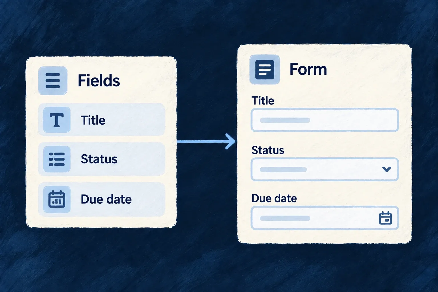
A form can start from the fields an operation accepts. Wildo selects the controls, resolves their labels and connects them to validation and submission.

Arrange those fields to suit the work. A custom layout can retain the standard field behavior instead of becoming a second implementation of the form.

Example: Arrange a task form around the decisions

A task form puts its title and description first, then groups status, priority, due date and assignee. Those controls still use the task operation’s input contract.

Declared title, status and due-date fields become controls in a form.
For engineers
Start with the operation, then arrange its fields

Register the resource schema, operations and relationships in the shared module. Its frontend resourceUIBehavior pairs that schema with the resource configuration and contributes the views through the frontend module’s resourceUIBehavior map.

ResourceAutomatedForm uses the operation’s request schema, derives create/update semantics, loads existing data when needed and submits through the resource registry. A field excluded from the update contract is not made writable by adding it to a template.

This selected layout.edit fragment is from Wonder Todos’ todos.ui-behavior.tsx. Imports and the surrounding behavior factory are omitted:

edit: () => {
  const { isExisting } = useFormTemplateContext();
  return (
    <FormLayout>
      <div className="flex flex-col gap-group">
        {/* `todoListId` is excludeFromUpdate — only CREATE carries it. When
            creating from inside a list scope the framework injects it as a
            context value and hides the picker automatically. */}
        {!isExisting && <FormField name="todoListId" />}
        <FormField name="title" />
        <FormField name="description" />
        {/* Workflow posture — four short inputs share two columns instead
            of stacking one-per-row. */}
        <div className="grid grid-cols-1 gap-group sm:grid-cols-2">
          <FormField name="status" />
          <FormField name="priority" />
          <FormField name="dueDate" />
          <FormField name="assignedToUserId" />
          <FormField name="progressPercent" />
          <FormField name="snoozedUntil" />
          <FormField name="externalRef" />
        </div>
        {/* Free-form tags: an array-of-scalar, auto-rendered as a simple
            tag-list FormFieldArray (no per-item template needed). */}
        <FormField name="tags" />
        {/* DEDICATED array component — array-specific knobs (renderItem,
            sectionAppearance, objectItemLayout) live here, not on the
            generic FormField. FORM variant: label is always an input. */}
        <FormFieldArray name="checklist" renderItem={(itemPath) => <ChecklistFormItem itemPath={itemPath} />} />
        {/* Composite object group with its own "Reminder" legend; the
            lead-time input self-hides until enabled via the schema-level
            `showWhen` on `reminder.leadTimeMinutes`. */}
        <FormField name="reminder" />
      </div>
    </FormLayout>
  );
},

useFormTemplateContext().isExisting separates creation from editing. The parent-list picker is only placed on creation; when a parent context already supplies it, the generated field handles that context rather than asking the person to repeat it. The grid changes placement, while each FormField still resolves its schema, control and errors.

Keep the standard form boundary

The frontend module installs the behavior map:

const tasksManagerFrontendModule: FrontendModule = {
  moduleId: 'tasks-manager',
  resourceUIBehavior: moduleResourcesUIBehavior,
  compositeViews: moduleAppLevelViewsCompositeViews,
  // Getting-started onboarding embedded on the home dashboard.
  onboardingViews: homeOnboardingViews,
  // Triggered guidance — the complement to the document above, not a second copy
  // of it. See the file for why the first list is the moment it fires on.
  guidanceFlows: moduleGuidanceFlows,
  ...moduleAppShellModuleConfig,
};

The resource form handles context injection and submission filtering. On update-like operations, a cleared optional field is represented differently from an omitted field: an omission leaves the stored value alone. Custom submit handlers must preserve this contract rather than serializing arbitrary component state.

Use a layout template when order or grouping matters. Leave it unspecified when the generated layout is sufficient; supply a full custom operation view only when the interaction itself needs to change.

Show and edit each value appropriately Mechanism

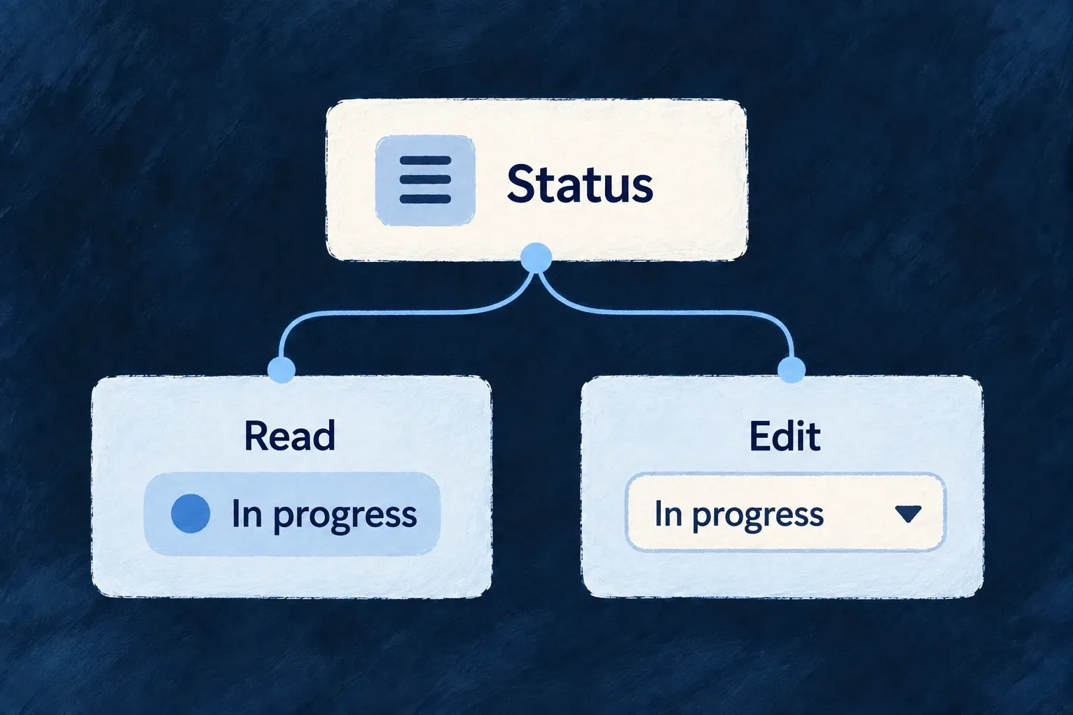
A status can read as a badge and edit as a choice. A description can display formatted text while exposing its source for editing. The same value can serve different moments in the interaction.

Declare those presentation choices beside the resource’s frontend behavior. Shared field types and business constraints remain in the data model.

Example: Read a status at a glance

The task status appears as an “In progress” badge on a detail screen. Editing selects another allowed status; changing the visual treatment does not change the allowed values.

The same status appears as a value when reading and a choice when editing.
For engineers
Keep storage and presentation separate

A resource’s fields map redecorates fields from schemaShape. It is a frontend presentation layer, not a place to change ownership, database indexes or operation exclusions.

This contiguous fragment from Wonder Todos pairs markdown display with source editing, then gives each status a semantic color:

description: sh.description.stringUI({
  // MARKDOWN (was MULTILINE, authored before the mode existed): renders
  // the description as themed rich text; editing stays markdown source.
  display: { displayMode: StringDisplayMode.MARKDOWN, showDescription: true },
  // `editMode` (not `component`) is the axis the string editor honors —
  // the earlier `component: FormFieldComponent.TEXTAREA` authored here
  // silently no-oped and the description edited as a single-line input.
  edit: { editMode: StringEditMode.TEXTAREA, textareaRows: 4, showDescription: true },
}),
status: sh.status.enumUI({
  display: { displayMode: EnumDisplayMode.BADGE, showDescription: true },
  edit: { showDescription: true },
  values: {
    [Todos_Status.PENDING]: { color: BadgeSemanticVariant.SECONDARY },
    [Todos_Status.IN_PROGRESS]: { color: BadgeSemanticVariant.INFO },
    [Todos_Status.COMPLETED]: { color: BadgeSemanticVariant.SUCCESS },
    [Todos_Status.CANCELLED]: { color: BadgeSemanticVariant.DESTRUCTIVE },
  },
}),

The description remains a string. StringDisplayMode.MARKDOWN changes its read renderer; StringEditMode.TEXTAREA presents plain source. A syntax-aware markdown editor is a separate edit-mode choice. The status colors come from BadgeSemanticVariant, so the theme resolves their appearance rather than receiving hardcoded colors.

Follow both consumers

FormField reads the edit configuration and chooses a control. DisplayValueDispatcher reads the display mode and selects the value renderer. Their shared field chrome handles labels and descriptions around those controls.

The redecorated frontend field can override presentation metadata inherited from the shared field. When a display change seems inert, inspect the frontend behavior as well as the schema; writing a second conflicting decorator is not additive configuration.

Keep labels and access independent

Enum value labels come from the application’s structured label tree. A color does not supply the value’s readable name. Conditional visibility and inline-edit choices shape the interface; backend roles, scopes and operation contracts still decide whether a change is allowed.

Give fields a clear visual hierarchy Mechanism

How a field is framed matters as much as its control. Labels, help text, required indicators and errors should form a predictable whole.

Wildo separates that surrounding presentation from the value editor, and supplies section containers for grouping related information. Choose the hierarchy the task needs, from a compact row to a guided sequence.

Example: Keep settings easy to scan

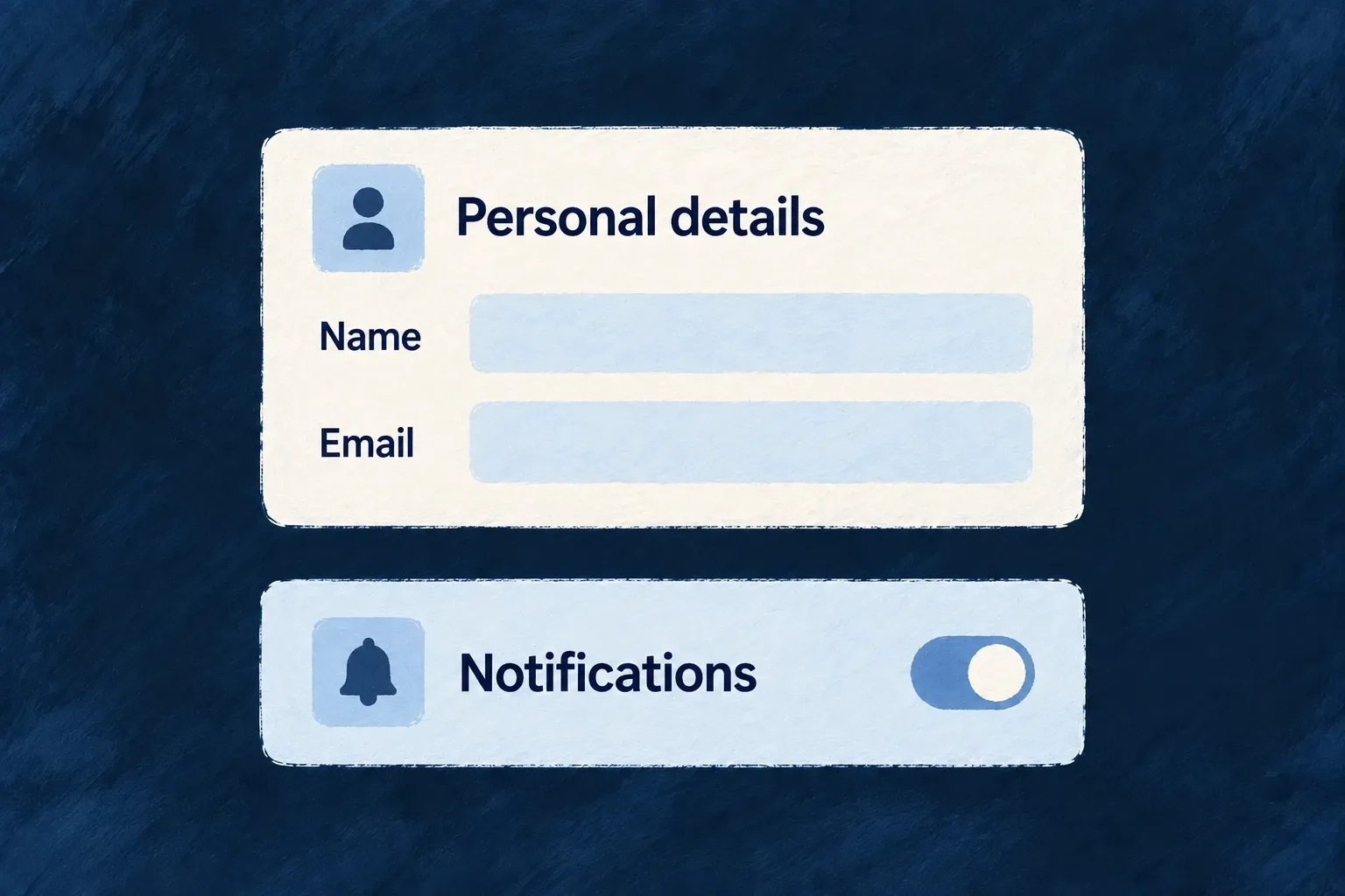
A notification setting places its label and explanation beside a switch. A personal-details form puts labels above its text inputs. Both retain the same error and help conventions.

Personal details and notification controls sit in clearly labelled sections.
For engineers
Choose field framing independently of its value

The field’s edit configuration accepts chromeMode; its display configuration has a corresponding reading mode. This current framework vocabulary shows the meaningful editing choices:

export const EditChromeMode = {
  /** Label above, control below, description + error below control (default). */
  STACKED: 'stacked',
  /** Label + description left, control + error right (settings page style). */
  SETTINGS_ROW: 'settings_row',
  /** Control left, label + description right (switch/checkbox style). */
  INLINE: 'inline',
  /** Generous spacing, heading-size label (onboarding, OTP, wizard). */
  RELAXED: 'relaxed',
  /** No label/description, just control + error (dense mode). */
  COMPACT: 'compact',
  /** No chrome at all — bare control output. */
  HIDDEN: 'hidden',
} as const;
export type EditChromeMode = typeof EditChromeMode[keyof typeof EditChromeMode];

STACKED suits ordinary forms. SETTINGS_ROW separates a setting’s explanation from its control. INLINE suits a switch or checkbox whose control precedes the label. RELAXED increases emphasis for focused steps. Compact and hidden chrome should be deliberate choices: the surrounding application must still provide an understandable accessible name.

FormFieldChrome owns the required marker, label association, descriptions, error display and save-state indicator. A preset implements the interactive content; recreating all that framing inside the preset risks duplicate labels and inconsistent feedback.

Carry a field choice into its named section

This illustrative update to a todo’s existing resourceUIBehavior joins decorated fields to a layout. Keep its other fields and operations. sh is the callback’s schemaShape; FormLayout, FormField and Section are public frontend components. EditChromeMode and SectionMode come from @wildo-ai/zod-decorators.

fields: {
  title: sh.title.stringUI({
    edit: { chromeMode: EditChromeMode.STACKED },
  }),
  description: sh.description.stringUI({
    edit: { chromeMode: EditChromeMode.SETTINGS_ROW },
  }),
},
layout: {
  refs: { sections: ['details'] },
  edit: () => (
    <FormLayout>
      <Section name="details" appearance={SectionMode.CARD}>
        <FormField name="title" />
        <FormField name="description" />
      </Section>
    </FormLayout>
  ),
},

The form reads the field’s decorated edit configuration. The title keeps its label above the input; description uses a settings row. Both still pass through FormFieldChrome for labels, errors and save feedback. The details reference must also exist in the resource specification’s section labels; layout.refs makes the named section discoverable but does not supply its words. Publish the corresponding labels through the application’s usual i18n pipeline.

A section’s own chromeMode can supply a common default. An explicit field choice takes precedence, so grouping fields does not erase their individual presentation.

Group fields using the layout contract

A ContentSectionContainer consumes section descriptors and one mode-specific configuration. Each descriptor carries a stable ID, resolved title and content; the mode decides whether those sections form tabs, a grid, an accordion or another supported arrangement.

For resource templates, named Section entries also belong in layout.refs and the resource specification’s matching text slots. Those references let labels and layout refer to the same section. Use plain layout containers when there is no real section to name.

Keep nested composition intentional

A single embedded surface normally needs a solo section appearance such as CARD, DEFAULT or GHOST. Container modes organize sibling sections; a section hidden behind a custom component is not automatically grouped by its parent template. Accordion mode defaults to one open section; an expandable collection instead reveals additional items. Choose the behavior, not just the silhouette.

Make changes clear and reliable

Help people correct the right field Mechanism

A rejected form should explain what needs fixing and bring the person to it. Wildo combines field feedback with summaries for cross-field and server errors.

When the server identifies a field, its message can appear on that field and clear as the person edits it. The application supplies the business rule and an error that describes it accurately.

Example: Correct the title that was refused

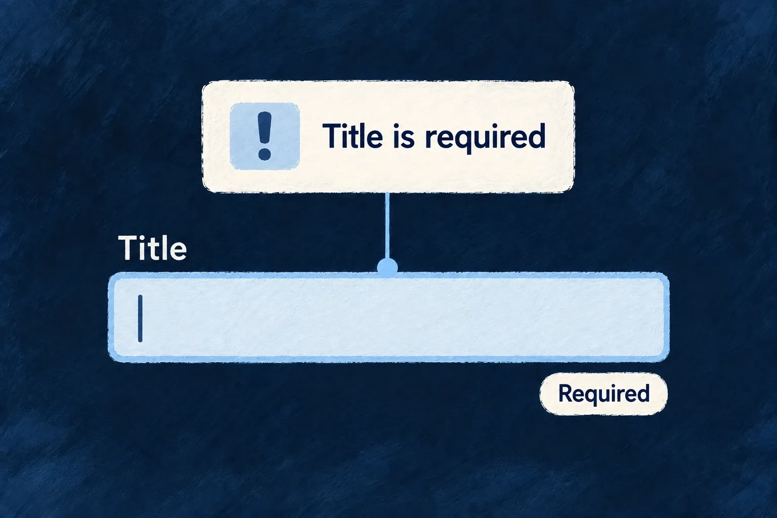
A task submission returns a title validation error. The form brings the title into view, shows the reason and removes that server message when the person changes it.

A title-required message points to the empty title field.
For engineers
Keep validation at both boundaries

The standard resource form validates the operation’s input schema before submission. The backend remains authoritative and may reject a value that depended on current data, uniqueness or a business rule.

ResourceAutomatedForm extracts structured server validation errors, maps their paths into the form and focuses the first rejected field. Do not flatten a field error into a generic toast before the form sees its path.

Preserve the error lifecycle in custom forms

The framework’s useServerErrorInjection implementation receives the active form methods. This selected runtime fragment shows the injection contract, not application code to copy instead of using the hook:

const injectServerErrors = useCallback((validationErrors: Record<string, string>) => {
  if (formMethodsRef.current) {
    Object.entries(validationErrors).forEach(([fieldName, message]) => {
      formMethodsRef.current!.setError(fieldName, {
        type: SERVER_ERROR_TYPE,
        message,
      });
      serverErrorFieldsRef.current.add(fieldName);
    });
    // Bring the first rejected field into view (audit D4). Injection happens
    // after a submit gesture, so the viewport is typically parked at the
    // submit button while the errored fields sit off-screen. Placing the
    // scroll HERE (the single injection seam) instead of at each catch block
    // keeps every server-validation path — direct submit, RMM mutation
    // result, draft save, publish, auth presets — covered by construction.
    // No-ops when no matching `[data-field]`/`[name]` element exists.
    scrollAndFocusFirstErroredField(Object.keys(validationErrors));
  }
}, [formMethodsRef]);

Call initAutoClearing when a custom form becomes ready, clearServerErrors before a new submission, and injectServerErrors with the extracted field-message map after a rejection. Auto-clearing watches edits to those paths; it does not remove unrelated client validation errors.

Put the summary where the layout needs it

FormErrorSummarySlot places the summary in a template. Generated layouts include it by default. The summary normally gathers cross-field and server errors; the surface policy can promote ordinary field errors to the top as well. In a wizard, field and server entries can be restricted to the current step, while cross-field errors remain visible.

For custom templates, retain the field wrappers and their field/name attributes so focus resolution can find the rejected input. Uniqueness prechecks can improve feedback, but a successful precheck is not a reservation: server validation still decides the final write.

Save small edits as people work Mechanism

A small correction need not require a separate edit-and-submit journey. Selected fields can save as people change them, with a visible saving, saved or failed state.

Choose where that behavior helps. Standard update forms can opt individual fields into autosave; inline editing also has dedicated support for single values and array items.

Example: Tick a checklist without submitting a form

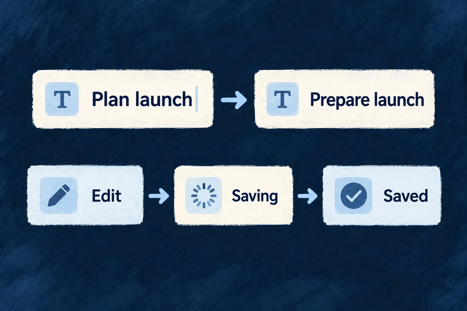
A task’s checklist saves a tick or label edit in place. The person stays on the detail screen and can see whether the change was saved.

An edited value moves through saving to saved feedback.
For engineers
Opt in at the right surface

On an update-like ResourceAutomatedForm, a field declaring edit.autosave: true or an enabled autosave configuration activates the provider. Undeclared fields keep autosave off in this derived mode. Create forms do not derive autosave: there is no existing record to patch yet.

For example, adapt an existing resource UI behavior’s fields and edit layout together. This is illustrative configuration for the existing todo title and description, not a change already installed in Wonder Todos:

fields: {
  title: sh.title.stringUI({
    edit: {
      autosave: { enabled: true, trigger: AutosaveTrigger.BLUR },
    },
  }),
  description: sh.description.stringUI({
    edit: {
      autosave: { enabled: false },
    },
  }),
},
layout: {
  edit: () => (
    <FormLayout>
      <FormField name="title" />
      <FormField name="description" />
    </FormLayout>
  ),
},

Import AutosaveTrigger from @wildo-ai/zod-decorators. sh is the resourceUIBehavior callback’s schemaShape; the layout components come from @wildo-ai/saas-frontend-lib. Open the resource’s standard UPDATE operation so ResourceAutomatedForm consumes this behavior. With no form-wide override, leaving a valid title triggers its field save; editing description does not initiate autosave. Keep an explicit submission path for fields that do not autosave. This example selects save triggers; it does not promise that a request payload excludes every other form value.

An explicit form-level autosaveConfig takes precedence. The framework’s actual resolution is shown here so the distinction between field opt-in and a form-wide default is visible:

const derivedAutosaveEnabled = useMemo(
  // `effectiveFormOperationType`, not `operationType`: a CUSTOM operation declaring
  // `resourceOperationLike: UPDATE` (a `rotate`, say) edits an existing row and autosaves on the
  // same terms. That variable is the one the rest of the form filters fields by.
  () => autosaveConfig === undefined && deriveAutosaveEnabledFromFields(formFieldShape, effectiveFormOperationType),
  [autosaveConfig, effectiveFormOperationType, formFieldShape],
);

const autosaveProviderConfig: AutosaveConfig = useMemo(() => ({
  enabled: autosaveConfig?.enabled ?? derivedAutosaveEnabled,
  defaultTrigger: autosaveConfig?.defaultTrigger ?? (derivedAutosaveEnabled ? AutosaveTrigger.NONE : AutosaveTrigger.DEBOUNCE),
  debounceMs: autosaveConfig?.debounceMs ?? 500,
  savedStateDurationMs: 2000,
}), [autosaveConfig, derivedAutosaveEnabled]);

The NONE default is significant: enabling one field does not silently make its neighbours save. Per-field triggers choose debounce, blur or no autosave; field validation runs before submission.

Bind custom array controls to the save contract

Wonder Todos declares its checklist inline-editable with arrayUI({ display: { inlineEditable: true }, objectItemLayout: ArrayObjectItemLayout.ROW }). Its custom item template then uses this real helper:

function useChecklistItem(itemPath: string): {
  done: boolean;
  toggleDone: (next: boolean) => void;
  label: string;
  setLabel: (next: string) => void;
} {
  const done = useArrayItemAutosaveField<boolean>(`${itemPath}.done`);
  const label = useArrayItemAutosaveField<string>(`${itemPath}.label`);
  return {
    done: !!done.value,
    toggleDone: (next) => done.setValue(next),
    label: typeof label.value === 'string' ? label.value : '',
    setLabel: (next) => label.setValue(next),
  };
}

useArrayItemAutosaveField updates the form state and signals the array editor to save the whole array. A raw React Hook Form controller alone does not perform that second step. The helper also works inside an ordinary edit form, where the surrounding submission persists the values.

Understand the write path

Scalar inline editing saves on its commit/blur path through the mutation manager. The inline array host mounts AutosaveProvider; generated update forms can now mount it from the field opt-in above. These are related surfaces, not one universal on-change handler.

The resource mutation manager orders updates and reconciles confirmed values. Network failures, rejected validation, conflicts and deleted records produce different outcomes. Custom controls should retain the provided save status and retry affordances rather than treating a local value change as proof of persistence.

Keep open screens in step with changes Mechanism

When records change, open screens should not stay confidently out of date. Wildo connects resource notifications with its read and mutation state.

Returning to a record can reuse a previous result while the application has a live subscription that would report changes to it. When that coverage is absent, the next read fetches again.

Example: Revisit a task after a colleague changes it

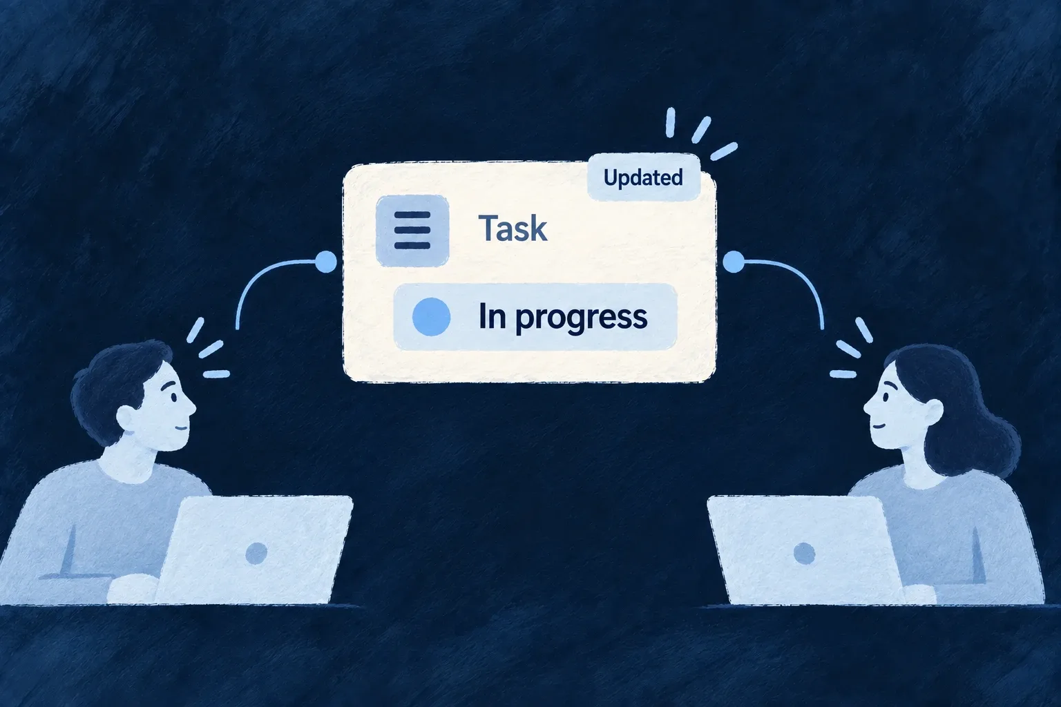
A colleague updates a task’s status. The notification invalidates affected read results, so returning to the task does not reuse the old status as if nothing happened.

Two people receive the updated state of a shared task.
For engineers
Use the resource runtime rather than a separate cache

Standard resource surfaces use the registry read path and useResourceRMM for update state. The application runtime supplies the mutation registry and ResourceReadCacheBridge; the bridge connects the cache with WebSocket room coverage and session state.

A custom component that fetches with its own client does not acquire this behavior merely by rendering inside Wildo. Reuse the resource operation surface or explicitly connect to the framework’s resource hooks and lifecycle.

Understand when a cached result may be served

The current ResourceReadCacheFrontendService.read implementation checks live coverage on every lookup:

public read(key: string): unknown | undefined {
  if (!this.enabled) return undefined;
  const entry = this.entries.get(key);
  if (!entry) return undefined;

  if (!this.authority?.covers(entry.resourceType, entry.scopes)) {
    // Not an error and not necessarily stale — simply unprovable. Dropping it keeps the map from
    // filling with entries that can never be served.
    this.entries.delete(key);
    logDebug('entry dropped: no live coverage', { resourceType: entry.resourceType });
    return undefined;
  }

  entry.lastReadAt = Date.now();
  return entry.value;
}

The cached value is a candidate, not a freshness promise. A disconnected socket, a refused or missing room, or an absent coverage authority makes the lookup miss. Session and reconnect resets and resource-event invalidation have their own paths, covering lists as well as individual records. The standard provider tree mounts the bridge inside the route-owned scope provider. Organisation changes clear cached entries and release bridge coverage; late room replies cannot revive retired claims. WebSocket cleanup independently releases old-organisation room claims.

Separate saved, optimistic and remote state

ResourceMutationManager maintains confirmed data and queued changes for a resource instance. Standard forms and inline edits use it to order writes, surface failures and reconcile the server’s response. The same record’s consumers can subscribe to that state instead of each maintaining an unrelated optimistic copy.

Conflicts are not all interchangeable. The configured conflict policy decides how applicable changes reconcile; a deleted record is terminal. Retain the runtime’s failure and remote-change feedback in a custom interaction. This mechanism does not make an arbitrary screen an offline editor or a collaborative text document.

Show how much work needs attention Mechanism

A badge is useful when its number means something specific: items assigned to a person, requests still open or work awaiting attention. Define that meaning as a query.

Wildo recomputes derived badges from matching records and delivers updates to their scope. The application chooses the filter, ownership field and display treatment.

Example: Count my unfinished todos

The Todos navigation item shows the number of todos assigned to the current person whose status is neither completed nor cancelled. Completing one removes it from that query.

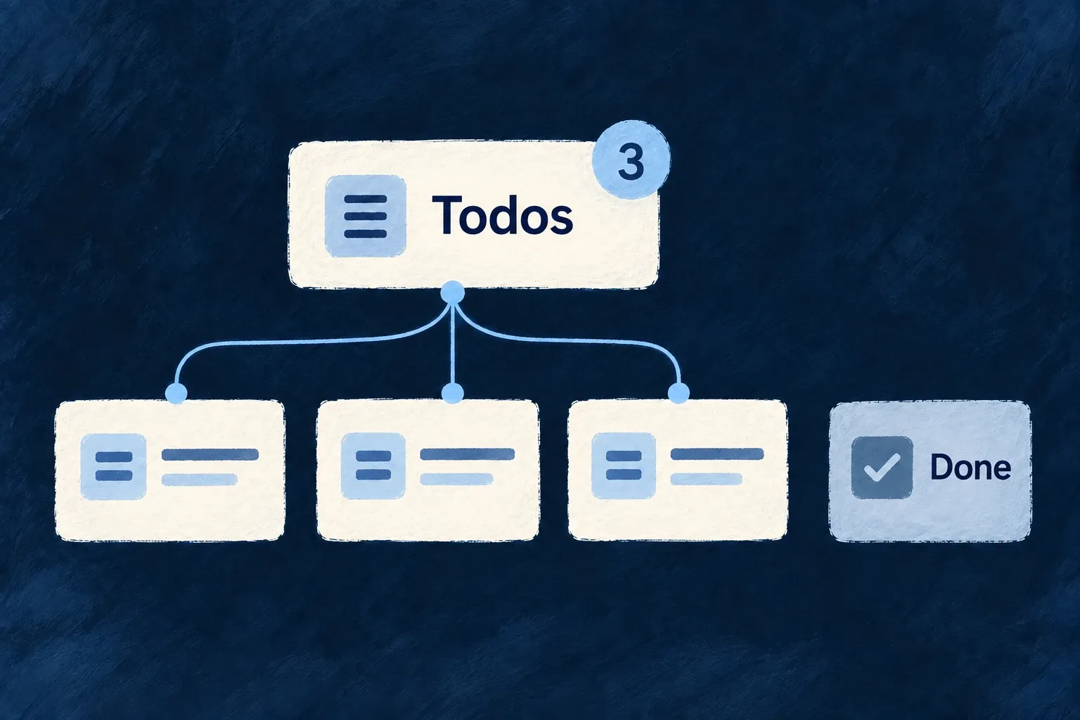
Three matching unfinished todos contribute to the Todos badge; a completed item does not.
For engineers
Define the count and its scope together

This complete badge declaration comes from Wonder Todos; imports and its identifier constants are omitted:

export const tasksManagerNotificationBadgeDefinitions: NotificationBadgeDefinition[] = [
  {
    identifier: USER_SELF_INCOMPLETE_TODOS_BADGE_IDENTIFIER,
    scope: ResourcePrimaryScope.USER_SELF,
    source: {
      kind: NotificationBadgeSourceKind.DERIVED_QUERY,
      resourceType: TasksManager_ResourceType.TODOS,
      filter: { status: { $nin: [Todos_Status.COMPLETED, Todos_Status.CANCELLED] } },
      scopeField: 'assignedToUserId',
    },
    display: {
      mode: NotificationBadgeDisplayMode.COUNT,
      tone: IndicatorVariant.INFO,
      pulse: NotificationBadgePulse.ON_INCREASE,
    },
  },
];

scopeField: 'assignedToUserId' ties the query to the badge owner. The status filter selects unfinished work. COUNT controls presentation and ON_INCREASE asks the badge to pulse when its value rises; neither changes which records are counted.

Register once, reference from navigation

The shared module contributes tasksManagerNotificationBadgeDefinitions through notificationBadgeDefinitions. The navigation item uses the key derived by buildNotificationBadgeKey(ResourcePrimaryScope.USER_SELF, identifier) as its notificationBadgeRef. This keeps the scope named in the definition and in the reference aligned.

On the backend, the notification dispatcher requests recomputation after relevant resource mutations. The badge service counts with the declared filter plus the owner’s scope field, persists the result and emits its update. Connection seeding recomputes the derived value as well; the frontend hook receives badge updates for the subscribed scope.

Do not mix counting models

A derived-query badge is recalculated from source records. Event-driven badges have a different update contract and should not be used to increment/decrement the same meaning in parallel. When the filter or assignment field changes, check both a newly matching record and one leaving the set. For user-scoped badges, verify two users independently rather than only observing the number on one navigation item.

Compose focused workspaces

Make the screen your product needs Mechanism

Standard screens provide a starting point, not the final shape of every product. Replace the presentation of one resource operation, or create a screen with its own interaction.

These are different choices. An operation-owned custom view receives that operation’s context; a fully custom screen owns its data loading and composition.

Example: Add a workspace beneath a record

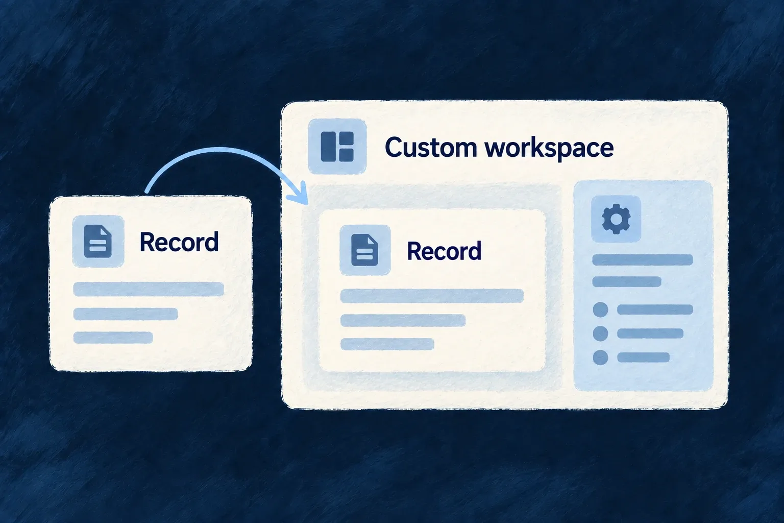
A task read view keeps the standard record content and adds a related workspace below it. The application authors the composition while retaining the normal read surface.

A record view is deliberately placed within a custom workspace.
For engineers
Start with a typed operation host

This is Wonder Todos’ actual TodoReadCustomView. Its imports and source markers are omitted:

export const TodoReadCustomView: ResourceReadCustomViewComponent = (props) => {
  const { resourceContext } = useReadOperationSurface({
    resourceContext: props.resourceContext,
    navigationZone: props.navigationZone,
    navigationInitiator: props.navigationInitiator,
  });

  return (
    <ResourceLayoutPreset_Read_Default
      {...props}
      showCharts={false}
    >
      <EmbedResourceOwnedCompositeView
        resourceContext={resourceContext}
        viewRef={TODO_WORKSPACE_COMPOSITE_VIEW_REF}
        navigationZone={props.navigationZone}
        navigationInitiator={props.navigationInitiator}
      />
    </ResourceLayoutPreset_Read_Default>
  );
};

ResourceReadCustomViewComponent supplies the read-host props. useReadOperationSurface resolves the resource context; forwarding the navigation zone and initiator preserves where the request came from. The standard read preset renders the familiar record surface, and the explicit composite embed adds the application’s workspace.

The resource’s views map binds customView: TodoReadCustomView to its READ operation. Keep that binding inside the resource’s registered frontend behavior. Other operations can continue using the standard hosts.

Choose an independent screen when there is no single host operation

A full custom view instead declares a stable ref, componentRef, scope and addressability in the app/module’s fullCustomViews. The component reference must be registered in the component registry. The host supplies context identifiers; the component owns its fetches, actions and layout.

Use the framework resource hooks or embeds when those interactions should retain resource semantics. A bare fetch or custom button does not inherit standard mutation reconciliation just because the screen has a Wildo route.

ChoiceRetained starting pointApplication responsibility
Layout templateExisting operation host and fieldsField order, grouping and local presentation
Operation customViewTyped operation and navigation propsCompose the host and explicitly place its inserted views
Full custom viewRegistered route/view contextData loading, interaction and composition

Custom presentation does not bypass backend access rules. Declare feature requirements and route scope deliberately, then make the component’s requests through the correct application contract.

Bring related work onto one screen Mechanism

Some work is easier when its related pieces are visible together. A composite view combines existing resource operations, charts and authored sections into one screen.

The application chooses the arrangement. Dedicated embeds resolve the surrounding record context so each part can retain its own standard behavior.

Example: Keep a task and its supporting work together

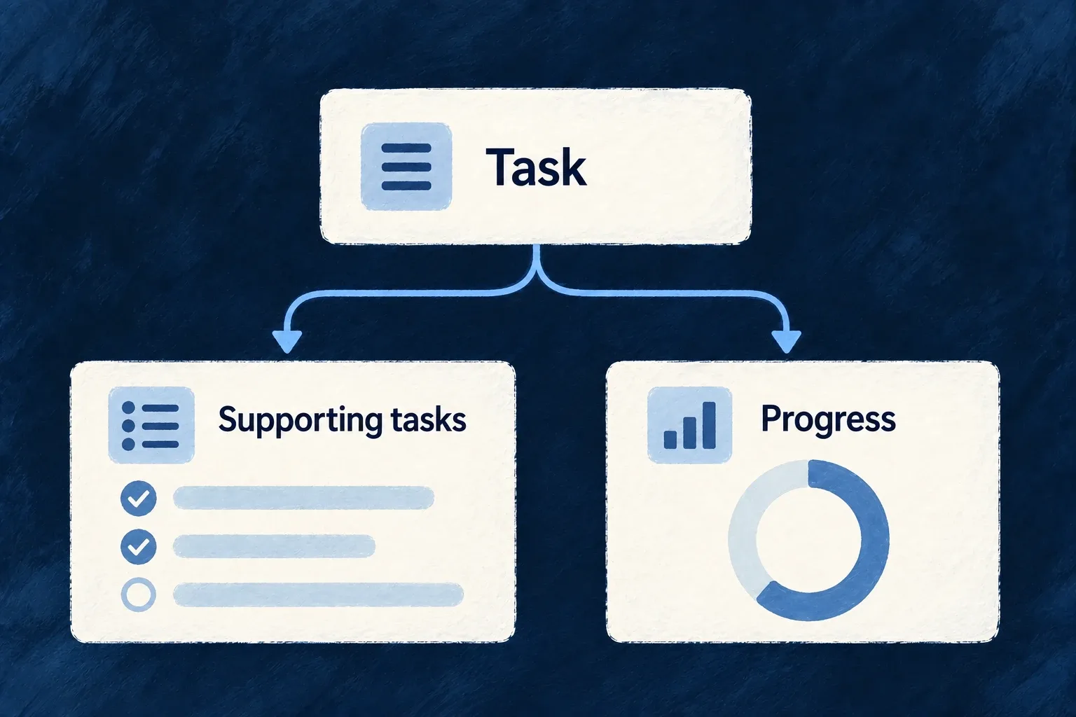
A task detail screen adds its supporting tasks and progress charts below the record. It gives the person adjacent context without rendering the same task details twice.

A task brings its supporting tasks and progress into one composition.
For engineers
Compose existing surfaces rather than re-fetching their data

Wonder Todos’ TodoWorkspaceCompositeView adds related tasks and metrics. The selected function below shows the composition; imports and the chart-cell helper are omitted:

export function TodoWorkspaceCompositeView(): React.ReactElement {
  return (
    <CompositeLayout>
      <Section name="tasks" appearance={SectionMode.GRID}>
        <EmbedRelatedResourceOperation
          resourceType={TasksManager_ResourceType.TASKS}
          operationLike={CoreResourceOperation.LIST}
        />
      </Section>
      <Section name="metrics" appearance={SectionMode.CARD}>
        {/* Three compact titled charts side by side (stacking full-width tripled
            the section height for the same information). Plain grid — chart
            cells, not sections, so no container mode applies. */}
        <div className="grid grid-cols-1 gap-group md:grid-cols-2 xl:grid-cols-3">
          <MetricsChartCell resourceType={TasksManager_ResourceType.TASKS} viewRef="todo-task-status" />
          <MetricsChartCell resourceType={TasksManager_ResourceType.TASKS} viewRef="todo-task-priority" />
          <MetricsChartCell resourceType={TasksManager_ResourceType.TASKS} viewRef="todo-task-timeline" />
        </div>
      </Section>
    </CompositeLayout>
  );
}

EmbedRelatedResourceOperation resolves the child operation from the host’s relationship context. EmbedRelatedChart inside MetricsChartCell does the equivalent for the named chart. The custom cell gets its title from the chart-view label namespace rather than inventing a second chart name.

Register the view and its sections

The same file publishes the composite contract:

export const TODO_COMPOSITE_VIEWS = {
  [TODO_WORKSPACE_COMPOSITE_VIEW_REF]: {
    viewComponent: TodoWorkspaceCompositeView,
    sectionRefs: ['tasks', 'metrics'],
    icon: ClipboardCheck,
  },
} satisfies ResourceCompositeViewsConfig;

Its owning resource references the composite configuration in frontend UI behavior. Section references must match the specification/label entries that describe them. App-level composites instead enter the frontend module’s compositeViews contribution.

Decide who owns placement

A standard host can render resource-owned inserted views according to configuration. A custom host must place them explicitly, using EmbedResourceOwnedCompositeView where this workspace belongs. The todo example deliberately omits a host-record section from the composite because its parent already renders the record.

When more than one relationship reaches the same target resource, disambiguate the embed with the appropriate foreign key. A plausible-looking list is not proof that it uses the intended relationship. The example places its sections directly beneath CompositeLayout, where the layout can resolve container appearances such as GRID. If a custom wrapper hides a section from that grouping pass, use a solo appearance such as CARD for its individual embed so its heading and frame are retained.

Turn records into useful measures Mechanism

A useful chart starts with a question about the data: how work is distributed, how much remains or how activity changes over time. Wildo connects that query with its chart presentation.

Choose the dimensions, measures and visual form. The backend executes the declared aggregation in the caller’s context; the frontend turns the result into a chart.

Example: See work by status

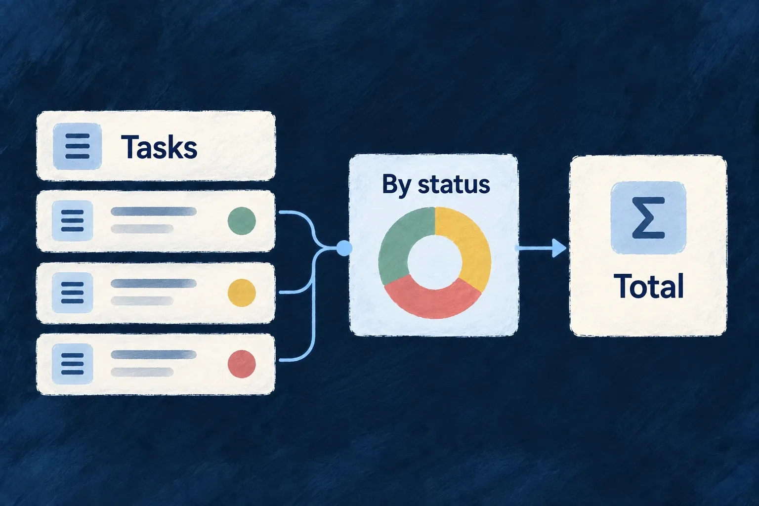
A task dashboard groups tasks by status and counts each group. A donut shows that distribution while the same result can supply summary figures.

Task records feed a status chart and a total.
For engineers
Share the chart definition across both layers

Wonder Todos declares this complete chart object in shared-lib. Imports are omitted; ChartDefinition, ChartType and AggregateFunction come from @wildo-ai/saas-models:

export const todosByStatusChartDefinition: ChartDefinition = {
  ref: 'wonder-todos-todos-by-status',
  chartType: ChartType.DONUT,
  dataQuery: {
    mainResourceType: TasksManager_ResourceType.TODOS,
    dimensions: [
      {
        ref: 'status',
        field: 'status',
      },
    ],
    measures: [
      {
        ref: 'count',
        field: '*',
        aggregate: AggregateFunction.COUNT,
      },
    ],
  },
  series: [
    {
      ref: 'todos-by-status',
      name: 'Todos by status',
      measureRef: 'count',
      splitByDimension: 'status',
    },
  ],
};

The dimension names the grouping field. The measure counts records, and the series selects that measure and splits it by the status dimension. This chart has no parent-record filter: it describes the current organisation’s todos, not the tasks beneath one particular todo.

Register execution and presentation

The backend module includes this shared object in chartDefinitions. The frontend resource behavior names the same object in chartViews:

{
  ref: todosByStatusChartDefinition.ref,
  scope: FrontendView_ScopeMode.RESOURCE,
  isAddressable: false,
  operationLike: Op.READ,
  primaryScope: ResourcePrimaryScope.ORGANIZATIONS,
  chartDefinition: todosByStatusChartDefinition,
},

Both registrations matter: a frontend-only chart has no registered data query to execute; a backend definition alone has no chosen screen placement. The application module must itself be installed in its layer’s module registry.

Make scope and placement explicit

The chart controller validates configured inputs, resolves trusted parent context and calls the aggregation service with the execution context and chart role configuration. For a parent-specific chart, declare the parent requirement and matching context filter; do not pass an arbitrary foreign organisation ID as a browser-selected filter.

Standard hosts can surface their configured charts. A custom host explicitly embeds the view. In this example, the custom todo read host does not automatically prepend these organisation-wide charts; the home dashboard chooses their placement. Labels, empty-state usefulness and which measures help a decision remain application design work.

Keep complex work in one workspace Mechanism

A complex interaction can involve a main record, related records and temporary working state. An execution view gives that interaction a host with a clear anchor.

The application builds the workflow interface. Wildo supplies the context and navigation mechanisms for opening related operations locally or handing them to the application router.

Example: Inspect related work while keeping the task open

A task workspace opens the parent todo’s read surface inside itself. The person can inspect that context and return to the workspace without replacing it with an unrelated page.

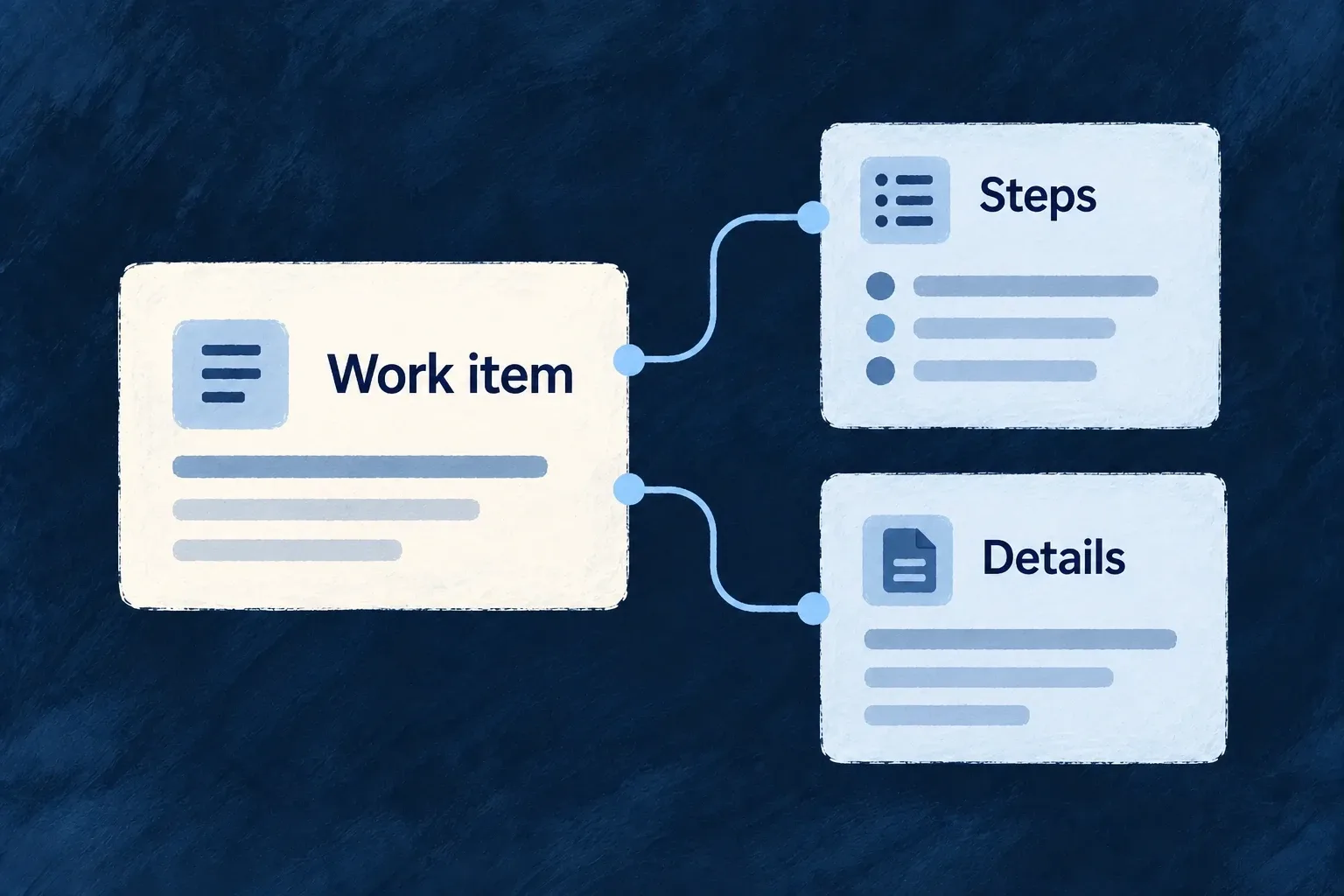
A work item anchors its steps and supporting details.
For engineers
Declare what the workspace is anchored to

A resource-owned execution view lives in executionViews, uses a stable view reference and points its anchor to a declared parent or additional resource requirement. participations can name the anchor and related records resolved from it. An anchor is a named binding, not whichever resource happens to appear first in an array.

Register the frontend resource behavior, give the view its matching specification/labels and choose its launch placement. The resource’s actual operation and relationship registrations still determine what can be opened.

Open an existing operation inside the execution host

This selected callback from Wonder Todos’ TaskExecutionView runs inside a component using useExecution(). parentTodoId comes from the resolved anchor:

const embedAnchoredTodoRead = useCallback(() => {
  if (!parentTodoId) {
    return;
  }

  execution.actions.operation({
    resourceType: TasksManager_ResourceType.TODOS,
    resourceId: parentTodoId,
    operationLike: CoreResourceOperation.READ,
    navigationInitiator: {
      sourceOperation: CoreResourceOperation.READ,
      sourceRelationship: {
        parentResourceType: TasksManager_ResourceType.TODOS,
        childResourceType: TasksManager_ResourceType.TASKS,
        foreignKeyField: TasksManager_ResourceFieldIdentifier[TasksManager_ResourceType.TODOS],
      },
    },
  }).embed();
}, [execution.actions, parentTodoId]);

The navigation initiator preserves the task-to-todo relationship. .embed() places the resource operation inside the execution shell; the router-delegated path opens it through the application’s navigation instead. Both retain the operation context rather than fabricating a parallel data API.

Keep local state distinct from durable work

The host also exposes local-pane and embedded-content state. Opening another embed replaces the current embedded-content slot; this is not an arbitrary collection of independent React windows. The supported embedded target is a resource operation.

Dirty markers let participating work report unsaved changes to the execution navigation policy. The application still decides what each step does and which backend operation persists it. An execution view is a frontend workspace contract, not an automatic durable workflow engine or a transaction spanning every step.

Guide the next action

Guide people toward useful first actions Mechanism

An empty screen can leave a new user unsure what to do next. Wildo provides onboarding content and contextual guidance that can explain the next useful action.

Progression can also record declared milestones from application activity. You decide what deserves guidance and what counts as progress; a dismissed introduction is not the same as completed work.

Example: Help a new user begin

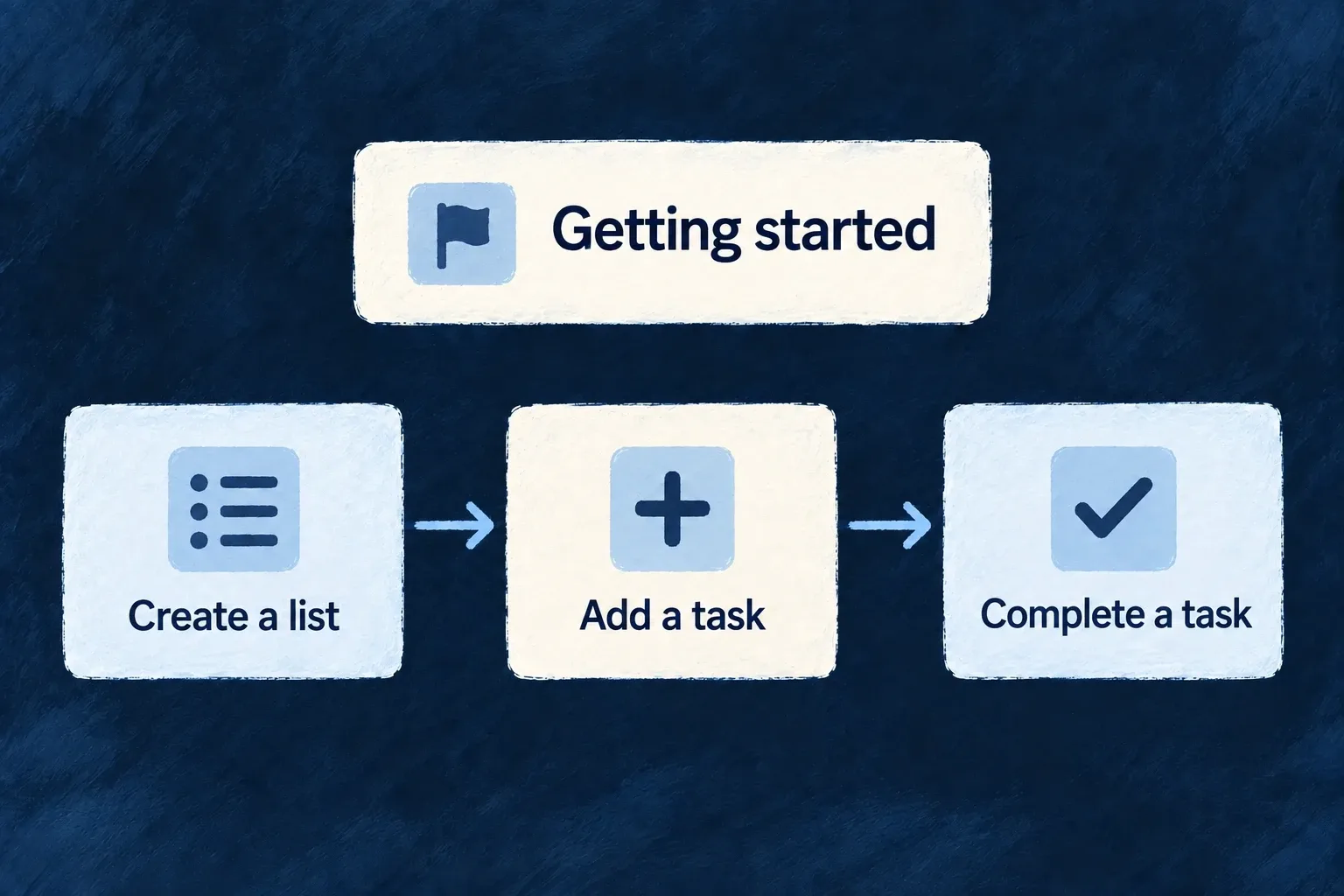
A getting-started panel explains creating a list and adding a task. A separate milestone can recognize the first successful list creation, rather than assuming reading the instruction completed it.

A getting-started sequence leads through creating a list, adding a task and completing it.
For engineers
Separate the document from the trigger

An onboarding view declares ordered elements and display options. A guidance flow decides when guidance should appear. Milestones define recognized application activity and progression. Each has its own identity and registration.

Wonder Todos’ home introduction uses this selected definition. Remaining cards and imports are omitted:

const homeGettingStartedOnboarding: OnboardingViewDefinition[] = [
  {
    ref: HOME_GETTING_STARTED_VIEW_REF,
    scope: FrontendView_ScopeMode.APPLICATION,
    options: {
      showProgress: true,
      allowDismiss: true,
      persistState: true,
      autoStart: false,
      allowSkip: true,
    },
    elements: [
      {
        ref: 'create-list',
        type: OnboardingElementType.CARD,
        status: OnboardingStatus.NOT_STARTED,
        order: 0,
        variant: OnboardingCardVariant.DEFAULT,
      },

The frontend module registers this document in onboardingViews, and the home dashboard places it inline with EmbedOnboarding. The registered view ref supplies the persistence identity, unless the host provides a registered guidanceFlowRef. An unregistered inline document keeps local state only. Saving dismissal or progress also requires the guidance-state update operation and a successful request.

The persistState option in this application excerpt does not control that decision in the current renderer. Placement belongs to the host; autoStart is likewise not consumed by this renderer.

Connect a guidance trigger to a registered flow

Wonder Todos also declares moduleGuidanceFlows. Unlike the inline home document, this flow responds to a successful resource operation. The selected declaration below retains the trigger, scope and visible element; imports and display options are omitted.

export const moduleGuidanceFlows: GuidanceFlowDefinition[] = [{
  ref: 'tasks-manager-first-list',
  scope: GuidanceFlowScope.USER,
  renderMode: GuidanceRenderMode.OVERLAY,
  trigger: {
    type: OnboardingTriggerType.EVENT,
    eventName: `${TasksManager_ResourceType.TODO_LISTS}:${CoreResourceOperation.CREATE}`,
  },
  priority: 50,
  elements: [{
    ref: 'first-list-created',
    type: OnboardingElementType.BANNER,
    status: OnboardingStatus.NOT_STARTED,
    order: 0,
    variant: OnboardingVariant.INFO,
    dismissible: true,
    position: OnboardingBannerPosition.TOP,
    actionRef: `${TasksManager_ResourceType.TODOS}.${CoreResourceOperation.CREATE}.default`,
  }],
  labels: { description: true },
}];

The resource-success event supplies the trigger name. The banner’s actionRef separately names the default todo CREATE operation. One says when to offer help; the other says where the offered action leads. The guidance vocabularies and type are exported by @wildo-ai/saas-models; resource identifiers belong to the application.

Register it on the same frontend module that contributes the resource UI:

const tasksManagerFrontendModule: FrontendModule = {
  moduleId: 'tasks-manager',
  resourceUIBehavior: moduleResourcesUIBehavior,
  onboardingViews: homeOnboardingViews,
  guidanceFlows: moduleGuidanceFlows,
  // Other module contributions remain here.
};

Include that module in applicationFrontendModules; the module registry merges guidanceFlows into the application configuration read by the guidance provider. Supply the flow/element specifications and published labels: an element reference does not provide the banner’s title or action wording. Dismissal and completion follow the registered-state persistence path described above. Registration does not mean the flow’s trigger has already occurred.

Record an outcome from the operation that proves it

The shared module separately registers customMilestoneDefinitions. These two actual definitions connect the first list and first todo to resource CREATE operations:

defineMilestone('FIRST_TODO_LIST_CREATED', {
  type: MilestoneType.FIRST_TIME,
  trigger: { resourceType: TasksManager_ResourceType.TODO_LISTS, operation: CoreResourceOperation.CREATE },
  reward: { type: MilestoneRewardType.CELEBRATION, celebrationLevel: 'medium' },
  category: 'getting-started',
  points: 10,
  labels: { description: true },
}),

defineMilestone('FIRST_TODO_CREATED', {
  type: MilestoneType.FIRST_TIME,
  trigger: { resourceType: TasksManager_ResourceType.TODOS, operation: CoreResourceOperation.CREATE },
  reward: { type: MilestoneRewardType.CELEBRATION, celebrationLevel: 'low' },
  category: 'getting-started',
  points: 5,
  labels: { description: true },
  dependencies: ['FIRST_TODO_LIST_CREATED'],
}),

For the standard authenticated frontend to load milestone definitions and show the progression tracker, enable applicationConfig.analytics.enabled. Registering definitions alone does not enable that display: the provider returns an empty definition list when analytics is disabled. This frontend gate is separate from backend activity recording.

The second milestone names its dependency. The backend registry validates definitions and their dependencies during registration. The event-driven progression mechanism records the configured activity; the onboarding card does not itself prove that the create operation happened.

Keep the guidance useful

Use stable element/section references and supply their authored specifications and generated labels. Choose sensible dismissal, skip and repetition behavior. Keep instructions tied to actions that are actually available in the current product. A celebration or checklist is a presentation choice; the business meaning of completion remains yours.

Explain what is available to each customer Mechanism

An unavailable feature should not leave the person guessing. Wildo can adapt its presentation to the reason and the person’s role: offer an upgrade, explain a limit, ask an administrator or hide the surface.

Declare the availability policy once and connect it to the relevant operation or view. Backend enforcement remains separate from what the interface displays.

Example: Offer the right next step for reports

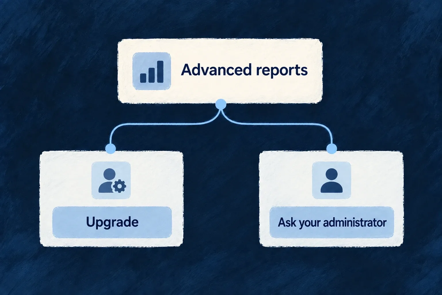
An administrator can see an upgrade action for advanced reports. A regular member can instead be directed to an administrator, without being offered a billing action they cannot complete.

Advanced reports offer an upgrade or an administrator request according to availability.
For engineers
Define availability and the response to its absence

Wonder Todos defines product features in its shared configuration. This selected declaration gives advanced reports a default upgrade prompt and a member-specific response:

defineFeature(ApplicationFeature.ADVANCED_REPORTS, {
  scope: ResourcePrimaryScope.ORGANIZATIONS,
  unavailability: {
    behavior: FeatureUnavailabilityBehavior.UPGRADE_PROMPT,
    byRole: { [CORE_ORG_ROLES.ORG_MEMBER]: FeatureUnavailabilityBehavior.CONTACT_ADMIN },
  },
}),

The feature registry and the current scope’s grants determine availability. The policy determines how unavailability is presented. Product plans or non-billing feature profiles supply grants; the policy alone does not enable a feature.

Apply it at the surface that owns access

For an authored component, FeatureGate accepts a featureId and children. Its implementation renders those children when available, renders nothing for HIDE, otherwise delegates to a custom renderer or the policy-driven prompt. Use renderUnavailable only when the product needs a distinct presentation of the same availability result.

This complete illustrative component consumes the same ApplicationFeature.ADVANCED_REPORTS used by the Professional grant and protected READ variant. Place it in the normal application provider tree; its parent supplies the report content:

import type { ReactNode } from 'react';
import { FeatureGate } from '@wildo-ai/saas-frontend-lib';
import { ApplicationFeature } from '@wonder-todos/shared-lib';

export function ReportsAccess({ children }: { children: ReactNode }) {
  return (
    <FeatureGate featureId={ApplicationFeature.ADVANCED_REPORTS}>
      {children}
    </FeatureGate>
  );
}

When the effective grant is available, the report content renders. Once an unavailable result is resolved, the existing policy can offer an upgrade to an administrator or direct a member to their administrator. A HIDE policy renders nothing, including when a custom unavailable renderer exists.

The frontend treats unresolved/loading feature state optimistically to avoid flashing a lock. It must not be used to keep confidential data out of a response: the protected backend READ remains the authority. Keep data fetching on that authorized path even when the wrapper is already visible.

Resource operation variants and registered views can declare requiredFeatures. The route guard checks those requirements when the route is opened directly; action resolution applies the relevant policy to operation affordances. A manually hidden navigation item is not a replacement for either check.

Separate entitlement, permissions and installed capability
QuestionOwning decision
Does this customer have the feature or remaining allowance?Feature grants and usage limits
What should the person see when it is unavailable?Unavailability policy, including role/reason overrides
May this person perform the operation on this record?Backend authorization and resource scope
Is the mechanism configured in this application?Runtime capability/configuration

Test a direct route as well as its launcher. Also test billing-disabled and non-administrator cases: an upgrade prompt without a usable action is not helpful guidance.

Put plans, usage and invoices together Feature

Customers need a coherent place to understand their subscription and manage its costs. Wildo brings plan information, usage and invoice history into a billing surface.

The widgets use shared billing state and configured provider actions. You define the commercial model and connect the provider; the screen presents those choices.

Example: Review a subscription before changing it

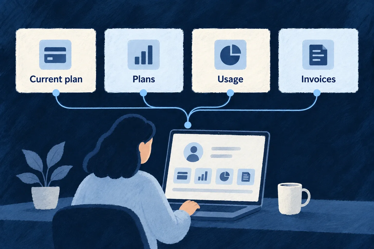
A workspace administrator sees the current subscription, available plans, usage and invoices together. The manage action opens the configured customer portal rather than a second hand-built billing flow.

Subscription, usage and invoices form a billing workspace.
For engineers

AppPage_BillingSettings is a Settings Hub panel composing SubscriptionStatus, BillingPortalLink, PricingTable, UsageDashboard and InvoiceHistory. Each widget reads the shared billing context; the panel does not fetch every billing child resource independently.

This selected part of the actual engine panel shows the plan, usage and invoice sections. Label resolution and earlier subscription/management sections are omitted:

<Card>
  <CardHeader>
    <CardTitle>{t('plansHeading')}</CardTitle>
  </CardHeader>
  <CardContent>
    {/* Self-hydrates: public active PLAN products scoped to the current
        billing scope; select = checkout (no subscription) / portal (active). */}
    <PricingTable />
  </CardContent>
</Card>

<Card>
  <CardHeader>
    <CardTitle>{t('usageHeading')}</CardTitle>
  </CardHeader>
  <CardContent>
    <UsageDashboard />
  </CardContent>
</Card>

<Card>
  <CardHeader>
    <CardTitle>{t('invoicesHeading')}</CardTitle>
  </CardHeader>
  <CardContent>
    <InvoiceHistory />
  </CardContent>
</Card>

The aggregated state is important: subscription and invoice resources are contextual children of the billing account. A generic organisation-level resource panel cannot simply invent their parent URLs.

Connect the commercial configuration before the screen

Enable billing for the application, register its product catalogue, and select the provider in the backend provider scope. Configure its credentials and webhook/runtime integration, then run wildo config sync to regenerate the application artifacts.

For an engine-shipped provider, selecting its reference in providers.scopes.backend.providers is sufficient for discovery: do not create a duplicate provider module or provider-contributions.ts entry. An authored contribution is needed when the application itself supplies a provider module. Backend billing still needs its matching providerRef, and the relevant SDK dependency must be installed. The frontend’s BillingContext reads the resulting state. Plan selection chooses the available checkout or portal action according to that state and the current subscription.

The Settings Hub then places the engine billing destination in an appropriate category. The destination is capability-gated; placement alone does not configure billing or grant a person billing-management rights.

Recompose widgets when the product needs another layout

The shared widgets can be used in an authored surface without replicating their data and action plumbing. Keep their billing provider/context available and retain their unavailable/loading behavior. The application still owns prices, entitlements, metering meaning and the customer-facing wording that explains those choices.

Make assistant activity understandable Mechanism

An assistant interface needs more than a text box. People need to follow the conversation, see work in progress and understand when their decision is required.

Wildo provides chat and agent-interface components alongside a conversation host for configured flow/actor systems. The application supplies the assistant’s behavior, tools and backend configuration.

Example: Keep the reply and its activity together

A task assistant displays its conversation and a working indicator while a reply streams. If that execution requires approval, the request appears beside the turn that needs the decision.

A person converses with an assistant and can follow its tool activity.
For engineers
Connect a real system to its frontend view

Wonder Todos registers this actual app-level flow/actor view; the surrounding array and commentary are omitted:

{
  ref: 'todo-assistant-view',
  scope: FrontendView_ScopeMode.APPLICATION,
  isAddressable: true,
  operationLike: CoreResourceOperation.READ,
  primaryScope: ResourcePrimaryScope.ORGANIZATIONS,
  systemRef: 'todo-assistant',
  layoutPreset: 'Default',
},

systemRef must match the backend’s registered flow/actor system. The frontend module contributes the definition through flowsActorsViews; the relevant module must be installed, and the backend must have the model/provider and tool configuration the system uses. A view definition does not create an assistant or its tools.

Choose the conversation host or compose the lower-level elements

FlowsActorsView is a chat-first host: discussions, transcript, prompt input and execution feedback. It reads prior conversations from the server and continues a thread through the execution service. Its current assistant view deliberately does not show the actor graph beside every conversation.

Lower-level conversation, message, prompt, reasoning, tool and graph elements are separately registered components. A custom agent interface can compose them, but it must connect their state to the real execution and tool results. The graph component has a lazy loading boundary; preserve that when an application does need structural exploration.

Keep decisions attached to the execution

The conversation host mounts FlowsActors_ApprovalRequest for a pending turn’s execution ID. That renders a decision only when the execution actually carries a pending approval. An approval queue remains useful for work outside the currently open conversation; it is a different placement, not a replacement for the inline decision.

Distinguish a streamed draft, a completed tool result and a failed execution in the interface. The component library supplies presentation contracts; authorization, tool implementation and whether a task succeeded come from the backend runtime.

Build on work that does not need to be done again.

Shared implementation and reusable knowledge leave more attention for the product—and give recurring engineering a place to improve beyond a single project.

Building a B2B product or an internal tool?

Wildo is not self-service yet. Tell us what you have in mind and we will say plainly whether it fits, and what happens next.