Wildo.ai Coming soon

Forms, views & custom interfaces

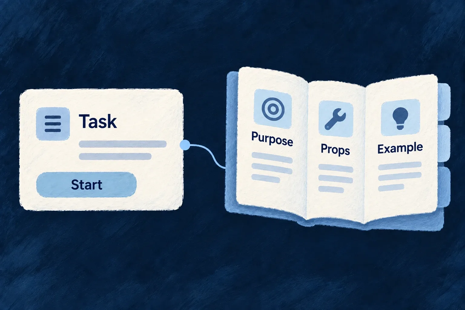
Compose resource-backed forms and views, select component presets and implement your own React interfaces.

Forms · tables · charts · navigation · themes · localizationReact · TypeScript

> From field rules to working forms > From shared components to your visual identity > From a selected record to the next action

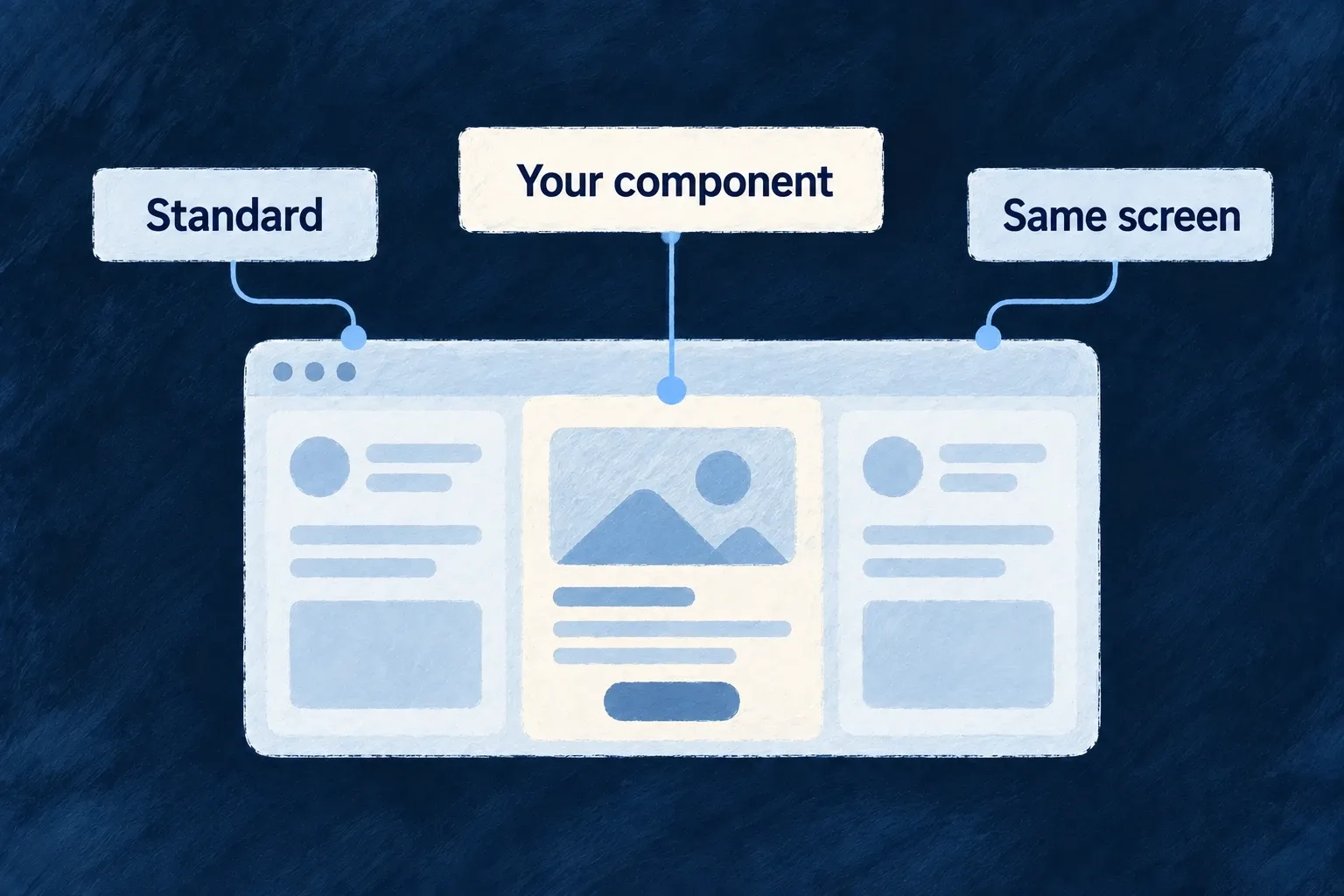
The front end is where people find information, make decisions and act. Screens need to work together: the same field, action or selected workspace should keep its meaning as someone moves through the application.

Wildo supplies standard forms, record views, components and navigation around your business definitions. You shape the layout, appearance and interactions that make the product yours.

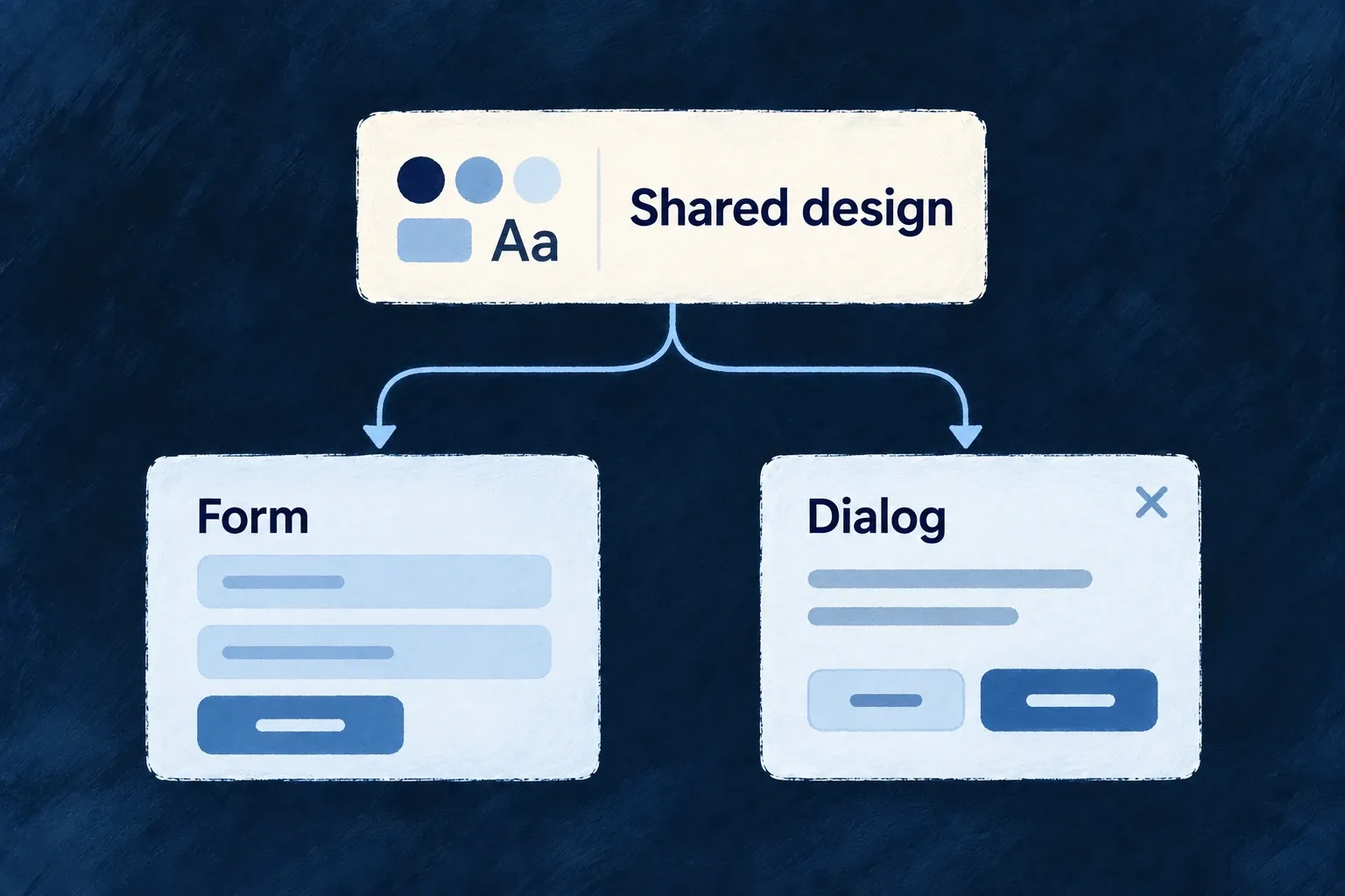
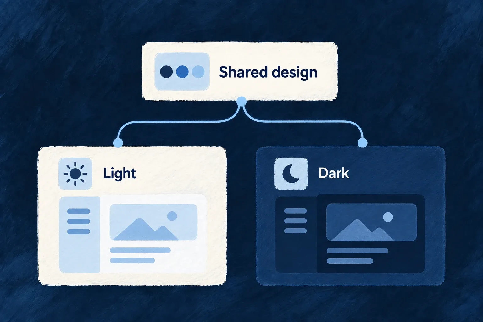
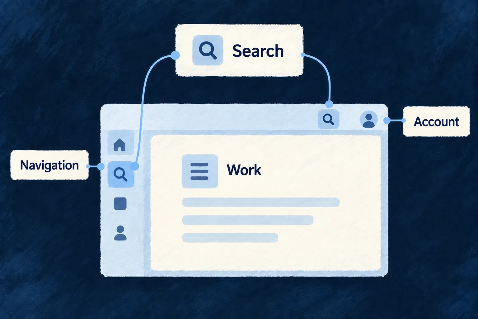
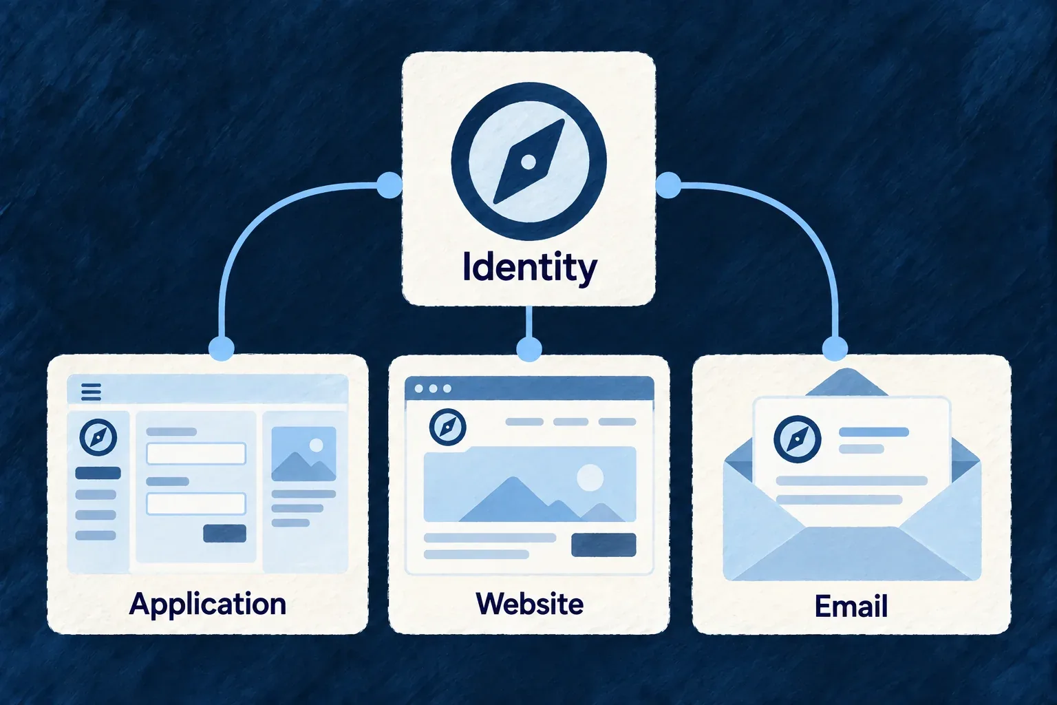
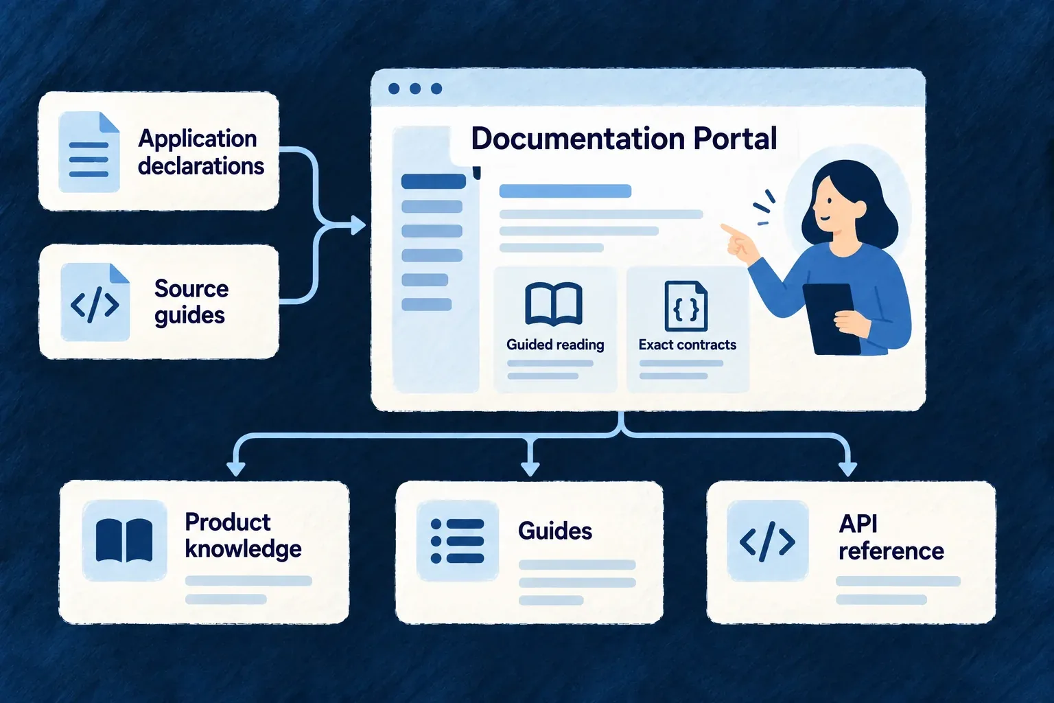
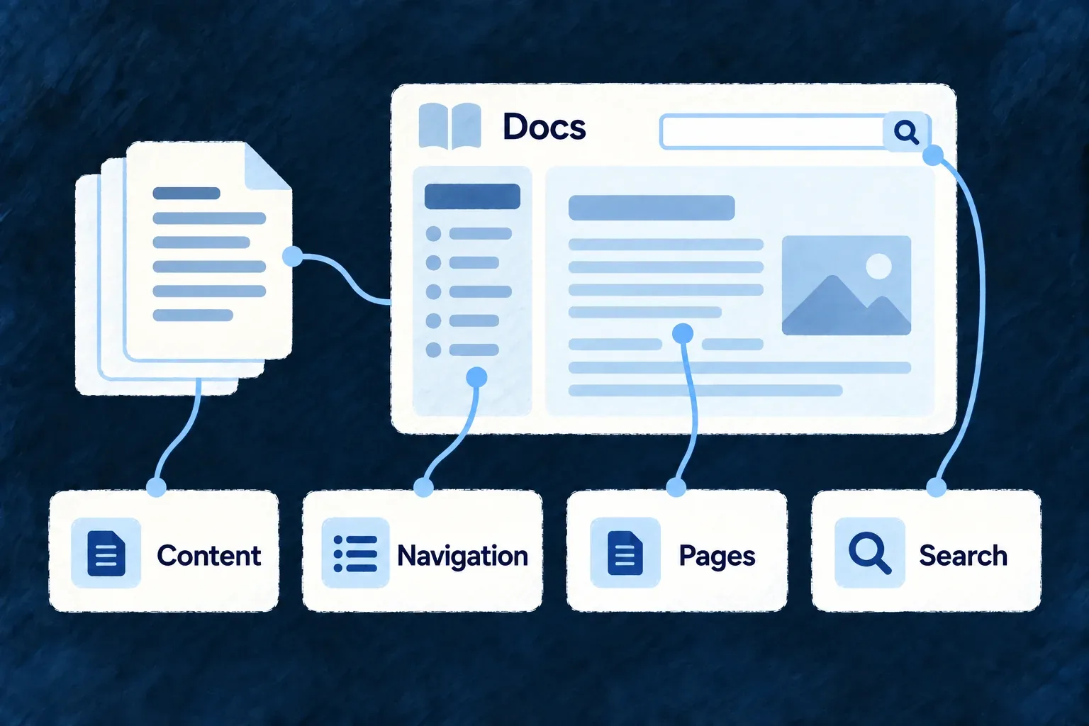
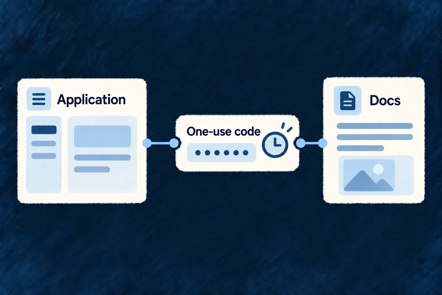
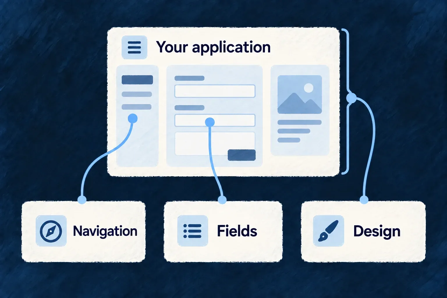
Fields connect to form inputs, navigation to the sidebar, and shared design to the whole application interface.

A connected foundation for the experience you build

Carry field rules into the interaction

A field’s requirements help shape standard forms and request validation. Reuse the declaration, then choose how fields are arranged and which interactions need a custom view.

Change the design, keep the contract

Shared themes carry visual choices across standard components. Replace a registered control for a tailored interaction while preserving the values, callbacks and references its callers expect.

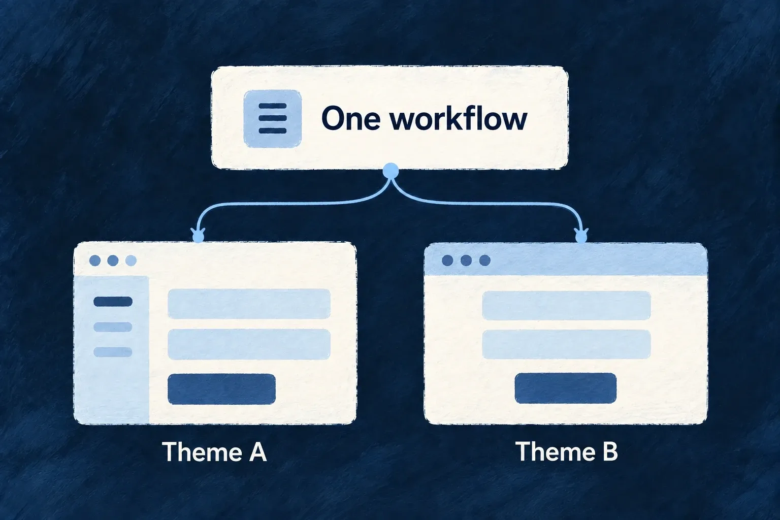
Change the presentation, keep the context

Open an action as a page or within the current workspace. Navigation carries its resource context; configured layout zones adapt the surrounding interface to the available space.

Example: Move from a list into the work behind it

A person selects a task, edits its fields and opens related information beside it. The application chooses that arrangement and its visual style. Standard resource controls handle the declared fields and actions, while navigation keeps track of the selected context.

For engineers

Assemble the frontend from its owning modules

A frontend module contributes resource UI behavior, views, navigation entries and component registrations. Shared modules supply resource configurations and relationships. The application composes those contributions into the provider used by the running interface.

This excerpt comes from Wonder Todos’ frontend/src/modules-registry.frontend.ts. It keeps the connected setup and omits unrelated provider options and imports; the imported application configurations already exist in that project.

export const frontendModules: FrontendModule[] = [
  engineFrontendModule,
  ...applicationFrontendModules,
];

export const frontendModuleRegistry = buildFrontendModuleRegistry(
  ...frontendModules,
);

export function buildApplicationMainProviderOptions(
  env: Record<string, string | undefined>,
): ApplicationMainProviderOptions {
  return {
    env,
    resourceUIBehavior: frontendModuleRegistry.resourceUIBehavior,
    baseFrontendConfig: frontendBaseConfig,
    // Other shared-resource and feature options omitted.
    frontendConfigOverrides: buildFrontendModuleConfigOverrides({
      navigationLayout: navigationLayoutConfig,
      designSystemConfiguration: frontendResolvedDesignSystemConfiguration,
      baseAppComponentsConfiguration: appShellConfig,
      moduleRegistry: frontendModuleRegistry,
      homeDefinition: homeDefinitionFactory(),
      errorPageConfig,
    }),
    componentLoader: async () => {
      await registerFrameworkFrontendComponents();
      await registerFrontendComponentRegistrations(frontendModuleRegistry.componentRegistrations);
    },
  };
}

resourceUIBehavior supplies the frontend decisions for registered resources. The configuration overrides combine application layout and design with module-owned contributions. The component loader registers framework components first, then application contributions. These loaders are awaited during startup; a dynamic import here does not mean the component waits until its screen is visited.

The resulting options belong to the application’s main provider. Declaring a module without including it in applicationFrontendModules leaves its contributions outside this composition.

Customize at the level that owns the decision

Product decisionConfigure or implementWhat remains connected
How one field reads or editsResource field UI behaviorIts schema, labels and standard feedback
Which fields appear togetherResource display/edit layoutThe standard resource operation
How a shared control looksDesign recipes or a registered component overrideThe component’s public props and consumers
How one action becomes a workspaceOperation view and explicit embedded contentThe operation and navigation context
Where a screen opensIts declared surface and navigation placementDestination resolution and the active context
A completely bespoke screenA registered custom viewThe surrounding application; the view owns its data and interactions

A custom screen is a deliberate implementation, not a promise that arbitrary React content inherits every standard behavior. Retain the standard controls or explicitly compose the mechanisms your view needs. Some internal renderers are direct components; a specification or label contract alone does not make a component injectable.

Register a component, then give it a place

Wonder Todos’ example module registers this custom component under a stable reference. This is a selected entry from frontend/src/modules/example-dev/index.ts; the module separately contributes its view definitions and shell entries.

{
  componentRef: FOCUS_HUB_SMOKE_COMPONENT_REF,
  loadComponent: async () => {
    const module = await import('./app-level-views/FocusHubSmokeView.js');
    return module.FocusHubSmokeView;
  },
  preset: CorePresetNames.DEFAULT,
  isConfigurable: false,
},

The same development module defines the screen using that component reference, then names the screen in a launcher:

const focusView: FullCustomViewDefinition = {
  ref: FOCUS_HUB_SMOKE_VIEW_REF,
  scope: FrontendView_ScopeMode.APPLICATION,
  isAddressable: true,
  operationLike: CoreResourceOperation.READ,
  primaryScope: ResourcePrimaryScope.ORGANIZATIONS,
  componentRef: FOCUS_HUB_SMOKE_COMPONENT_REF,
};

const focusLauncher: SidebarItem = {
  kind: LauncherItemTargetKind.VIEW,
  viewRef: FOCUS_HUB_SMOKE_VIEW_REF,
};

FullCustomViewDefinition, SidebarItem and LauncherItemTargetKind are public companion exports; FrontendView_ScopeMode is also a companion export; CoreResourceOperation and ResourcePrimaryScope come from @wildo-ai/saas-models. The module contributes the definition through fullCustomViews, and adds focusLauncher through sidebarSectionItems under the existing labs section. The registry passes both to the application provider, which loads the component and resolves the launcher to the view.

This is explicitly Wonder Todos’ development lab: its shell contributions are gated by the development environment. It demonstrates the join, not a production menu shipped to end users. For a product screen, use your own registered view reference, component and normal product section. Component registration alone does not create either the view definition or its visible launcher.

Registration makes the component resolvable. Its view definition supplies the screen contract; a navigation contribution makes that destination reachable. Keeping those responsibilities separate also lets a component serve an embedded view without inventing a public route for it.

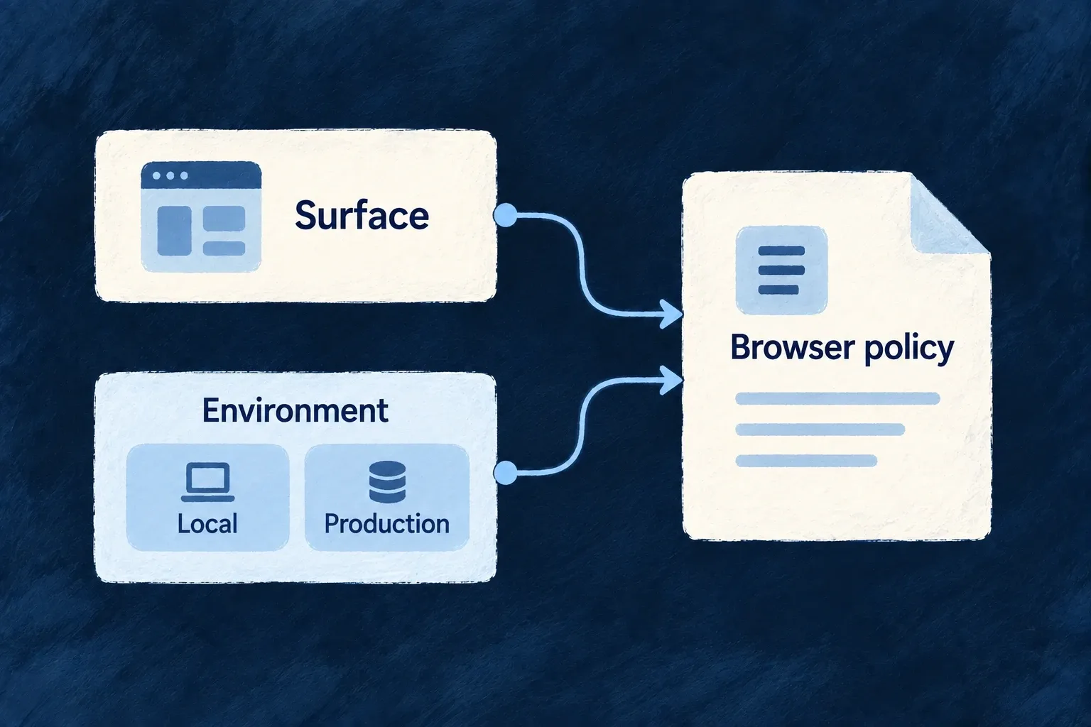
An addressable operation may have a URL. An embedded operation can be opened within the current navigation surface without becoming a shareable page. Choose that behavior in the operation’s frontend surface declaration, then configure where navigation should present it.

Keep the frontend contract connected to the backend

Standard validation and availability messages help people act, while the backend still enforces requests and permissions. A chart needs its query registered as well as a visible placement. Assistant components need an exposed backend system. Real-time read reuse depends on live scope coverage.

The areas below explain those contracts individually, with the configuration, registration and consumers needed to use them. Your application owns the product decisions; the framework provides the common interactions those decisions build on.

Change the presentation without losing the contract

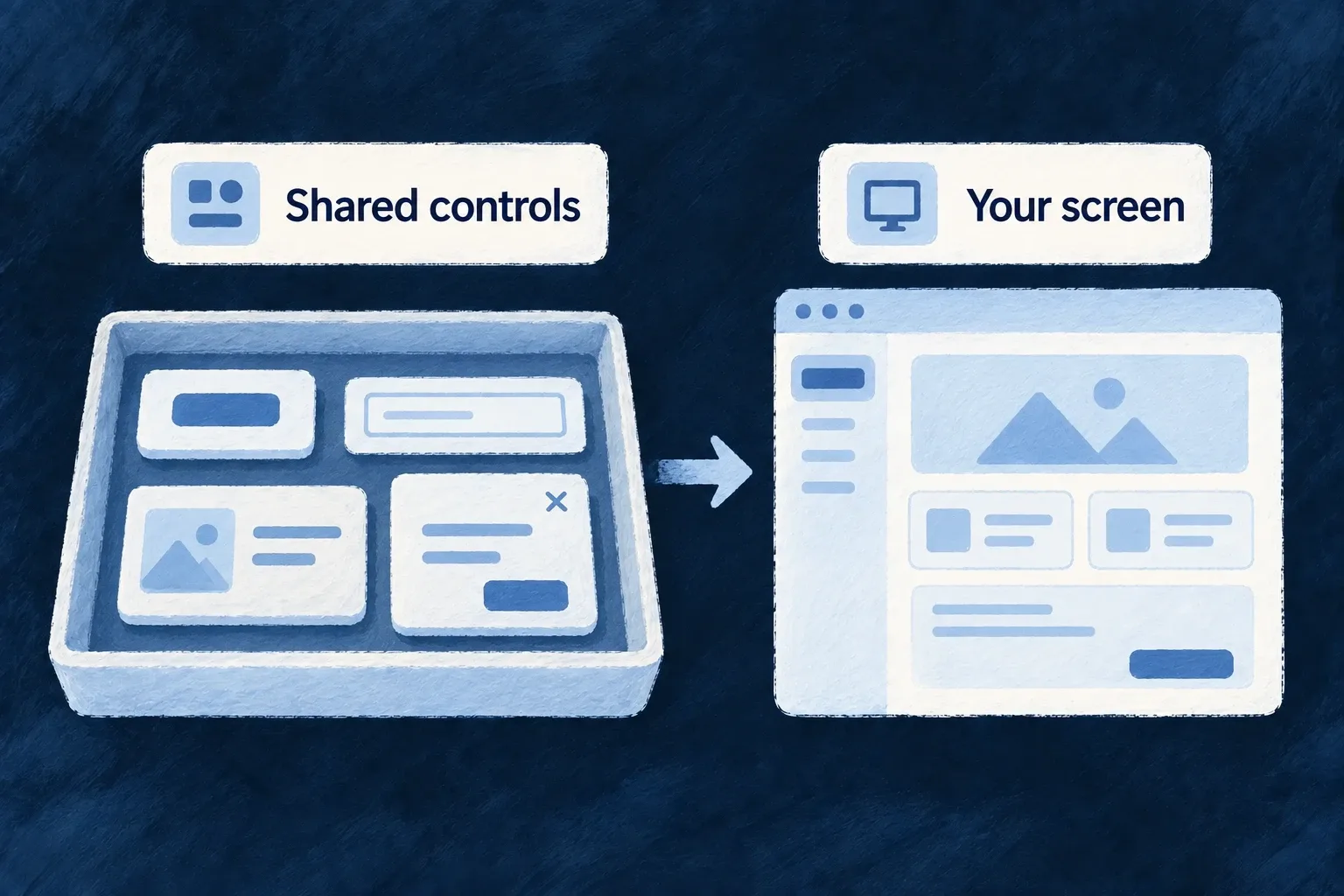
A screen should be able to ask for a familiar control without owning its implementation. Wildo’s component system separates that request from the registered component that renders it.

That separation lets a product refine its interface in small, deliberate choices. Shared services keep participating components connected to the same design, language and interaction rules.

Example: Refine one interaction across its callers

A product replaces an injectable date control while keeping the wrapper’s accepted values and callbacks. Screens using that registration receive the new implementation; their business actions do not need to be rewritten just to select a different control.

For engineers

The framework’s button wrapper illustrates the boundary. It accepts the public props, resolves the named preset, and forwards the result to the implementation. This excerpt is from button.tsx:

export const Button = forwardRef<HTMLButtonElement, ButtonWrapperProps>(
  ({ preset = CorePresetNames.DEFAULT, ...props }, ref) => {
    const Component = createComponentResolver<ButtonProps>(FrontendComponentType.LOW_LEVEL_BUTTON, 'Button')(preset)
    return <Component ref={ref} {...props} />
  }
)

The wrapper does not decide what a primary button looks like. The registered preset consumes ButtonProps and retrieves its visual recipe through useUI. A replacement must preserve the element/ref expectations and interaction props, not only produce a similar-looking rectangle.

Keep customization at its semantic home

ChangeKeep stableUpdate deliberately
Theme treatmentComponent props and caller intentRecipes, required tokens and visual verification
Component implementationWrapper contract and selected preset keyRegistration and implementation behavior
Container behaviorChild contractsThe policy and its participating consumers
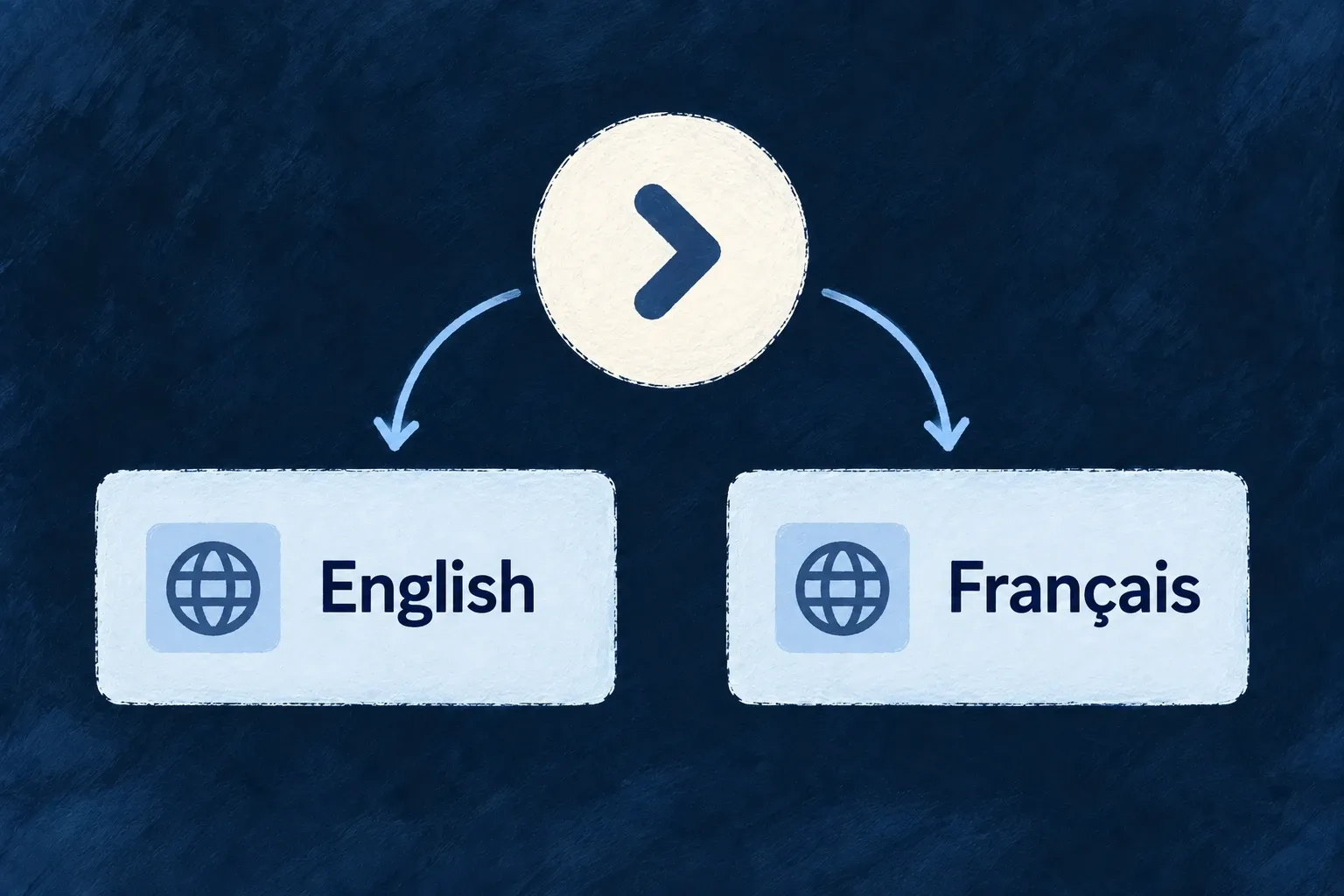
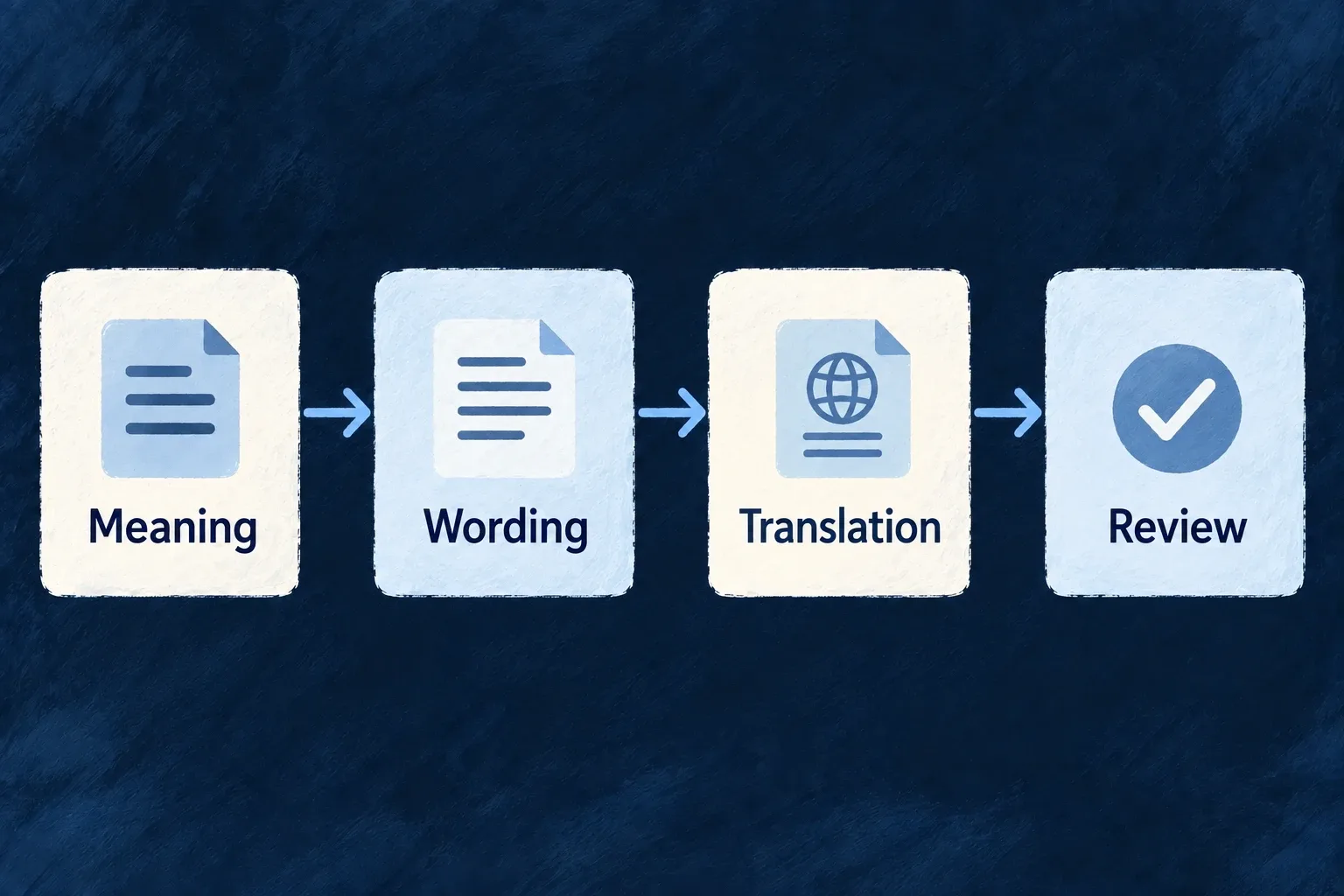
WordingThe action’s meaningIts specification, generated language files and review

The application’s startup loader establishes which implementations exist. Its design configuration establishes their common visual rules. Specifications explain how to use them; they do not substitute for runtime registration.

This separation is useful only while the joins remain accurate. Keep the caller, implementation, registration, specification and label ownership aligned when making a change, and test the composed screen rather than treating each file as an independent success.

Make movement a product decision

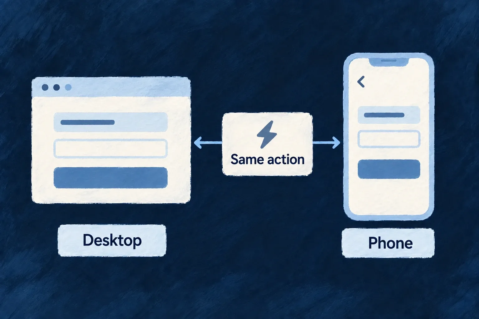
The same action should feel familiar wherever a person encounters it. Opening a record, working beside a list and returning from an edit should follow an intentional pattern.

Wildo separates what someone wants to open from how the application presents it. A shared navigation policy handles the ordinary moves; an operation can declare a deliberate exception without rebuilding the surrounding navigation.

Example: Keep a review workflow consistent

A product chooses to open record details beside a collection on a wide screen and in the primary area on a phone. New operations that follow that policy inherit the same movement, while a focused editing action can explicitly use an overlay.

For engineers

A destination is not a panel

The resource registry defines an operation and the context it needs. The layout chooses the transition, such as pushing a destination or opening an adjacent pane. Appearance chooses how that destination is presented. Keeping these decisions separate lets a product change its interaction style without declaring a second resource operation.

QuestionOwning contract
What can be opened?Registered operation or view, including its addressability
Where does the move begin?Navigation request context and source zone
How should it move?Operation or relationship policy, then application defaults
Where does it render?Structural zone or the implicit overlay destination
What can a link restore?Addressable route and its serialized context

Keep the runtime as the common path

Application shell launchers, resource links and custom controls should enter the navigation controller with the destination’s identity. The resolver combines that request with the active viewport and policy. The controller coordinates stacks and URL ownership; the host renders the resulting destination.

A component that opens its own local panel bypasses this contract even when it looks identical. Use local state for genuinely local interaction. Use navigation when the interaction needs a destination, back behavior, scope reconstruction or a declared placement policy.

The navigation policy guide shows the complete application layout declaration. Resource routes explains how addressability and parent context feed the router. These are complementary declarations, not competing routing systems.

Keep transient and restorable work distinct

An addressable destination can be restored from a link. An overlay or in-place edit is normally transient; dismissing it returns to the underlying work. A hosted pane may serialize its context alongside the host when that route family supports it. Choose the contract before choosing a visual container.

Build screens around the work people do

Start with working forms and record views, then compose the workspace your product needs. Fields, operations and related records provide the shared basis for browsing, editing and acting on information.

Wildo supplies the standard interaction machinery. You choose the hierarchy, the useful measures and the moments that need a tailored screen.

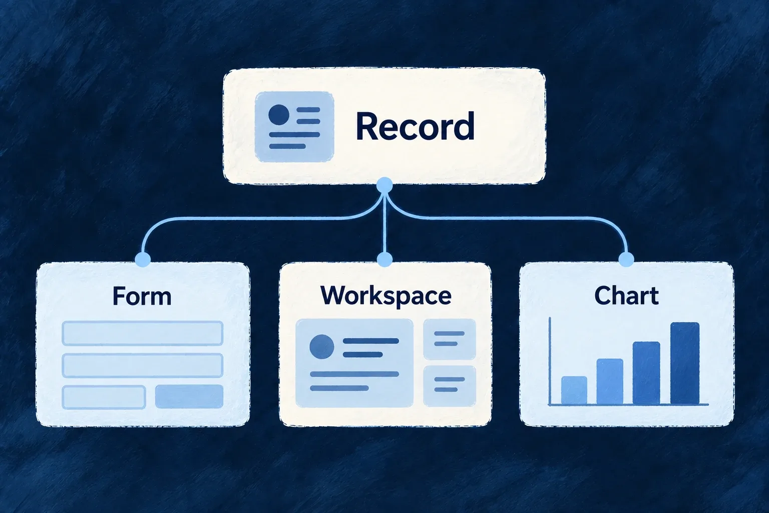
A record supports a form, a composed workspace and a chart.

From everyday actions to a complete workspace

Make routine work feel consistent

Forms, lists and detail views use the same resource contracts. Field presentation, validation and save feedback keep familiar actions coherent across screens.

Put useful context beside the work

Combine related records, charts and custom sections where they help a decision. Extend one operation or build a dedicated workspace without duplicating every standard surface.

Help people know what comes next

Guidance, meaningful badges and availability messages explain the next action. Billing and assistant components give specialized interactions their own clear place.

Example: Give a task room to become real work

A person finds a task in a filtered collection, changes its checklist in place and inspects related tasks beside a progress chart. The application chooses that arrangement; the resource controls, save feedback and related-record context remain connected.

For engineers

Begin with the registered resource behavior

The shared module registers the schema-backed resource configurations and relationships. The frontend module then contributes their UI behaviors, layouts and views. Wonder Todos’ actual frontend module shows the separate contributions; imports are omitted:

const tasksManagerFrontendModule: FrontendModule = {
  moduleId: 'tasks-manager',
  resourceUIBehavior: moduleResourcesUIBehavior,
  compositeViews: moduleAppLevelViewsCompositeViews,
  // Getting-started onboarding embedded on the home dashboard.
  onboardingViews: homeOnboardingViews,
  // Triggered guidance — the complement to the document above, not a second copy
  // of it. See the file for why the first list is the moment it fires on.
  guidanceFlows: moduleGuidanceFlows,
  ...moduleAppShellModuleConfig,
};

resourceUIBehavior controls fields and operation surfaces. compositeViews contributes app-level combinations. onboardingViews and guidanceFlows have separate jobs: the former describes content, the latter when guidance is offered. The module itself must be present in the frontend application’s module registry.

Override the part that needs a product decision

NeedAuthoring surfaceBehavior to retain
A different control or value presentationResource fields display/edit configurationSchema, labels, validation and surrounding field feedback
A better order or groupinglayout.edit, layout.display, layout.summaryStandard operation host and field controls
Several connected surfaces togetherComposite view and dedicated embedsEach embedded resource’s operation and relationship context
One operation with a tailored interactionIts typed customViewOperation and navigation context; explicitly compose the retained runtime
A workspace with temporary working stateExecution view with a declared anchorParticipation resolution and local/delegated operation navigation
A screen without one owning operationRegistered full custom viewView context; data loading and interaction become application responsibilities

A registered view does not create its backend operation. Presentation gates do not replace backend authorization. A custom host also decides which inserted views it renders; it should not expect charts and composites to appear automatically around arbitrary React content.

Connect specialized surfaces at both ends

Charts need the shared query definition in the backend chart registry and a frontend chart/view placement. A query-driven badge needs its shared definition and a navigation reference. Billing widgets need configured billing state and provider actions. An assistant view needs an exposed backend system, not only conversation components.

For forms, individual field autosave is an opt-in on update-like records. For read reuse, the cache requires live scope coverage before serving a stored result. Keeping these mechanisms in their standard runtime preserves the conditions that make their behavior reliable.

Follow the specific contract when extending

Use working forms for field composition and submission, custom operation screens for host replacement, and composite views for related content. The detailed entries below explain the configuration, registration and consumer for each choice.

Build everyday record screens

Give records a complete working interface Mechanism

People can browse a collection, inspect a record and act on it through a connected set of standard screens. Search, filters, pagination and available actions use the resource’s declarations.

Choose which operations become pages and which open within the current screen. The interface follows that choice rather than treating every action as another destination.

Example: Edit without losing the collection

A task collection offers selection and bulk actions. Creating a task opens an overlay; reading or editing an existing task can have its own address.
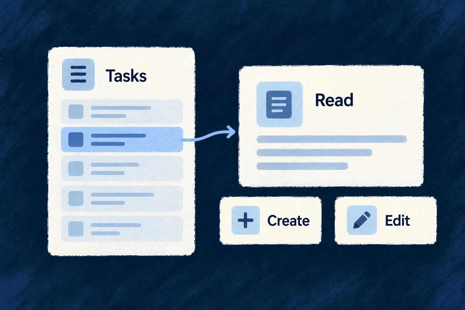
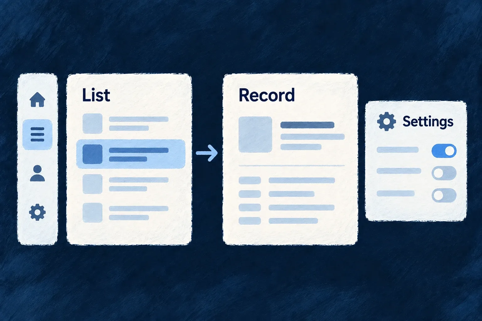
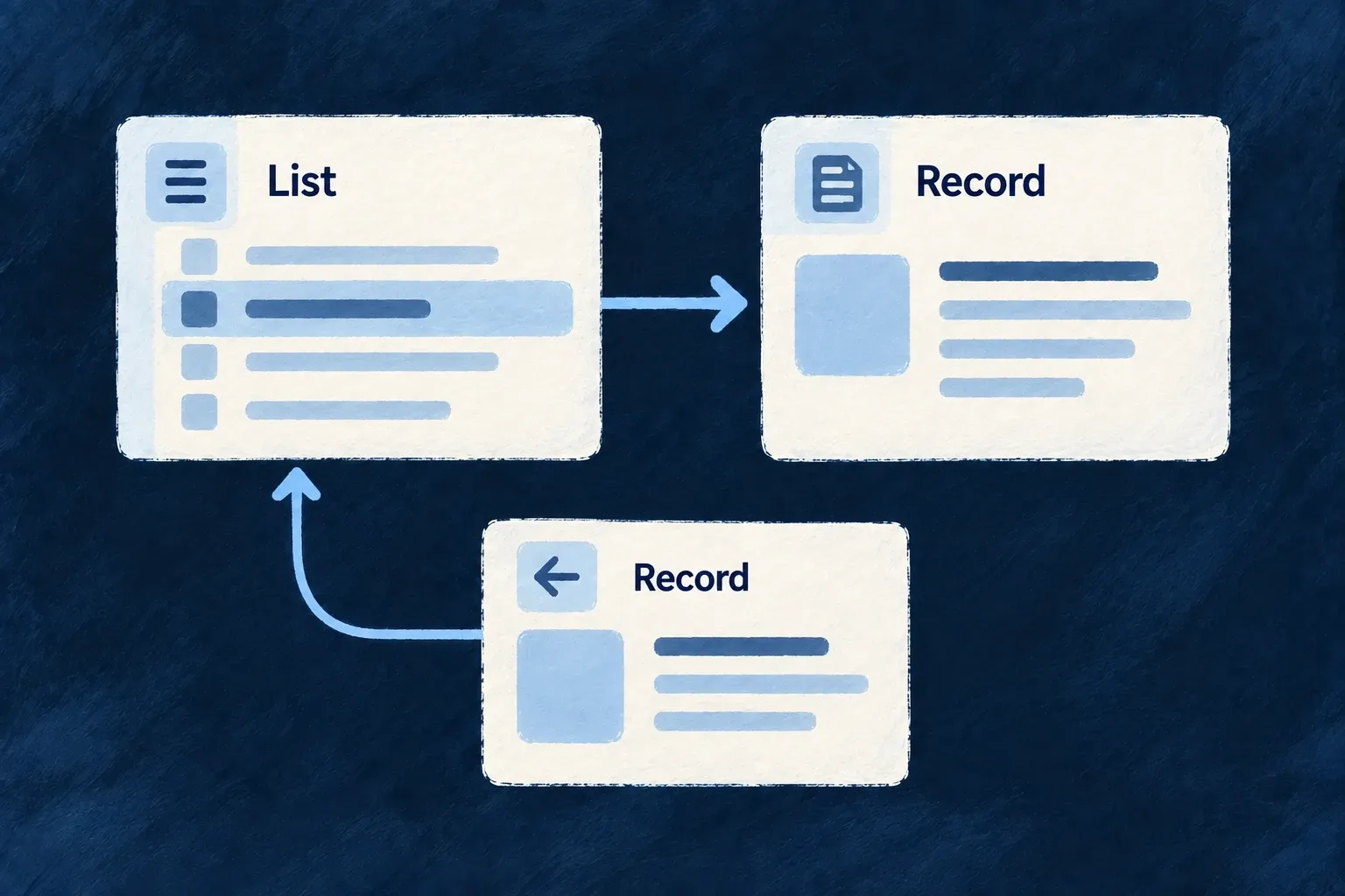
A selected list record leads to reading, creation and editing views.
For engineers
Expose the operation deliberately

The shared resource configuration must declare each operation first. The frontend views map chooses its surface; it does not create backend operations or grant access to them.

Wonder Todos makes this choice in todos.ui-behavior.tsx. This is a selected part of its views array; unrelated custom actions are omitted:

[Op.CREATE, { surface: ResourceOperationFrontendSurface.EMBEDDED }],
[Op.READ, {
  surface: ResourceOperationFrontendSurface.ADDRESSABLE,
  customView: TodoReadCustomView,
}],
[Op.LIST, {
  surface: ResourceOperationFrontendSurface.ADDRESSABLE,
  // Dogfood the collection capabilities: selectable cards/table surface the
  // bulk operations declared on the todos config (change-status, assign,
  // delete, …) via the shared bulk bar; per-card actions sit in the top-end
  // corner instead of the mid-row default.
  collectionDisplayConfig: {
    selectable: true,
    cardActionPlacement: { vertical: VerticalPlacement.TOP, horizontal: HorizontalPlacement.END },
  },
}],
[Op.SEARCH, { surface: ResourceOperationFrontendSurface.EMBEDDED }],
[Op.UPDATE, { surface: ResourceOperationFrontendSurface.ADDRESSABLE }],
[Op.DELETE, { surface: ResourceOperationFrontendSurface.EMBEDDED }],

ADDRESSABLE gives an operation a route where its configured path supports one. EMBEDDED keeps it inside a host such as an overlay. In this resource, create deliberately stays embedded because its core path would otherwise collide with the list path. Do not turn every entry into an addressable page mechanically.

Reuse the collection behavior

collectionDisplayConfig.selectable enables the selection surface. Cards and tables share selection state; filtering clears the selection, while pagination can retain it. The bulk toolbar resolves actual bulk operations from the resource rather than assuming every per-record action accepts several records.

The standard collection toolbar joins search, filter state, sorting and action presentation. Quick-filter tabs write the same filter state as the filter panel. Set these view-specific choices on the operation configuration rather than implementing an independent filter in a decorative tab bar.

Choose the smallest override

A custom read host in the example keeps the other operations on their standard surfaces. For a different field order use layout.display or layout.edit; for a genuinely different interaction use customView. Operation availability still depends on roles, context, enabled conditions and feature policy. A visible button is not the server’s authorization decision.
Turn field definitions into working forms Mechanism

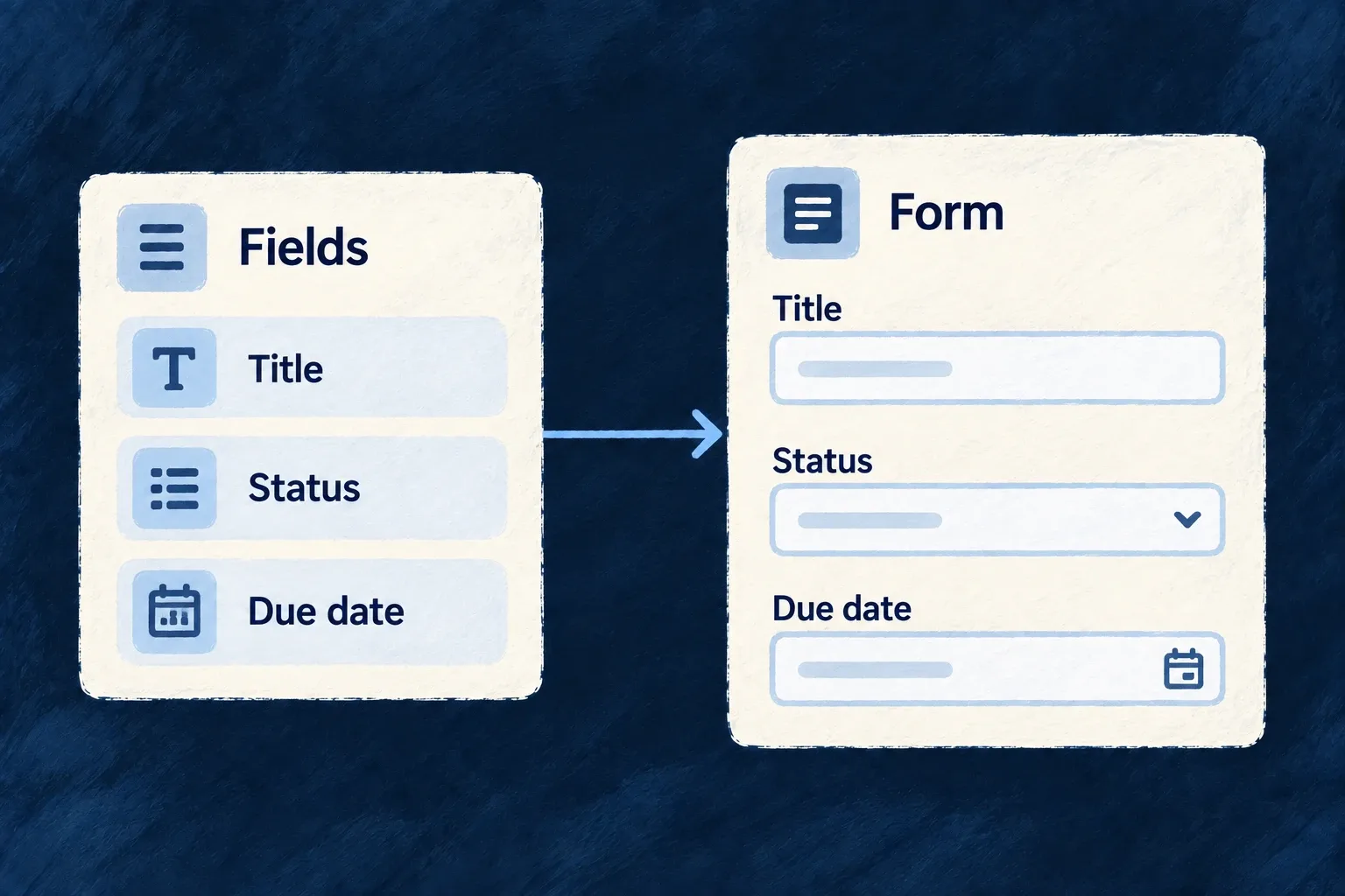
A form can start from the fields an operation accepts. Wildo selects the controls, resolves their labels and connects them to validation and submission.

Arrange those fields to suit the work. A custom layout can retain the standard field behavior instead of becoming a second implementation of the form.

Example: Arrange a task form around the decisions

A task form puts its title and description first, then groups status, priority, due date and assignee. Those controls still use the task operation’s input contract.

Declared title, status and due-date fields become controls in a form.
For engineers
Start with the operation, then arrange its fields

Register the resource schema, operations and relationships in the shared module. Its frontend resourceUIBehavior pairs that schema with the resource configuration and contributes the views through the frontend module’s resourceUIBehavior map.

ResourceAutomatedForm uses the operation’s request schema, derives create/update semantics, loads existing data when needed and submits through the resource registry. A field excluded from the update contract is not made writable by adding it to a template.

This selected layout.edit fragment is from Wonder Todos’ todos.ui-behavior.tsx. Imports and the surrounding behavior factory are omitted:

edit: () => {
  const { isExisting } = useFormTemplateContext();
  return (
    <FormLayout>
      <div className="flex flex-col gap-group">
        {/* `todoListId` is excludeFromUpdate — only CREATE carries it. When
            creating from inside a list scope the framework injects it as a
            context value and hides the picker automatically. */}
        {!isExisting && <FormField name="todoListId" />}
        <FormField name="title" />
        <FormField name="description" />
        {/* Workflow posture — four short inputs share two columns instead
            of stacking one-per-row. */}
        <div className="grid grid-cols-1 gap-group sm:grid-cols-2">
          <FormField name="status" />
          <FormField name="priority" />
          <FormField name="dueDate" />
          <FormField name="assignedToUserId" />
          <FormField name="progressPercent" />
          <FormField name="snoozedUntil" />
          <FormField name="externalRef" />
        </div>
        {/* Free-form tags: an array-of-scalar, auto-rendered as a simple
            tag-list FormFieldArray (no per-item template needed). */}
        <FormField name="tags" />
        {/* DEDICATED array component — array-specific knobs (renderItem,
            sectionAppearance, objectItemLayout) live here, not on the
            generic FormField. FORM variant: label is always an input. */}
        <FormFieldArray name="checklist" renderItem={(itemPath) => <ChecklistFormItem itemPath={itemPath} />} />
        {/* Composite object group with its own "Reminder" legend; the
            lead-time input self-hides until enabled via the schema-level
            `showWhen` on `reminder.leadTimeMinutes`. */}
        <FormField name="reminder" />
      </div>
    </FormLayout>
  );
},

useFormTemplateContext().isExisting separates creation from editing. The parent-list picker is only placed on creation; when a parent context already supplies it, the generated field handles that context rather than asking the person to repeat it. The grid changes placement, while each FormField still resolves its schema, control and errors.

Keep the standard form boundary

The frontend module installs the behavior map:

const tasksManagerFrontendModule: FrontendModule = {
  moduleId: 'tasks-manager',
  resourceUIBehavior: moduleResourcesUIBehavior,
  compositeViews: moduleAppLevelViewsCompositeViews,
  // Getting-started onboarding embedded on the home dashboard.
  onboardingViews: homeOnboardingViews,
  // Triggered guidance — the complement to the document above, not a second copy
  // of it. See the file for why the first list is the moment it fires on.
  guidanceFlows: moduleGuidanceFlows,
  ...moduleAppShellModuleConfig,
};

The resource form handles context injection and submission filtering. On update-like operations, a cleared optional field is represented differently from an omitted field: an omission leaves the stored value alone. Custom submit handlers must preserve this contract rather than serializing arbitrary component state.

Use a layout template when order or grouping matters. Leave it unspecified when the generated layout is sufficient; supply a full custom operation view only when the interaction itself needs to change.

Show and edit each value appropriately Mechanism

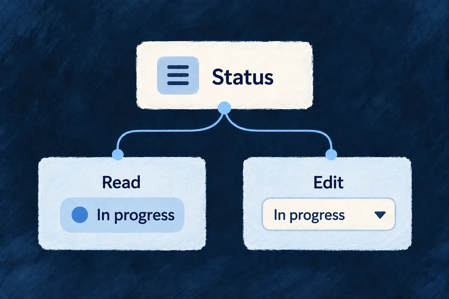
A status can read as a badge and edit as a choice. A description can display formatted text while exposing its source for editing. The same value can serve different moments in the interaction.

Declare those presentation choices beside the resource’s frontend behavior. Shared field types and business constraints remain in the data model.

Example: Read a status at a glance

The task status appears as an “In progress” badge on a detail screen. Editing selects another allowed status; changing the visual treatment does not change the allowed values.

The same status appears as a value when reading and a choice when editing.
For engineers
Keep storage and presentation separate

A resource’s fields map redecorates fields from schemaShape. It is a frontend presentation layer, not a place to change ownership, database indexes or operation exclusions.

This contiguous fragment from Wonder Todos pairs markdown display with source editing, then gives each status a semantic color:

description: sh.description.stringUI({
  // MARKDOWN (was MULTILINE, authored before the mode existed): renders
  // the description as themed rich text; editing stays markdown source.
  display: { displayMode: StringDisplayMode.MARKDOWN, showDescription: true },
  // `editMode` (not `component`) is the axis the string editor honors —
  // the earlier `component: FormFieldComponent.TEXTAREA` authored here
  // silently no-oped and the description edited as a single-line input.
  edit: { editMode: StringEditMode.TEXTAREA, textareaRows: 4, showDescription: true },
}),
status: sh.status.enumUI({
  display: { displayMode: EnumDisplayMode.BADGE, showDescription: true },
  edit: { showDescription: true },
  values: {
    [Todos_Status.PENDING]: { color: BadgeSemanticVariant.SECONDARY },
    [Todos_Status.IN_PROGRESS]: { color: BadgeSemanticVariant.INFO },
    [Todos_Status.COMPLETED]: { color: BadgeSemanticVariant.SUCCESS },
    [Todos_Status.CANCELLED]: { color: BadgeSemanticVariant.DESTRUCTIVE },
  },
}),

The description remains a string. StringDisplayMode.MARKDOWN changes its read renderer; StringEditMode.TEXTAREA presents plain source. A syntax-aware markdown editor is a separate edit-mode choice. The status colors come from BadgeSemanticVariant, so the theme resolves their appearance rather than receiving hardcoded colors.

Follow both consumers

FormField reads the edit configuration and chooses a control. DisplayValueDispatcher reads the display mode and selects the value renderer. Their shared field chrome handles labels and descriptions around those controls.

The redecorated frontend field can override presentation metadata inherited from the shared field. When a display change seems inert, inspect the frontend behavior as well as the schema; writing a second conflicting decorator is not additive configuration.

Keep labels and access independent

Enum value labels come from the application’s structured label tree. A color does not supply the value’s readable name. Conditional visibility and inline-edit choices shape the interface; backend roles, scopes and operation contracts still decide whether a change is allowed.

Give fields a clear visual hierarchy Mechanism

How a field is framed matters as much as its control. Labels, help text, required indicators and errors should form a predictable whole.

Wildo separates that surrounding presentation from the value editor, and supplies section containers for grouping related information. Choose the hierarchy the task needs, from a compact row to a guided sequence.

Example: Keep settings easy to scan

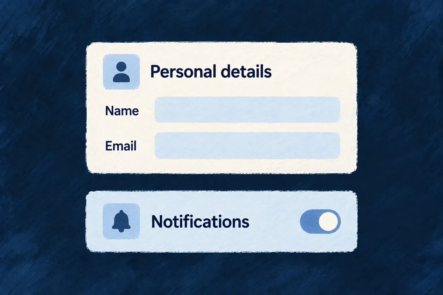
A notification setting places its label and explanation beside a switch. A personal-details form puts labels above its text inputs. Both retain the same error and help conventions.

Personal details and notification controls sit in clearly labelled sections.
For engineers
Choose field framing independently of its value

The field’s edit configuration accepts chromeMode; its display configuration has a corresponding reading mode. This current framework vocabulary shows the meaningful editing choices:

export const EditChromeMode = {
  /** Label above, control below, description + error below control (default). */
  STACKED: 'stacked',
  /** Label + description left, control + error right (settings page style). */
  SETTINGS_ROW: 'settings_row',
  /** Control left, label + description right (switch/checkbox style). */
  INLINE: 'inline',
  /** Generous spacing, heading-size label (onboarding, OTP, wizard). */
  RELAXED: 'relaxed',
  /** No label/description, just control + error (dense mode). */
  COMPACT: 'compact',
  /** No chrome at all — bare control output. */
  HIDDEN: 'hidden',
} as const;
export type EditChromeMode = typeof EditChromeMode[keyof typeof EditChromeMode];

STACKED suits ordinary forms. SETTINGS_ROW separates a setting’s explanation from its control. INLINE suits a switch or checkbox whose control precedes the label. RELAXED increases emphasis for focused steps. Compact and hidden chrome should be deliberate choices: the surrounding application must still provide an understandable accessible name.

FormFieldChrome owns the required marker, label association, descriptions, error display and save-state indicator. A preset implements the interactive content; recreating all that framing inside the preset risks duplicate labels and inconsistent feedback.

Carry a field choice into its named section

This illustrative update to a todo’s existing resourceUIBehavior joins decorated fields to a layout. Keep its other fields and operations. sh is the callback’s schemaShape; FormLayout, FormField and Section are public frontend components. EditChromeMode and SectionMode come from @wildo-ai/zod-decorators.

fields: {
  title: sh.title.stringUI({
    edit: { chromeMode: EditChromeMode.STACKED },
  }),
  description: sh.description.stringUI({
    edit: { chromeMode: EditChromeMode.SETTINGS_ROW },
  }),
},
layout: {
  refs: { sections: ['details'] },
  edit: () => (
    <FormLayout>
      <Section name="details" appearance={SectionMode.CARD}>
        <FormField name="title" />
        <FormField name="description" />
      </Section>
    </FormLayout>
  ),
},

The form reads the field’s decorated edit configuration. The title keeps its label above the input; description uses a settings row. Both still pass through FormFieldChrome for labels, errors and save feedback. The details reference must also exist in the resource specification’s section labels; layout.refs makes the named section discoverable but does not supply its words. Publish the corresponding labels through the application’s usual i18n pipeline.

A section’s own chromeMode can supply a common default. An explicit field choice takes precedence, so grouping fields does not erase their individual presentation.

Group fields using the layout contract

A ContentSectionContainer consumes section descriptors and one mode-specific configuration. Each descriptor carries a stable ID, resolved title and content; the mode decides whether those sections form tabs, a grid, an accordion or another supported arrangement.

For resource templates, named Section entries also belong in layout.refs and the resource specification’s matching text slots. Those references let labels and layout refer to the same section. Use plain layout containers when there is no real section to name.

Keep nested composition intentional

A single embedded surface normally needs a solo section appearance such as CARD, DEFAULT or GHOST. Container modes organize sibling sections; a section hidden behind a custom component is not automatically grouped by its parent template. Accordion mode defaults to one open section; an expandable collection instead reveals additional items. Choose the behavior, not just the silhouette.

Make changes clear and reliable

Help people correct the right field Mechanism

A rejected form should explain what needs fixing and bring the person to it. Wildo combines field feedback with summaries for cross-field and server errors.

When the server identifies a field, its message can appear on that field and clear as the person edits it. The application supplies the business rule and an error that describes it accurately.

Example: Correct the title that was refused

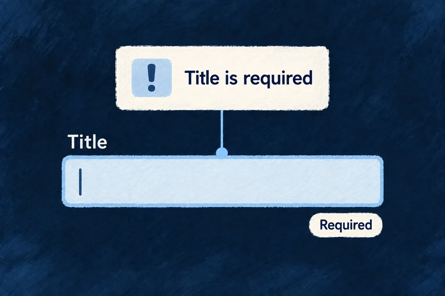
A task submission returns a title validation error. The form brings the title into view, shows the reason and removes that server message when the person changes it.

A title-required message points to the empty title field.
For engineers
Keep validation at both boundaries

The standard resource form validates the operation’s input schema before submission. The backend remains authoritative and may reject a value that depended on current data, uniqueness or a business rule.

ResourceAutomatedForm extracts structured server validation errors, maps their paths into the form and focuses the first rejected field. Do not flatten a field error into a generic toast before the form sees its path.

Preserve the error lifecycle in custom forms

The framework’s useServerErrorInjection implementation receives the active form methods. This selected runtime fragment shows the injection contract, not application code to copy instead of using the hook:

const injectServerErrors = useCallback((validationErrors: Record<string, string>) => {
  if (formMethodsRef.current) {
    Object.entries(validationErrors).forEach(([fieldName, message]) => {
      formMethodsRef.current!.setError(fieldName, {
        type: SERVER_ERROR_TYPE,
        message,
      });
      serverErrorFieldsRef.current.add(fieldName);
    });
    // Bring the first rejected field into view (audit D4). Injection happens
    // after a submit gesture, so the viewport is typically parked at the
    // submit button while the errored fields sit off-screen. Placing the
    // scroll HERE (the single injection seam) instead of at each catch block
    // keeps every server-validation path — direct submit, RMM mutation
    // result, draft save, publish, auth presets — covered by construction.
    // No-ops when no matching `[data-field]`/`[name]` element exists.
    scrollAndFocusFirstErroredField(Object.keys(validationErrors));
  }
}, [formMethodsRef]);

Call initAutoClearing when a custom form becomes ready, clearServerErrors before a new submission, and injectServerErrors with the extracted field-message map after a rejection. Auto-clearing watches edits to those paths; it does not remove unrelated client validation errors.

Put the summary where the layout needs it

FormErrorSummarySlot places the summary in a template. Generated layouts include it by default. The summary normally gathers cross-field and server errors; the surface policy can promote ordinary field errors to the top as well. In a wizard, field and server entries can be restricted to the current step, while cross-field errors remain visible.

For custom templates, retain the field wrappers and their field/name attributes so focus resolution can find the rejected input. Uniqueness prechecks can improve feedback, but a successful precheck is not a reservation: server validation still decides the final write.

Save small edits as people work Mechanism

A small correction need not require a separate edit-and-submit journey. Selected fields can save as people change them, with a visible saving, saved or failed state.

Choose where that behavior helps. Standard update forms can opt individual fields into autosave; inline editing also has dedicated support for single values and array items.

Example: Tick a checklist without submitting a form

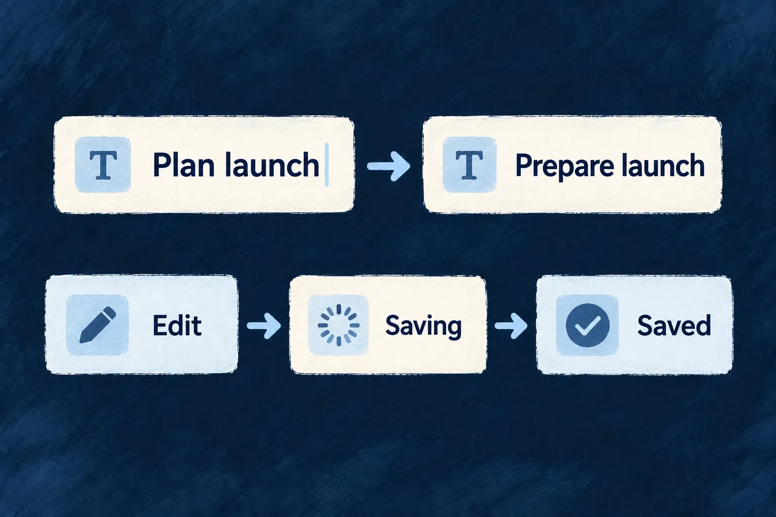
A task’s checklist saves a tick or label edit in place. The person stays on the detail screen and can see whether the change was saved.

An edited value moves through saving to saved feedback.
For engineers
Opt in at the right surface

On an update-like ResourceAutomatedForm, a field declaring edit.autosave: true or an enabled autosave configuration activates the provider. Undeclared fields keep autosave off in this derived mode. Create forms do not derive autosave: there is no existing record to patch yet.

For example, adapt an existing resource UI behavior’s fields and edit layout together. This is illustrative configuration for the existing todo title and description, not a change already installed in Wonder Todos:

fields: {
  title: sh.title.stringUI({
    edit: {
      autosave: { enabled: true, trigger: AutosaveTrigger.BLUR },
    },
  }),
  description: sh.description.stringUI({
    edit: {
      autosave: { enabled: false },
    },
  }),
},
layout: {
  edit: () => (
    <FormLayout>
      <FormField name="title" />
      <FormField name="description" />
    </FormLayout>
  ),
},

Import AutosaveTrigger from @wildo-ai/zod-decorators. sh is the resourceUIBehavior callback’s schemaShape; the layout components come from @wildo-ai/saas-frontend-lib. Open the resource’s standard UPDATE operation so ResourceAutomatedForm consumes this behavior. With no form-wide override, leaving a valid title triggers its field save; editing description does not initiate autosave. Keep an explicit submission path for fields that do not autosave. This example selects save triggers; it does not promise that a request payload excludes every other form value.

An explicit form-level autosaveConfig takes precedence. The framework’s actual resolution is shown here so the distinction between field opt-in and a form-wide default is visible:

const derivedAutosaveEnabled = useMemo(
  // `effectiveFormOperationType`, not `operationType`: a CUSTOM operation declaring
  // `resourceOperationLike: UPDATE` (a `rotate`, say) edits an existing row and autosaves on the
  // same terms. That variable is the one the rest of the form filters fields by.
  () => autosaveConfig === undefined && deriveAutosaveEnabledFromFields(formFieldShape, effectiveFormOperationType),
  [autosaveConfig, effectiveFormOperationType, formFieldShape],
);

const autosaveProviderConfig: AutosaveConfig = useMemo(() => ({
  enabled: autosaveConfig?.enabled ?? derivedAutosaveEnabled,
  defaultTrigger: autosaveConfig?.defaultTrigger ?? (derivedAutosaveEnabled ? AutosaveTrigger.NONE : AutosaveTrigger.DEBOUNCE),
  debounceMs: autosaveConfig?.debounceMs ?? 500,
  savedStateDurationMs: 2000,
}), [autosaveConfig, derivedAutosaveEnabled]);

The NONE default is significant: enabling one field does not silently make its neighbours save. Per-field triggers choose debounce, blur or no autosave; field validation runs before submission.

Bind custom array controls to the save contract

Wonder Todos declares its checklist inline-editable with arrayUI({ display: { inlineEditable: true }, objectItemLayout: ArrayObjectItemLayout.ROW }). Its custom item template then uses this real helper:

function useChecklistItem(itemPath: string): {
  done: boolean;
  toggleDone: (next: boolean) => void;
  label: string;
  setLabel: (next: string) => void;
} {
  const done = useArrayItemAutosaveField<boolean>(`${itemPath}.done`);
  const label = useArrayItemAutosaveField<string>(`${itemPath}.label`);
  return {
    done: !!done.value,
    toggleDone: (next) => done.setValue(next),
    label: typeof label.value === 'string' ? label.value : '',
    setLabel: (next) => label.setValue(next),
  };
}

useArrayItemAutosaveField updates the form state and signals the array editor to save the whole array. A raw React Hook Form controller alone does not perform that second step. The helper also works inside an ordinary edit form, where the surrounding submission persists the values.

Understand the write path

Scalar inline editing saves on its commit/blur path through the mutation manager. The inline array host mounts AutosaveProvider; generated update forms can now mount it from the field opt-in above. These are related surfaces, not one universal on-change handler.

The resource mutation manager orders updates and reconciles confirmed values. Network failures, rejected validation, conflicts and deleted records produce different outcomes. Custom controls should retain the provided save status and retry affordances rather than treating a local value change as proof of persistence.

Keep open screens in step with changes Mechanism

When records change, open screens should not stay confidently out of date. Wildo connects resource notifications with its read and mutation state.

Returning to a record can reuse a previous result while the application has a live subscription that would report changes to it. When that coverage is absent, the next read fetches again.

Example: Revisit a task after a colleague changes it

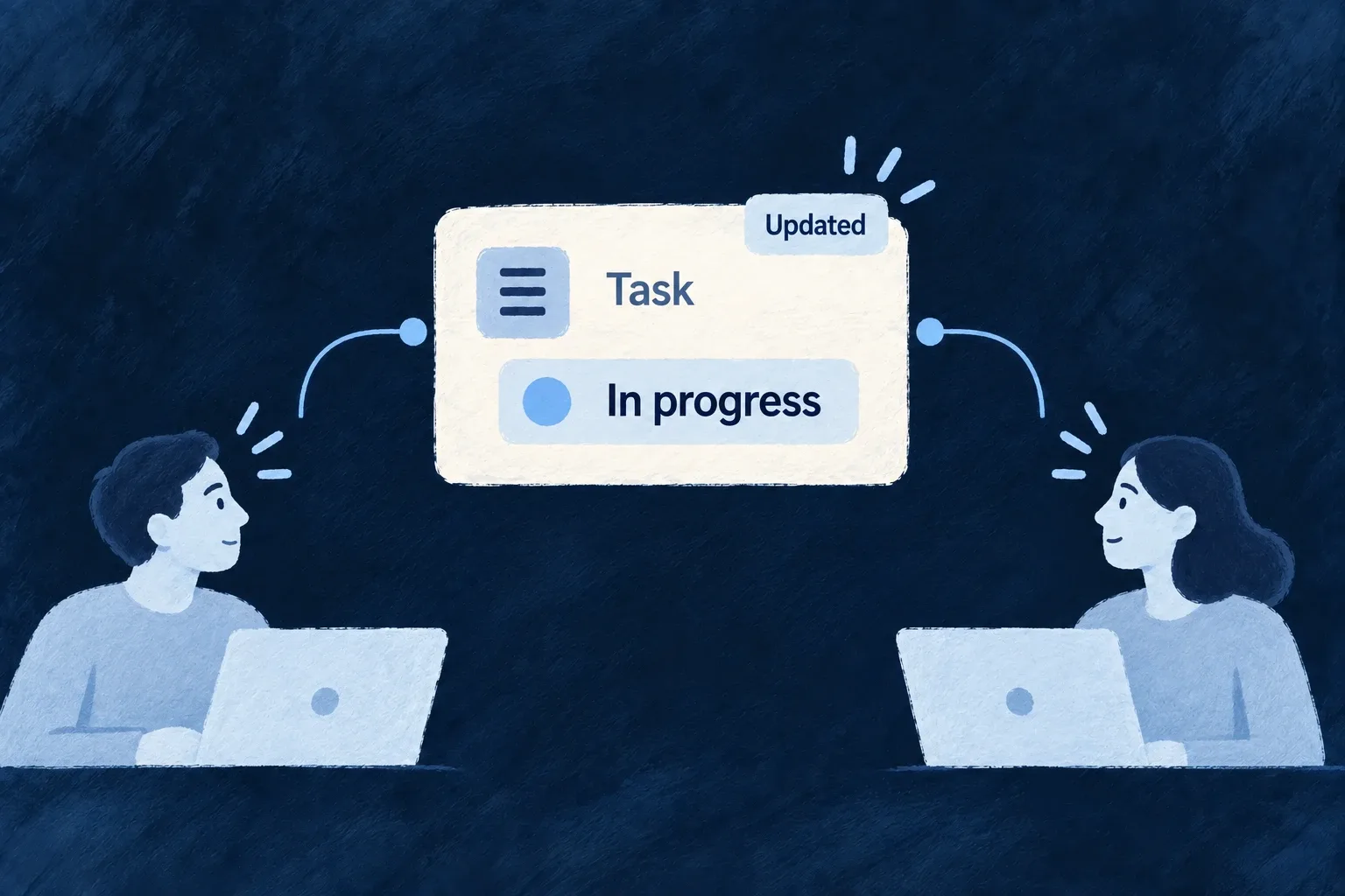
A colleague updates a task’s status. The notification invalidates affected read results, so returning to the task does not reuse the old status as if nothing happened.

Two people receive the updated state of a shared task.
For engineers
Use the resource runtime rather than a separate cache

Standard resource surfaces use the registry read path and useResourceRMM for update state. The application runtime supplies the mutation registry and ResourceReadCacheBridge; the bridge connects the cache with WebSocket room coverage and session state.

A custom component that fetches with its own client does not acquire this behavior merely by rendering inside Wildo. Reuse the resource operation surface or explicitly connect to the framework’s resource hooks and lifecycle.

Understand when a cached result may be served

The current ResourceReadCacheFrontendService.read implementation checks live coverage on every lookup:

public read(key: string): unknown | undefined {
  if (!this.enabled) return undefined;
  const entry = this.entries.get(key);
  if (!entry) return undefined;

  if (!this.authority?.covers(entry.resourceType, entry.scopes)) {
    // Not an error and not necessarily stale — simply unprovable. Dropping it keeps the map from
    // filling with entries that can never be served.
    this.entries.delete(key);
    logDebug('entry dropped: no live coverage', { resourceType: entry.resourceType });
    return undefined;
  }

  entry.lastReadAt = Date.now();
  return entry.value;
}

The cached value is a candidate, not a freshness promise. A disconnected socket, a refused or missing room, or an absent coverage authority makes the lookup miss. Session and reconnect resets and resource-event invalidation have their own paths, covering lists as well as individual records. The standard provider tree mounts the bridge inside the route-owned scope provider. Organisation changes clear cached entries and release bridge coverage; late room replies cannot revive retired claims. WebSocket cleanup independently releases old-organisation room claims.

Separate saved, optimistic and remote state

ResourceMutationManager maintains confirmed data and queued changes for a resource instance. Standard forms and inline edits use it to order writes, surface failures and reconcile the server’s response. The same record’s consumers can subscribe to that state instead of each maintaining an unrelated optimistic copy.

Conflicts are not all interchangeable. The configured conflict policy decides how applicable changes reconcile; a deleted record is terminal. Retain the runtime’s failure and remote-change feedback in a custom interaction. This mechanism does not make an arbitrary screen an offline editor or a collaborative text document.

Show how much work needs attention Mechanism

A badge is useful when its number means something specific: items assigned to a person, requests still open or work awaiting attention. Define that meaning as a query.

Wildo recomputes derived badges from matching records and delivers updates to their scope. The application chooses the filter, ownership field and display treatment.

Example: Count my unfinished todos

The Todos navigation item shows the number of todos assigned to the current person whose status is neither completed nor cancelled. Completing one removes it from that query.

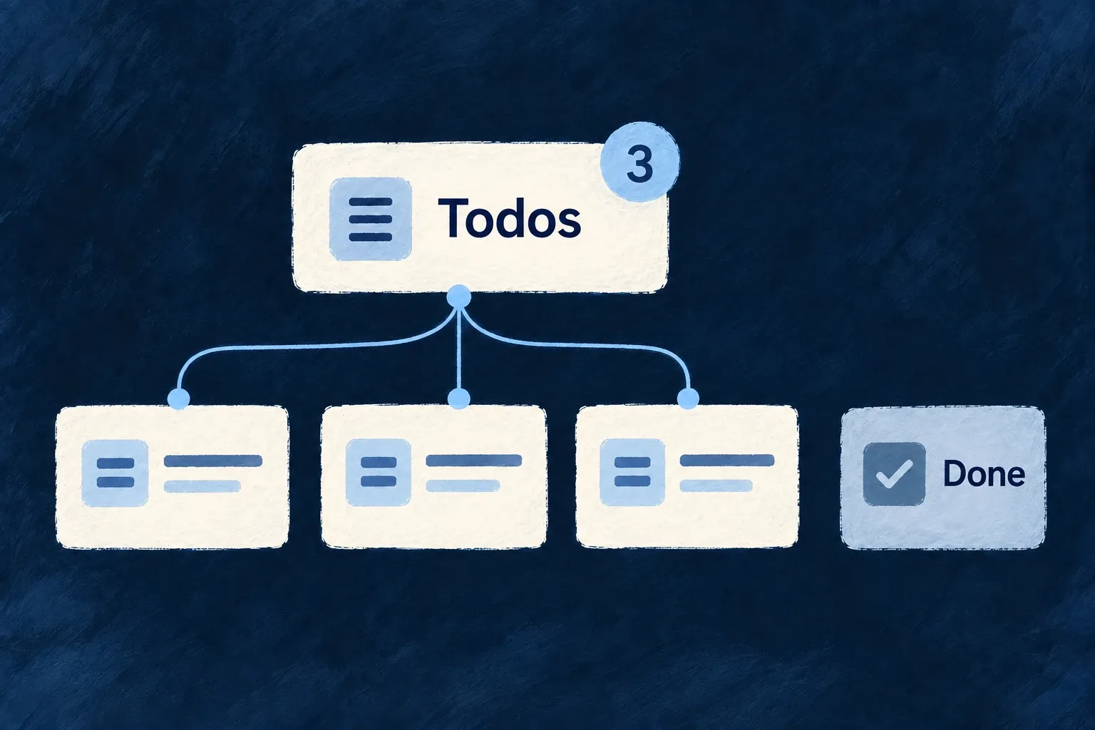
Three matching unfinished todos contribute to the Todos badge; a completed item does not.
For engineers
Define the count and its scope together

This complete badge declaration comes from Wonder Todos; imports and its identifier constants are omitted:

export const tasksManagerNotificationBadgeDefinitions: NotificationBadgeDefinition[] = [
  {
    identifier: USER_SELF_INCOMPLETE_TODOS_BADGE_IDENTIFIER,
    scope: ResourcePrimaryScope.USER_SELF,
    source: {
      kind: NotificationBadgeSourceKind.DERIVED_QUERY,
      resourceType: TasksManager_ResourceType.TODOS,
      filter: { status: { $nin: [Todos_Status.COMPLETED, Todos_Status.CANCELLED] } },
      scopeField: 'assignedToUserId',
    },
    display: {
      mode: NotificationBadgeDisplayMode.COUNT,
      tone: IndicatorVariant.INFO,
      pulse: NotificationBadgePulse.ON_INCREASE,
    },
  },
];

scopeField: 'assignedToUserId' ties the query to the badge owner. The status filter selects unfinished work. COUNT controls presentation and ON_INCREASE asks the badge to pulse when its value rises; neither changes which records are counted.

Register once, reference from navigation

The shared module contributes tasksManagerNotificationBadgeDefinitions through notificationBadgeDefinitions. The navigation item uses the key derived by buildNotificationBadgeKey(ResourcePrimaryScope.USER_SELF, identifier) as its notificationBadgeRef. This keeps the scope named in the definition and in the reference aligned.

On the backend, the notification dispatcher requests recomputation after relevant resource mutations. The badge service counts with the declared filter plus the owner’s scope field, persists the result and emits its update. Connection seeding recomputes the derived value as well; the frontend hook receives badge updates for the subscribed scope.

Do not mix counting models

A derived-query badge is recalculated from source records. Event-driven badges have a different update contract and should not be used to increment/decrement the same meaning in parallel. When the filter or assignment field changes, check both a newly matching record and one leaving the set. For user-scoped badges, verify two users independently rather than only observing the number on one navigation item.

Compose focused workspaces

Make the screen your product needs Mechanism

Standard screens provide a starting point, not the final shape of every product. Replace the presentation of one resource operation, or create a screen with its own interaction.

These are different choices. An operation-owned custom view receives that operation’s context; a fully custom screen owns its data loading and composition.

Example: Add a workspace beneath a record

A task read view keeps the standard record content and adds a related workspace below it. The application authors the composition while retaining the normal read surface.

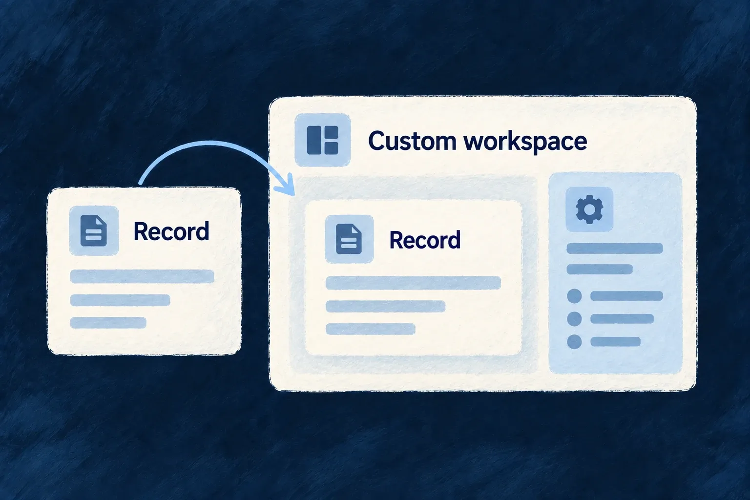
A record view is deliberately placed within a custom workspace.
For engineers
Start with a typed operation host

This is Wonder Todos’ actual TodoReadCustomView. Its imports and source markers are omitted:

export const TodoReadCustomView: ResourceReadCustomViewComponent = (props) => {
  const { resourceContext } = useReadOperationSurface({
    resourceContext: props.resourceContext,
    navigationZone: props.navigationZone,
    navigationInitiator: props.navigationInitiator,
  });

  return (
    <ResourceLayoutPreset_Read_Default
      {...props}
      showCharts={false}
    >
      <EmbedResourceOwnedCompositeView
        resourceContext={resourceContext}
        viewRef={TODO_WORKSPACE_COMPOSITE_VIEW_REF}
        navigationZone={props.navigationZone}
        navigationInitiator={props.navigationInitiator}
      />
    </ResourceLayoutPreset_Read_Default>
  );
};

ResourceReadCustomViewComponent supplies the read-host props. useReadOperationSurface resolves the resource context; forwarding the navigation zone and initiator preserves where the request came from. The standard read preset renders the familiar record surface, and the explicit composite embed adds the application’s workspace.

The resource’s views map binds customView: TodoReadCustomView to its READ operation. Keep that binding inside the resource’s registered frontend behavior. Other operations can continue using the standard hosts.

Choose an independent screen when there is no single host operation

A full custom view instead declares a stable ref, componentRef, scope and addressability in the app/module’s fullCustomViews. The component reference must be registered in the component registry. The host supplies context identifiers; the component owns its fetches, actions and layout.

Use the framework resource hooks or embeds when those interactions should retain resource semantics. A bare fetch or custom button does not inherit standard mutation reconciliation just because the screen has a Wildo route.

ChoiceRetained starting pointApplication responsibility
Layout templateExisting operation host and fieldsField order, grouping and local presentation
Operation customViewTyped operation and navigation propsCompose the host and explicitly place its inserted views
Full custom viewRegistered route/view contextData loading, interaction and composition

Custom presentation does not bypass backend access rules. Declare feature requirements and route scope deliberately, then make the component’s requests through the correct application contract.

Bring related work onto one screen Mechanism

Some work is easier when its related pieces are visible together. A composite view combines existing resource operations, charts and authored sections into one screen.

The application chooses the arrangement. Dedicated embeds resolve the surrounding record context so each part can retain its own standard behavior.

Example: Keep a task and its supporting work together

A task detail screen adds its supporting tasks and progress charts below the record. It gives the person adjacent context without rendering the same task details twice.

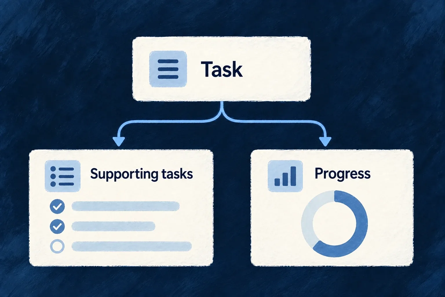
A task brings its supporting tasks and progress into one composition.
For engineers
Compose existing surfaces rather than re-fetching their data

Wonder Todos’ TodoWorkspaceCompositeView adds related tasks and metrics. The selected function below shows the composition; imports and the chart-cell helper are omitted:

export function TodoWorkspaceCompositeView(): React.ReactElement {
  return (
    <CompositeLayout>
      <Section name="tasks" appearance={SectionMode.GRID}>
        <EmbedRelatedResourceOperation
          resourceType={TasksManager_ResourceType.TASKS}
          operationLike={CoreResourceOperation.LIST}
        />
      </Section>
      <Section name="metrics" appearance={SectionMode.CARD}>
        {/* Three compact titled charts side by side (stacking full-width tripled
            the section height for the same information). Plain grid — chart
            cells, not sections, so no container mode applies. */}
        <div className="grid grid-cols-1 gap-group md:grid-cols-2 xl:grid-cols-3">
          <MetricsChartCell resourceType={TasksManager_ResourceType.TASKS} viewRef="todo-task-status" />
          <MetricsChartCell resourceType={TasksManager_ResourceType.TASKS} viewRef="todo-task-priority" />
          <MetricsChartCell resourceType={TasksManager_ResourceType.TASKS} viewRef="todo-task-timeline" />
        </div>
      </Section>
    </CompositeLayout>
  );
}

EmbedRelatedResourceOperation resolves the child operation from the host’s relationship context. EmbedRelatedChart inside MetricsChartCell does the equivalent for the named chart. The custom cell gets its title from the chart-view label namespace rather than inventing a second chart name.

Register the view and its sections

The same file publishes the composite contract:

export const TODO_COMPOSITE_VIEWS = {
  [TODO_WORKSPACE_COMPOSITE_VIEW_REF]: {
    viewComponent: TodoWorkspaceCompositeView,
    sectionRefs: ['tasks', 'metrics'],
    icon: ClipboardCheck,
  },
} satisfies ResourceCompositeViewsConfig;

Its owning resource references the composite configuration in frontend UI behavior. Section references must match the specification/label entries that describe them. App-level composites instead enter the frontend module’s compositeViews contribution.

Decide who owns placement

A standard host can render resource-owned inserted views according to configuration. A custom host must place them explicitly, using EmbedResourceOwnedCompositeView where this workspace belongs. The todo example deliberately omits a host-record section from the composite because its parent already renders the record.

When more than one relationship reaches the same target resource, disambiguate the embed with the appropriate foreign key. A plausible-looking list is not proof that it uses the intended relationship. The example places its sections directly beneath CompositeLayout, where the layout can resolve container appearances such as GRID. If a custom wrapper hides a section from that grouping pass, use a solo appearance such as CARD for its individual embed so its heading and frame are retained.

Turn records into useful measures Mechanism

A useful chart starts with a question about the data: how work is distributed, how much remains or how activity changes over time. Wildo connects that query with its chart presentation.

Choose the dimensions, measures and visual form. The backend executes the declared aggregation in the caller’s context; the frontend turns the result into a chart.

Example: See work by status

A task dashboard groups tasks by status and counts each group. A donut shows that distribution while the same result can supply summary figures.

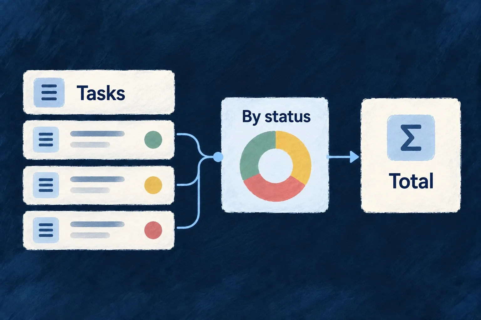
Task records feed a status chart and a total.
For engineers
Share the chart definition across both layers

Wonder Todos declares this complete chart object in shared-lib. Imports are omitted; ChartDefinition, ChartType and AggregateFunction come from @wildo-ai/saas-models:

export const todosByStatusChartDefinition: ChartDefinition = {
  ref: 'wonder-todos-todos-by-status',
  chartType: ChartType.DONUT,
  dataQuery: {
    mainResourceType: TasksManager_ResourceType.TODOS,
    dimensions: [
      {
        ref: 'status',
        field: 'status',
      },
    ],
    measures: [
      {
        ref: 'count',
        field: '*',
        aggregate: AggregateFunction.COUNT,
      },
    ],
  },
  series: [
    {
      ref: 'todos-by-status',
      name: 'Todos by status',
      measureRef: 'count',
      splitByDimension: 'status',
    },
  ],
};

The dimension names the grouping field. The measure counts records, and the series selects that measure and splits it by the status dimension. This chart has no parent-record filter: it describes the current organisation’s todos, not the tasks beneath one particular todo.

Register execution and presentation

The backend module includes this shared object in chartDefinitions. The frontend resource behavior names the same object in chartViews:

{
  ref: todosByStatusChartDefinition.ref,
  scope: FrontendView_ScopeMode.RESOURCE,
  isAddressable: false,
  operationLike: Op.READ,
  primaryScope: ResourcePrimaryScope.ORGANIZATIONS,
  chartDefinition: todosByStatusChartDefinition,
},

Both registrations matter: a frontend-only chart has no registered data query to execute; a backend definition alone has no chosen screen placement. The application module must itself be installed in its layer’s module registry.

Make scope and placement explicit

The chart controller validates configured inputs, resolves trusted parent context and calls the aggregation service with the execution context and chart role configuration. For a parent-specific chart, declare the parent requirement and matching context filter; do not pass an arbitrary foreign organisation ID as a browser-selected filter.

Standard hosts can surface their configured charts. A custom host explicitly embeds the view. In this example, the custom todo read host does not automatically prepend these organisation-wide charts; the home dashboard chooses their placement. Labels, empty-state usefulness and which measures help a decision remain application design work.

Keep complex work in one workspace Mechanism

A complex interaction can involve a main record, related records and temporary working state. An execution view gives that interaction a host with a clear anchor.

The application builds the workflow interface. Wildo supplies the context and navigation mechanisms for opening related operations locally or handing them to the application router.

Example: Inspect related work while keeping the task open

A task workspace opens the parent todo’s read surface inside itself. The person can inspect that context and return to the workspace without replacing it with an unrelated page.

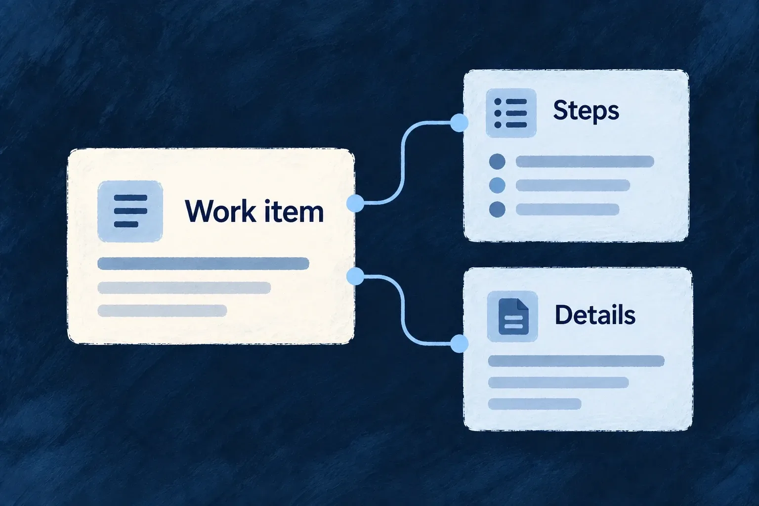
A work item anchors its steps and supporting details.
For engineers
Declare what the workspace is anchored to

A resource-owned execution view lives in executionViews, uses a stable view reference and points its anchor to a declared parent or additional resource requirement. participations can name the anchor and related records resolved from it. An anchor is a named binding, not whichever resource happens to appear first in an array.

Register the frontend resource behavior, give the view its matching specification/labels and choose its launch placement. The resource’s actual operation and relationship registrations still determine what can be opened.

Open an existing operation inside the execution host

This selected callback from Wonder Todos’ TaskExecutionView runs inside a component using useExecution(). parentTodoId comes from the resolved anchor:

const embedAnchoredTodoRead = useCallback(() => {
  if (!parentTodoId) {
    return;
  }

  execution.actions.operation({
    resourceType: TasksManager_ResourceType.TODOS,
    resourceId: parentTodoId,
    operationLike: CoreResourceOperation.READ,
    navigationInitiator: {
      sourceOperation: CoreResourceOperation.READ,
      sourceRelationship: {
        parentResourceType: TasksManager_ResourceType.TODOS,
        childResourceType: TasksManager_ResourceType.TASKS,
        foreignKeyField: TasksManager_ResourceFieldIdentifier[TasksManager_ResourceType.TODOS],
      },
    },
  }).embed();
}, [execution.actions, parentTodoId]);

The navigation initiator preserves the task-to-todo relationship. .embed() places the resource operation inside the execution shell; the router-delegated path opens it through the application’s navigation instead. Both retain the operation context rather than fabricating a parallel data API.

Keep local state distinct from durable work

The host also exposes local-pane and embedded-content state. Opening another embed replaces the current embedded-content slot; this is not an arbitrary collection of independent React windows. The supported embedded target is a resource operation.

Dirty markers let participating work report unsaved changes to the execution navigation policy. The application still decides what each step does and which backend operation persists it. An execution view is a frontend workspace contract, not an automatic durable workflow engine or a transaction spanning every step.

Guide the next action

Guide people toward useful first actions Mechanism

An empty screen can leave a new user unsure what to do next. Wildo provides onboarding content and contextual guidance that can explain the next useful action.

Progression can also record declared milestones from application activity. You decide what deserves guidance and what counts as progress; a dismissed introduction is not the same as completed work.

Example: Help a new user begin

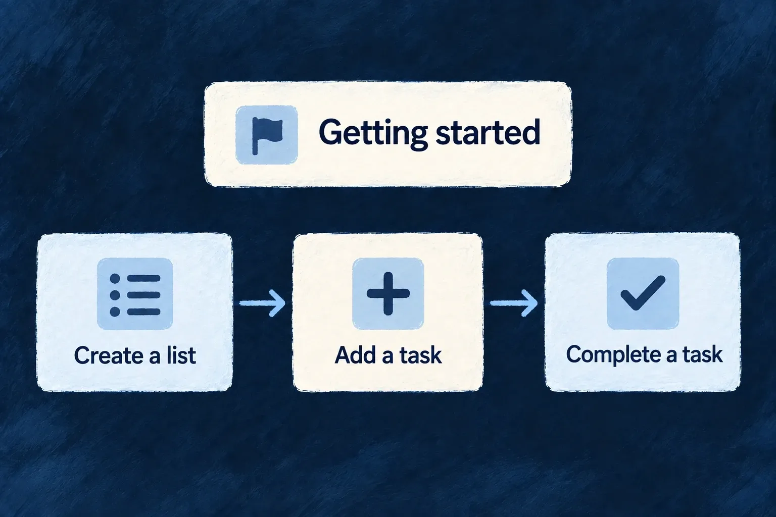
A getting-started panel explains creating a list and adding a task. A separate milestone can recognize the first successful list creation, rather than assuming reading the instruction completed it.

A getting-started sequence leads through creating a list, adding a task and completing it.
For engineers
Separate the document from the trigger

An onboarding view declares ordered elements and display options. A guidance flow decides when guidance should appear. Milestones define recognized application activity and progression. Each has its own identity and registration.

Wonder Todos’ home introduction uses this selected definition. Remaining cards and imports are omitted:

const homeGettingStartedOnboarding: OnboardingViewDefinition[] = [
  {
    ref: HOME_GETTING_STARTED_VIEW_REF,
    scope: FrontendView_ScopeMode.APPLICATION,
    options: {
      showProgress: true,
      allowDismiss: true,
      persistState: true,
      autoStart: false,
      allowSkip: true,
    },
    elements: [
      {
        ref: 'create-list',
        type: OnboardingElementType.CARD,
        status: OnboardingStatus.NOT_STARTED,
        order: 0,
        variant: OnboardingCardVariant.DEFAULT,
      },

The frontend module registers this document in onboardingViews, and the home dashboard places it inline with EmbedOnboarding. The registered view ref supplies the persistence identity, unless the host provides a registered guidanceFlowRef. An unregistered inline document keeps local state only. Saving dismissal or progress also requires the guidance-state update operation and a successful request.

The persistState option in this application excerpt does not control that decision in the current renderer. Placement belongs to the host; autoStart is likewise not consumed by this renderer.

Connect a guidance trigger to a registered flow

Wonder Todos also declares moduleGuidanceFlows. Unlike the inline home document, this flow responds to a successful resource operation. The selected declaration below retains the trigger, scope and visible element; imports and display options are omitted.

export const moduleGuidanceFlows: GuidanceFlowDefinition[] = [{
  ref: 'tasks-manager-first-list',
  scope: GuidanceFlowScope.USER,
  renderMode: GuidanceRenderMode.OVERLAY,
  trigger: {
    type: OnboardingTriggerType.EVENT,
    eventName: `${TasksManager_ResourceType.TODO_LISTS}:${CoreResourceOperation.CREATE}`,
  },
  priority: 50,
  elements: [{
    ref: 'first-list-created',
    type: OnboardingElementType.BANNER,
    status: OnboardingStatus.NOT_STARTED,
    order: 0,
    variant: OnboardingVariant.INFO,
    dismissible: true,
    position: OnboardingBannerPosition.TOP,
    actionRef: `${TasksManager_ResourceType.TODOS}.${CoreResourceOperation.CREATE}.default`,
  }],
  labels: { description: true },
}];

The resource-success event supplies the trigger name. The banner’s actionRef separately names the default todo CREATE operation. One says when to offer help; the other says where the offered action leads. The guidance vocabularies and type are exported by @wildo-ai/saas-models; resource identifiers belong to the application.

Register it on the same frontend module that contributes the resource UI:

const tasksManagerFrontendModule: FrontendModule = {
  moduleId: 'tasks-manager',
  resourceUIBehavior: moduleResourcesUIBehavior,
  onboardingViews: homeOnboardingViews,
  guidanceFlows: moduleGuidanceFlows,
  // Other module contributions remain here.
};

Include that module in applicationFrontendModules; the module registry merges guidanceFlows into the application configuration read by the guidance provider. Supply the flow/element specifications and published labels: an element reference does not provide the banner’s title or action wording. Dismissal and completion follow the registered-state persistence path described above. Registration does not mean the flow’s trigger has already occurred.

Record an outcome from the operation that proves it

The shared module separately registers customMilestoneDefinitions. These two actual definitions connect the first list and first todo to resource CREATE operations:

defineMilestone('FIRST_TODO_LIST_CREATED', {
  type: MilestoneType.FIRST_TIME,
  trigger: { resourceType: TasksManager_ResourceType.TODO_LISTS, operation: CoreResourceOperation.CREATE },
  reward: { type: MilestoneRewardType.CELEBRATION, celebrationLevel: 'medium' },
  category: 'getting-started',
  points: 10,
  labels: { description: true },
}),

defineMilestone('FIRST_TODO_CREATED', {
  type: MilestoneType.FIRST_TIME,
  trigger: { resourceType: TasksManager_ResourceType.TODOS, operation: CoreResourceOperation.CREATE },
  reward: { type: MilestoneRewardType.CELEBRATION, celebrationLevel: 'low' },
  category: 'getting-started',
  points: 5,
  labels: { description: true },
  dependencies: ['FIRST_TODO_LIST_CREATED'],
}),

For the standard authenticated frontend to load milestone definitions and show the progression tracker, enable applicationConfig.analytics.enabled. Registering definitions alone does not enable that display: the provider returns an empty definition list when analytics is disabled. This frontend gate is separate from backend activity recording.

The second milestone names its dependency. The backend registry validates definitions and their dependencies during registration. The event-driven progression mechanism records the configured activity; the onboarding card does not itself prove that the create operation happened.

Keep the guidance useful

Use stable element/section references and supply their authored specifications and generated labels. Choose sensible dismissal, skip and repetition behavior. Keep instructions tied to actions that are actually available in the current product. A celebration or checklist is a presentation choice; the business meaning of completion remains yours.

Explain what is available to each customer Mechanism

An unavailable feature should not leave the person guessing. Wildo can adapt its presentation to the reason and the person’s role: offer an upgrade, explain a limit, ask an administrator or hide the surface.

Declare the availability policy once and connect it to the relevant operation or view. Backend enforcement remains separate from what the interface displays.

Example: Offer the right next step for reports

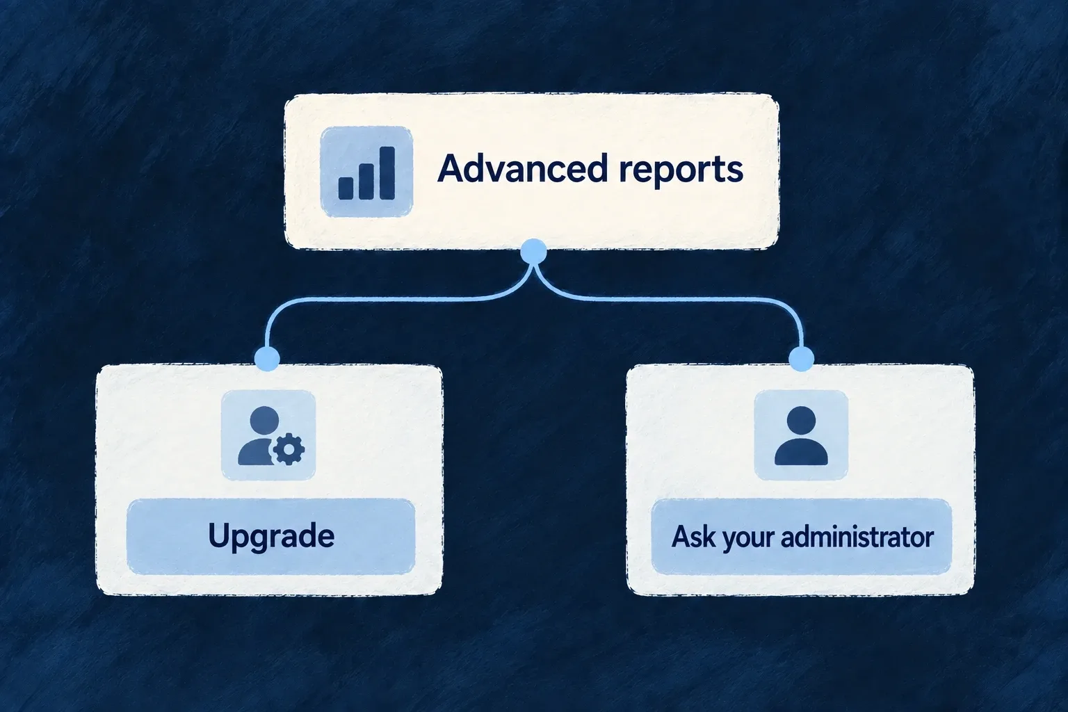
An administrator can see an upgrade action for advanced reports. A regular member can instead be directed to an administrator, without being offered a billing action they cannot complete.

Advanced reports offer an upgrade or an administrator request according to availability.
For engineers
Define availability and the response to its absence

Wonder Todos defines product features in its shared configuration. This selected declaration gives advanced reports a default upgrade prompt and a member-specific response:

defineFeature(ApplicationFeature.ADVANCED_REPORTS, {
  scope: ResourcePrimaryScope.ORGANIZATIONS,
  unavailability: {
    behavior: FeatureUnavailabilityBehavior.UPGRADE_PROMPT,
    byRole: { [CORE_ORG_ROLES.ORG_MEMBER]: FeatureUnavailabilityBehavior.CONTACT_ADMIN },
  },
}),

The feature registry and the current scope’s grants determine availability. The policy determines how unavailability is presented. Product plans or non-billing feature profiles supply grants; the policy alone does not enable a feature.

Apply it at the surface that owns access

For an authored component, FeatureGate accepts a featureId and children. Its implementation renders those children when available, renders nothing for HIDE, otherwise delegates to a custom renderer or the policy-driven prompt. Use renderUnavailable only when the product needs a distinct presentation of the same availability result.

This complete illustrative component consumes the same ApplicationFeature.ADVANCED_REPORTS used by the Professional grant and protected READ variant. Place it in the normal application provider tree; its parent supplies the report content:

import type { ReactNode } from 'react';
import { FeatureGate } from '@wildo-ai/saas-frontend-lib';
import { ApplicationFeature } from '@wonder-todos/shared-lib';

export function ReportsAccess({ children }: { children: ReactNode }) {
  return (
    <FeatureGate featureId={ApplicationFeature.ADVANCED_REPORTS}>
      {children}
    </FeatureGate>
  );
}

When the effective grant is available, the report content renders. Once an unavailable result is resolved, the existing policy can offer an upgrade to an administrator or direct a member to their administrator. A HIDE policy renders nothing, including when a custom unavailable renderer exists.

The frontend treats unresolved/loading feature state optimistically to avoid flashing a lock. It must not be used to keep confidential data out of a response: the protected backend READ remains the authority. Keep data fetching on that authorized path even when the wrapper is already visible.

Resource operation variants and registered views can declare requiredFeatures. The route guard checks those requirements when the route is opened directly; action resolution applies the relevant policy to operation affordances. A manually hidden navigation item is not a replacement for either check.

Separate entitlement, permissions and installed capability
QuestionOwning decision
Does this customer have the feature or remaining allowance?Feature grants and usage limits
What should the person see when it is unavailable?Unavailability policy, including role/reason overrides
May this person perform the operation on this record?Backend authorization and resource scope
Is the mechanism configured in this application?Runtime capability/configuration

Test a direct route as well as its launcher. Also test billing-disabled and non-administrator cases: an upgrade prompt without a usable action is not helpful guidance.

Put plans, usage and invoices together Feature

Customers need a coherent place to understand their subscription and manage its costs. Wildo brings plan information, usage and invoice history into a billing surface.

The widgets use shared billing state and configured provider actions. You define the commercial model and connect the provider; the screen presents those choices.

Example: Review a subscription before changing it

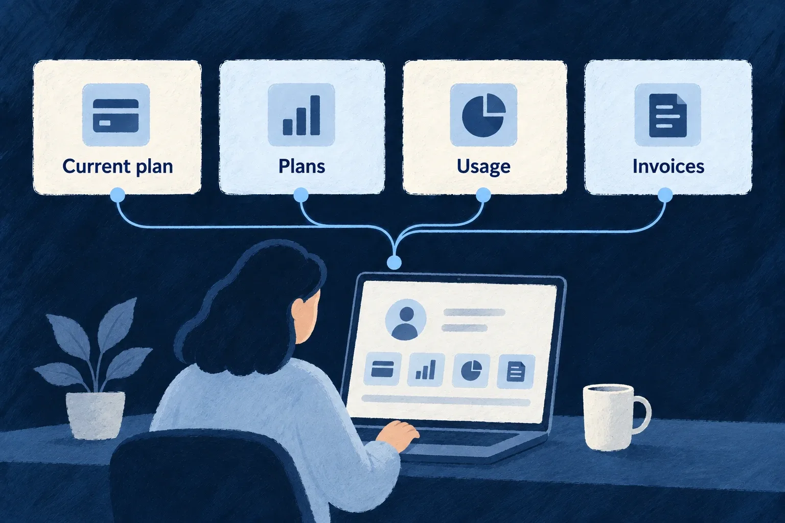
A workspace administrator sees the current subscription, available plans, usage and invoices together. The manage action opens the configured customer portal rather than a second hand-built billing flow.

Subscription, usage and invoices form a billing workspace.
For engineers

AppPage_BillingSettings is a Settings Hub panel composing SubscriptionStatus, BillingPortalLink, PricingTable, UsageDashboard and InvoiceHistory. Each widget reads the shared billing context; the panel does not fetch every billing child resource independently.

This selected part of the actual engine panel shows the plan, usage and invoice sections. Label resolution and earlier subscription/management sections are omitted:

<Card>
  <CardHeader>
    <CardTitle>{t('plansHeading')}</CardTitle>
  </CardHeader>
  <CardContent>
    {/* Self-hydrates: public active PLAN products scoped to the current
        billing scope; select = checkout (no subscription) / portal (active). */}
    <PricingTable />
  </CardContent>
</Card>

<Card>
  <CardHeader>
    <CardTitle>{t('usageHeading')}</CardTitle>
  </CardHeader>
  <CardContent>
    <UsageDashboard />
  </CardContent>
</Card>

<Card>
  <CardHeader>
    <CardTitle>{t('invoicesHeading')}</CardTitle>
  </CardHeader>
  <CardContent>
    <InvoiceHistory />
  </CardContent>
</Card>

The aggregated state is important: subscription and invoice resources are contextual children of the billing account. A generic organisation-level resource panel cannot simply invent their parent URLs.

Connect the commercial configuration before the screen

Enable billing for the application, register its product catalogue, and select the provider in the backend provider scope. Configure its credentials and webhook/runtime integration, then run wildo config sync to regenerate the application artifacts.

For an engine-shipped provider, selecting its reference in providers.scopes.backend.providers is sufficient for discovery: do not create a duplicate provider module or provider-contributions.ts entry. An authored contribution is needed when the application itself supplies a provider module. Backend billing still needs its matching providerRef, and the relevant SDK dependency must be installed. The frontend’s BillingContext reads the resulting state. Plan selection chooses the available checkout or portal action according to that state and the current subscription.

The Settings Hub then places the engine billing destination in an appropriate category. The destination is capability-gated; placement alone does not configure billing or grant a person billing-management rights.

Recompose widgets when the product needs another layout

The shared widgets can be used in an authored surface without replicating their data and action plumbing. Keep their billing provider/context available and retain their unavailable/loading behavior. The application still owns prices, entitlements, metering meaning and the customer-facing wording that explains those choices.

Make assistant activity understandable Mechanism

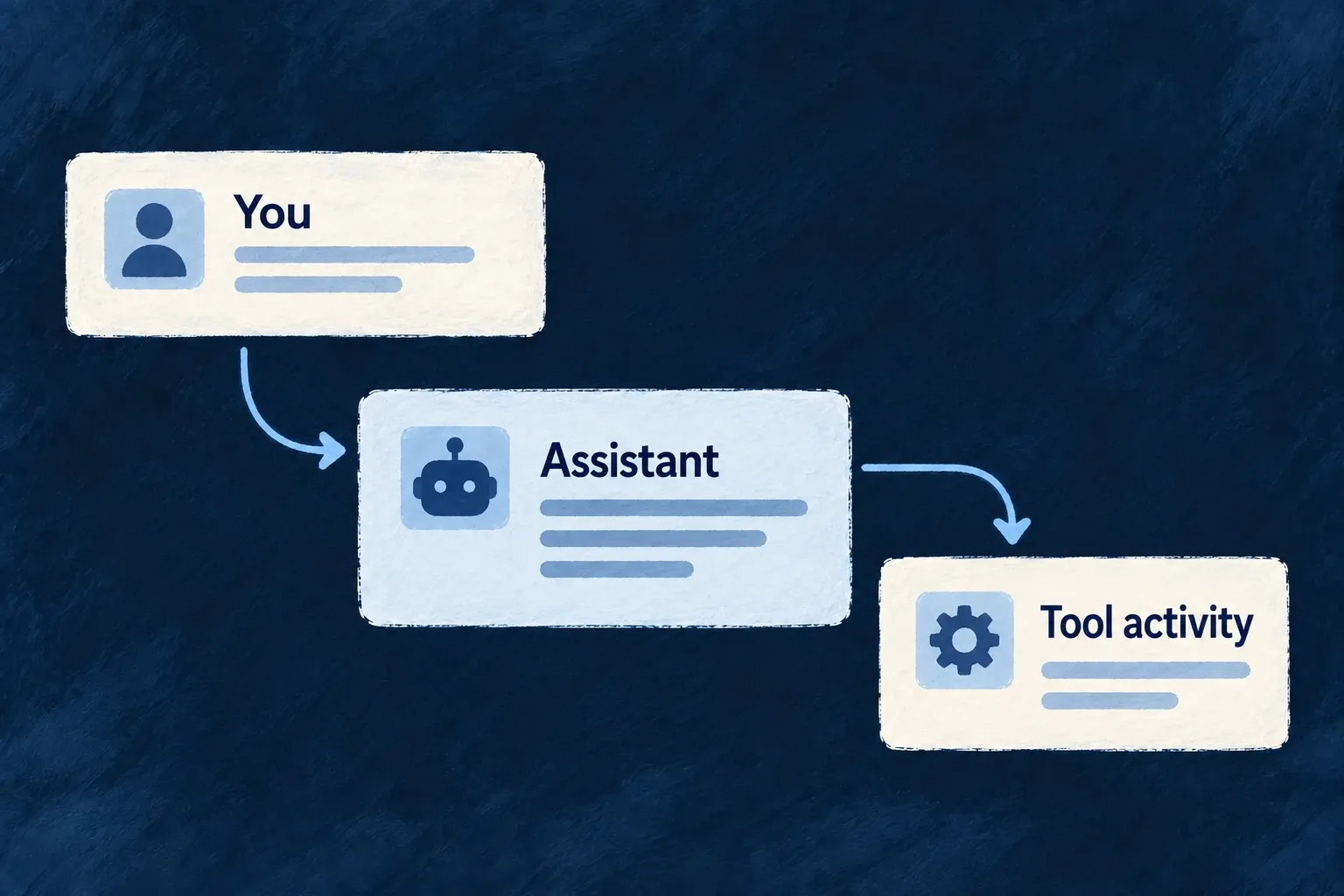
An assistant interface needs more than a text box. People need to follow the conversation, see work in progress and understand when their decision is required.

Wildo provides chat and agent-interface components alongside a conversation host for configured flow/actor systems. The application supplies the assistant’s behavior, tools and backend configuration.

Example: Keep the reply and its activity together

A task assistant displays its conversation and a working indicator while a reply streams. If that execution requires approval, the request appears beside the turn that needs the decision.
A person converses with an assistant and can follow its tool activity.
For engineers
Connect a real system to its frontend view

Wonder Todos registers this actual app-level flow/actor view; the surrounding array and commentary are omitted:

{
  ref: 'todo-assistant-view',
  scope: FrontendView_ScopeMode.APPLICATION,
  isAddressable: true,
  operationLike: CoreResourceOperation.READ,
  primaryScope: ResourcePrimaryScope.ORGANIZATIONS,
  systemRef: 'todo-assistant',
  layoutPreset: 'Default',
},

systemRef must match the backend’s registered flow/actor system. The frontend module contributes the definition through flowsActorsViews; the relevant module must be installed, and the backend must have the model/provider and tool configuration the system uses. A view definition does not create an assistant or its tools.

Choose the conversation host or compose the lower-level elements

FlowsActorsView is a chat-first host: discussions, transcript, prompt input and execution feedback. It reads prior conversations from the server and continues a thread through the execution service. Its current assistant view deliberately does not show the actor graph beside every conversation.

Lower-level conversation, message, prompt, reasoning, tool and graph elements are separately registered components. A custom agent interface can compose them, but it must connect their state to the real execution and tool results. The graph component has a lazy loading boundary; preserve that when an application does need structural exploration.

Keep decisions attached to the execution

The conversation host mounts FlowsActors_ApprovalRequest for a pending turn’s execution ID. That renders a decision only when the execution actually carries a pending approval. An approval queue remains useful for work outside the currently open conversation; it is a different placement, not a replacement for the inline decision.
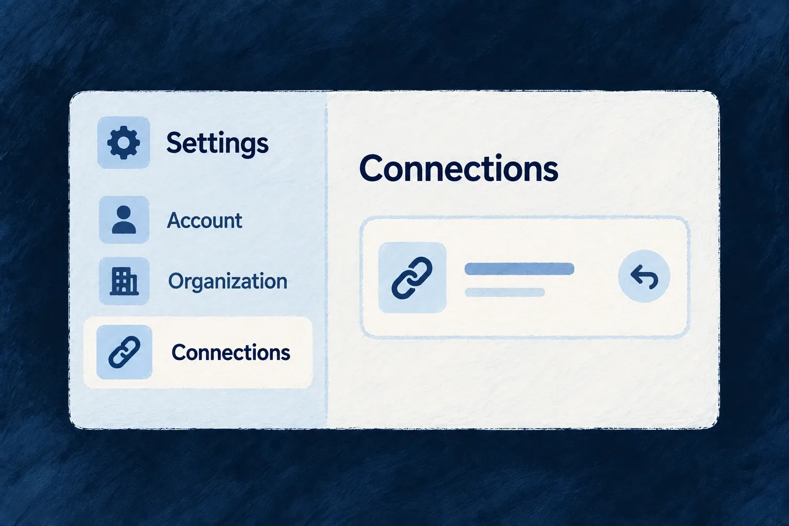
Distinguish a streamed draft, a completed tool result and a failed execution in the interface. The component library supplies presentation contracts; authorization, tool implementation and whether a task succeeded come from the backend runtime.

Make the interface feel like one product

Shared components, design configuration and product language give screens a consistent starting point. Change the presentation at the level that owns it, from a color role to a registered component.

Wildo supplies the common rendering mechanisms. You choose the visual character, the words people read and the custom interactions that distinguish the application.

Shared design choices give a form and a dialog a consistent appearance.

Consistency with room for your own choices

Adapt the right part

Choose a theme for shared visual treatment or replace a registered component for a different implementation. The surrounding screens can keep their contracts.

Carry behavior across screens

Shared surfaces and navigation handle recurring focus, scrolling and viewport decisions. Custom content builds on these mechanisms with its own accessible structure.

Give wording a common home

Specifications guide label generation, and the translation tree serves the interface. Review terminology once at its owner instead of inventing it inside each screen.

Example: A new customer screen that belongs to the product

A customer summary uses standard cards and actions, the application’s light and dark palette, and its translated resource labels. A specialist control replaces one registered component. The application owns that control’s behavior while the surrounding screen continues using the shared design system.

For engineers

Start with the application’s existing composition

The frontend module registry combines resource UI behavior, application views and component registrations. Its component loader installs framework presets before application contributions. Design configuration is converted separately, and labels reach the browser through the backend’s i18n service.

These are connected inputs, not interchangeable ways to customize a screen:

Desired changeOwning declarationConsumer
Replace a registered implementationComponent registration with matching slot and presetRuntime wrapper and registry
Change common visual treatmentDesign source configuration and themeUI provider, recipes and tokens
Change a container’s shared behaviorSurface policy at the owning levelSurface and participating descendants
Adapt navigation by viewportNavigation configurationNavigation policy resolver and hosts
Change product wordingLabel units and their specificationsBackend locale publication and frontend i18n helpers
Change allowed browser sourcesSurface/environment CSP configurationGenerated artifact and delivered server policy

Preserve the setup when extending it

Wonder Todos’ frontend/src/modules-registry.frontend.ts resolves its design system with this expression:

export const frontendResolvedDesignSystemConfiguration =
  createDesignSystemConfigurationFromSourceConfig(designSystemConfig);

The resulting configuration is passed through buildFrontendModuleConfigOverrides as designSystemConfiguration. Its component loader separately awaits registerFrameworkFrontendComponents() and then registerFrontendComponentRegistrations(frontendModuleRegistry.componentRegistrations). Keeping those paths distinct allows a theme change without replacing component code, or a component replacement without abandoning application-wide tokens.

Put the three customization paths together

For example, an application can use the resource-reference edit adapter while selecting its own theme. Keep those choices in their actual startup owners:

const designSystemConfig = defineDesignSystemConfig({
  ...existingDesignSystemConfig,
  theme: applicationTheme,
});

const designSystemConfiguration = createDesignSystemConfigurationFromSourceConfig(designSystemConfig);

const componentLoader = async () => {
  await registerFrameworkFrontendComponents();
  await registerFrontendComponentRegistrations(frontendModuleRegistry.componentRegistrations);
  registerApplicationPicker();
};

This is an illustrative composition of the capability examples. Import the design helpers from @wildo-ai/presets-components-models and registerFrontendComponentRegistrations from @wildo-ai/saas-frontend-lib. Keep your application’s existing registerFrameworkFrontendComponents wrapper, which registers the framework defaults; that wrapper belongs to the application. applicationTheme is the recipe override, and registerApplicationPicker is the EDIT-category adapter. existingDesignSystemConfig preserves the application’s tokens and other choices. Pass the resolved designSystemConfiguration into buildFrontendModuleConfigOverrides and this loader into the main provider options.

The adapter preserves the original picker’s labels, value contract and ref. Product wording still comes through its resource/component specifications and published label units; neither a CSS class nor component registration translates it. Update those label sources and run the normal label pipeline when wording changes. The resulting screen combines application styling, a replaced registered implementation and the existing language contract without merging them into one mechanism.

Check the seams that an isolated component cannot prove

A custom component must honor its props, refs and state contracts. A custom surface needs a single accessibility owner. A theme needs its tokens and CSS utilities available. A translated label needs a published unit. A CSP declaration needs the correct delivered header before it affects the browser.

Review the complete screen with keyboard input, long labels, both color modes and a narrow viewport. Shared mechanisms reduce repeated work; the assembled product is still the unit a person experiences.

Choose the building blocks

Start with working interface building blocks Feature

The preset library supplies implementations for controls, content containers and application interfaces. They use the same component contracts and shared styling services as the rest of Wildo.

That gives a new screen familiar behavior without assembling a separate visual toolkit. You still choose the composition and supply the product’s actions and content.

Example: A new screen that belongs to the same product

A customer summary uses the existing cards, buttons and inputs. Its controls pick up the application theme and shared interaction states, while the application decides what the actions do.

Shared controls assemble into an application screen.
For engineers

Application code consumes wrappers from @wildo-ai/saas-frontend-lib; the presets package supplies their implementations. Wonder Todos’ registerFrameworkFrontendComponents performs this startup sequence after importing the registration functions:

  registerDefaultIcons();
  registerDefaultPresets();
  registerDefaultAnimations();
  registerBuiltinCommonEnums();
  registerFrameworkLayouts();

  // Tier-1 completeness guard. Throws in dev when a registry-resolved
  // FrontendComponentType is missing a default preset; warns in prod.
  // See compound-component-system.md Section 15 for the Tier-1/Tier-2 model.
  assertRegistryCompleteness();

The function is awaited by the application’s component loader before module-specific registrations. Icons, animations and common enum registrations are separate dependencies of the complete interface; registering components alone is not the whole startup sequence.

Keep interaction contracts when composing a screen

The supplied button maps its public variant to a theme recipe. The actual preset then assembles these states:

  const classes = cn(
    STRUCTURE,
    recipe.base,
    recipe.states.hover,
    recipe.states.active,
    recipe.states.focus,
    recipe.states.disabled,
    recipe.states.invalid,
    recipe.sizes?.[size],
    recipe.motion.transition,
    className,
  )

That is why using the same wrapper carries focus, disabled and invalid appearance into another screen. Its loading state disables the native button and adds aria-busy; the application still controls when loading starts, error feedback and the operation itself. The asChild path composes into another element and does not apply the same loading behavior automatically.

The registry completeness check catches missing injectable slots: it throws in development and warns in production unless strict mode is selected. It does not prove the accessibility, correctness or visual fit of your custom composition. Verify the controls in the real screen, including keyboard use and failure states.

Replace the parts that make your product different Mechanism

Wildo’s replaceable components have named slots: a button, a field control or a layout can resolve a registered implementation instead of importing it directly.

Keep the supplied implementation where it fits. Register an alternative where your product needs something different, while preserving the contract used by its callers.

Example: A specialist view inside the application

A planning product adds a focus view for its own workflow. The application registers that view under a stable name, and the configured launcher refers to that name. Standard controls elsewhere keep their existing implementations.

A custom component replaces one part within a shared screen.
For engineers

Wonder Todos registers a custom focus view in frontend/src/modules/example-dev/index.ts. This is the actual selected registration; the surrounding module also contributes its view definitions and shell placement.

    {
      componentRef: FOCUS_HUB_SMOKE_COMPONENT_REF,
      loadComponent: async () => {
        const module = await import('./app-level-views/FocusHubSmokeView.js');
        return module.FocusHubSmokeView;
      },
      preset: CorePresetNames.DEFAULT,
      isConfigurable: false,
    },

componentRef must agree with the view definition or wrapper that requests it. loadComponent returns the React implementation. preset selects the registry key; a replacement must meet the props and ref contract expected by the existing wrapper.

The application’s modules-registry.frontend.ts then registers defaults before its module contributions:

    componentLoader: async () => {
      await registerFrameworkFrontendComponents();
      await registerFrontendComponentRegistrations(frontendModuleRegistry.componentRegistrations);
    },

The module belongs in applicationFrontendModules, which feeds buildFrontendModuleRegistry. The resulting componentLoader is handed to application initialization. These asynchronous imports may form separate bundles, but this loader awaits them at startup; they are not automatically deferred until a screen opens.

Replace the edit category without replacing display

An existing resource-reference field uses one slot with separate EDIT and DISPLAY registrations. This illustrative adapter preserves the existing picker’s behavior while adding a local styling hook. It captures the implementation after defaults load, then replaces only the edit key. The public props and forwarded ref remain intact.

import { forwardRef } from 'react';
import {
  ComponentRegistryService,
  type ResourceFieldEditPreset_ResourceReference_DefaultProps as PickerProps,
  type ResourceFieldEdit_ResourceReferenceRef as PickerRef,
} from '@wildo-ai/saas-frontend-lib';
import {
  FrontendComponentType, CorePresetNames, FrontEndComponentResourceFieldCategory,
} from '@wildo-ai/presets-components-models';

export function registerApplicationPicker(): void {
  const slot = FrontendComponentType.RESOURCES_FIELDS_RESOURCE_REFERENCE;
  const preset = CorePresetNames.DEFAULT;
  const category = FrontEndComponentResourceFieldCategory.EDIT;
  const Original = ComponentRegistryService.resolve(slot, preset, category);
  if (!Original) throw new Error('Register framework components before the picker adapter');

  const ApplicationPicker = forwardRef<PickerRef, PickerProps>((props, ref) => (
    <Original
      {...props}
      ref={ref}
      className={['application-reference-picker', props.className].filter(Boolean).join(' ')}
    />
  ));
  ApplicationPicker.displayName = 'ApplicationPicker';

  ComponentRegistryService.register(slot, preset, ApplicationPicker, {
    category,
    isConfigurable: true,
  });
}

Call registerApplicationPicker() once at the end of the application’s component loader, after framework defaults and module registrations. The generated field’s ResourceFieldEdit_ResourceReference wrapper then resolves this exact slot/preset/EDIT key. Its display wrapper continues resolving DISPLAY, which was not changed. The class is an application-owned hook; define its styling in the application’s stylesheet.

Capturing Original before registering avoids resolving the adapter from inside itself. Do not render the public resolving wrapper inside its own replacement: that would recurse. A completely new picker may replace the captured implementation, but must preserve value changes, disabled/error behavior and the forwarded input/button ref. isConfigurable is metadata, not an overwrite lock; the last registration for a key wins.

Choose the replacement boundary deliberately
ChoiceMeaning
Existing slot and presetReplace that registration; the last registration for the same key wins
Another preset on the slotOffer an explicitly selected alternative
New component referenceAdd a custom view with its own caller and definition
A framework-owned direct rendererUse its supported configuration or extension point; its named specification slot alone does not make it injectable

Direct registry keys also include a field category where applicable. Module contributions merge by componentRef, so two module entries with that same reference do not preserve independent presets merely because their preset names differ.

A missing requested preset does not silently use Default: the resolver shows a development placeholder and renders no component in production. Keep the startup completeness check and exercise the exact preset your screen requests.

Explain when and how a component should be used Mechanism

A component needs more than a name. Its specification explains its purpose, when it fits, the inputs it accepts and how its registered implementations relate to that contract.

Wildo makes this guidance available to development tools and language generation. Application authors can understand a component’s intended use before composing or extending it.

Example: Choose a card for the right reason

A summary card’s specification describes its header, content and action regions, and suggests where that grouping helps. A builder can choose it for a customer snapshot rather than guessing from its export name.

A component is described through its purpose, props and example.
For engineers

The framework’s card specification uses frontendComponentSpecification and names the same LOW_LEVEL_CARD reference used by the runtime. This selected source captures its authoring guidance:

    componentId: 'framework.low-level.card',
    purpose:
      'Group related content with header, title, description, actions, and body regions in a surfaced container.',
    uiRole:
      'Compound card shell: `Card`, `CardHeader`, `CardTitle`, `CardDescription`, `CardAction`, `CardContent`, `CardFooter`.',
    useWhen:
      'Use for summaries, entity snapshots, dashboard tiles, and form sections that need a clear boundary.',
    avoidWhen:
      'Avoid nesting many interactive cards inside tiny lists without spacing; consider table rows instead.',
    compositionNotes: [
      'Sub-components are separate exports that share the same registry preset.',
    ],

The same specification records CardProps, its preset vocabulary, a compound-card usage example and the implementation/registration symbols. Those connections matter: guidance for an old prop or nonexistent preset would mislead the next author even if the prose sounded useful.

Publish the specification to its consumers

An application-owned specification belongs in its specifications package and must be included in the frontendComponentSpecifications companion export. Wonder Todos already publishes the framework’s specification map there. The companion’s component-specification context factory and labelling context loader read that map to provide component meaning and prop information.

RecordResponsibility
Runtime registrationMakes a component implementation available to its callers
Component specificationExplains that contract and the intended use of its presets
Label declaration and generated bundleDefines the wording keys and supplies their values

Writing a specification does not register the React implementation. Keep those separate connections aligned when adding a custom slot or preset. Include a useful composition example and explain constraints that a caller must respect; changing only the visual recipe generally belongs in the theme configuration rather than a new component specification.

Shape a consistent interface

Give the whole interface a consistent visual language Mechanism

A design system gives recurring choices—colors, surfaces, spacing and typography—a common home. Wildo’s standard components consume those choices across the application.

Light and dark appearances can carry different values without becoming separate sets of screens. You choose the palette and theme, and check the result with your real content.

Example: The same workspace after dark

A customer switches appearance. The workspace keeps its layout and actions while backgrounds, text, borders and interaction colors use the dark palette.

One shared design supplies matching light and dark appearances.
For engineers

Wonder Todos starts from DEFAULT_DESIGN_SYSTEM_SOURCE_CONFIG and overrides semantic groups in frontend/src/config/design-system.config.ts. These are actual selected dark-mode values from its colors block:

    dark: {
      ...DEFAULT_DESIGN_SYSTEM_SOURCE_CONFIG.colors.dark,
      background: 'oklch(0.129 0.042 264)',
      foreground: 'oklch(0.968 0.007 247)',
      primary: 'oklch(0.746 0.16 232)',
      'primary-foreground': 'oklch(0.129 0.042 264)',
      secondary: 'oklch(0.279 0.041 260)',
      'secondary-foreground': 'oklch(0.968 0.007 247)',

The selection omits the rest of the dark palette, light palette and enclosing defineDesignSystemConfig call. Background/foreground pairs describe how content reads; primary and its foreground describe an action pair. A change to one should be evaluated with the other.

The application converts the authored source once:

export const frontendResolvedDesignSystemConfiguration =
  createDesignSystemConfigurationFromSourceConfig(designSystemConfig);

That result is passed as designSystemConfiguration in buildFrontendModuleConfigOverrides. UIProvider applies the resolved tokens and appearance; presets retrieve recipes through useUI. A custom component inherits the system when it consumes those tokens and recipes, not merely because it renders somewhere inside the app.

Separate palette, visual treatment and behavior
ConfigurationControls
Color and surface groupsSemantic values for light and dark modes
Theme recipesHow controls and containers use those values and interaction states
Typography and spacingShared type and layout scales
Surface policiesContainer behavior observed by participating children

Use subtle interaction tints for hover and selection rather than treating every accent as a saturated brand color. Test text, focus indicators, disabled controls, charts and third-party content in both modes; token configuration cannot establish their readability by itself.

Change the visual character without rebuilding screens Mechanism

A component theme describes the visual treatment of shared interface behaviors: primary actions, inputs, selected items, containers and text.

Choosing another theme changes how participating components present those behaviors. Your screens keep their structure, and your application can refine selected parts of the theme.

Example: A calmer treatment for the same workflow

A team adjusts the style of cards and primary actions. The customer screen keeps its fields and operations while the shared controls use the updated treatment.

Two visual treatments preserve the same workflow structure.
For engineers

Wonder Todos’ design-system configuration spreads a theme and then sets application choices. This actual selection shows its shell treatment:

    ...defaultTheme,
    // ...glassTheme,
    // ── Continuous shell chrome ("one canvas", Revolut-style) ──
    // Sidebar / menubar / toolbar / status bar / content zones render as
    // TRANSPARENT regions with no separating borders; the fixed
    // `backgroundLayer` below is the single background that flows under the
    // whole app. Selection/hover structure comes from the alpha
    // `surfaces.sunken-accent` washes above, not from opaque slabs.
    shellAppearance: ShellAppearance.CONTINUOUS,
    // Compact rail shows a small centered label under each icon (labels wrap
    // when long) instead of icon-only + tooltip.
    sidebarCompactLabelMode: SidebarCompactLabelMode.ICON_AND_LABEL,

The comments in this source excerpt describe the application’s current design choice. defaultTheme is imported from @wildo-ai/saas-frontend-lib/companion; optional preset themes are exposed through the deliberate @wildo-ai/presets-components/themes entrypoint.

A theme is a ComponentStyleTheme: its semantic recipes provide base classes, state classes, sizes and motion. For example, the button asks for UIBehavior.INTERACTIVE and the variant corresponding to its public variant prop. A card asks for a surface recipe. Neither screen needs a second implementation just to change these recipes.

Change one recipe and show its consumer

For a calmer primary action, override only the primary recipe’s base and hover treatment. This illustrative theme preserves the other variants, sizes, focus/disabled states, motion and required tokens from cozyTheme.

import { cozyTheme } from '@wildo-ai/presets-components/themes';
import { InteractiveVariant, type ComponentStyleTheme } from '@wildo-ai/presets-components-models';

const primary = cozyTheme.interactive[InteractiveVariant.PRIMARY];
export const applicationTheme: ComponentStyleTheme = {
  ...cozyTheme,
  interactive: {
    ...cozyTheme.interactive,
    [InteractiveVariant.PRIMARY]: {
      ...primary,
      base: 'bg-primary text-primary-foreground rounded-lg font-medium text-sm cursor-pointer shadow-none',
      states: {
        ...primary.states,
        hover: 'hover:bg-primary/90',
      },
    },
  },
};

Select applicationTheme in the design source’s theme, then pass the resolved design system to the application provider. The ordinary public button remains the caller:

<Button variant="default" onClick={saveChanges} disabled={!canSave}>
  {saveLabel}
</Button>

Here saveChanges, canSave and the localized saveLabel belong to the application. The button maps default to InteractiveVariant.PRIMARY, requests its UIBehavior.INTERACTIVE recipe and applies its states and size. That is why changing the recipe reaches this button without changing its action. Other interactive variants keep their inherited recipes.

Preserve dependencies when making an override

Spread the chosen theme before overriding its fields. If the theme owns requiredCustomTokens, preserve those when adding your own; otherwise a recipe can reference a CSS variable that was never emitted. The application’s Tailwind setup must include the package sources and required animation utilities so recipe classes actually exist.

Theme material profiles may add their own runtime behavior and fallback choices. A theme swap is therefore a configuration change to verify on real controls, across both appearances and reduced-motion settings. It does not retheme arbitrary third-party markup or replace application-specific styling automatically.

Let containers explain how their content should behave Mechanism

A dialog, a card and the application shell have different responsibilities. A surface policy describes those responsibilities—such as focus handling, scrolling or content presentation—in a form participating children can observe.

Keep visual choices in the theme and shared behavior in the policy. A local exception can then change the behavior without making nearby components infer it from CSS.

Example: A dialog with one focus owner

A dialog keeps keyboard interaction inside its active content while it is open. When the host dialog already manages focus, the inner surface leaves that job to the host instead of installing a second trap.

One dialog owns the keyboard-focus cycle within its controls.
For engineers

Wonder Todos assigns the main landmark to its canonical shell in design-system.config.ts:

  surfacePolicies: {
    [SurfaceVariant.SHELL]: {
      a11y: {
        landmarkRole: 'main',
      },
    },
  },

This is a selected configuration block. The shell default does not claim main, allowing an application to choose its owner. A nested shell used only as layout context must avoid claiming a second main region.

Surface merges framework defaults, theme policy, application policy and its call-site policyOverride, in that order. The result is available through useSurfacePolicy; supported values are also emitted as CSS variables and attributes. Current Surface is exported from @wildo-ai/saas-frontend-lib.

Make inheritance an explicit choice

This illustrative composition gives the parent a single-line text policy and lets its child opt into that policy. useSurfacePolicy exposes the resolved value to participating child components; merely nesting arbitrary HTML does not apply truncation to it.

import { Surface } from '@wildo-ai/saas-frontend-lib';
import { SurfaceVariant } from '@wildo-ai/presets-components-models';

<Surface variant={SurfaceVariant.BASE}
  policyOverride={{ content: { textTruncation: 'ellipsis-line' } }}>
  <Surface variant={SurfaceVariant.BASE}
    policyOverride={{ content: { textTruncation: 'inherit' } }}>
    {content}
  </Surface>
</Surface>

content represents application content using the framework’s policy-aware text primitives. With inherit, the child resolves the parent’s value. With reset, it resolves the framework default for that slot instead. Omitting a slot uses the normal variant/theme/application policy chain; nesting alone is not an instruction to copy every parent value.

Give a dialog one behavior owner

When adapting a dialog primitive that already owns focus trapping and scroll lock, use Surface on its content root with asChild and a11yManagedByHost. The existing host must supply a labelled dialog and keyboard/focus behavior; the flag delegates those responsibilities, it does not implement them.

<Surface variant={SurfaceVariant.BASE} asChild a11yManagedByHost
  policyOverride={{ a11y: { landmarkRole: 'none' } }}>
  <DialogContent aria-labelledby={titleId}>
    <DialogTitle id={titleId}>{dialogTitle}</DialogTitle>
    {content}
  </DialogContent>
</Surface>

This is an adapter fragment inside an already configured dialog root. DialogContent and DialogTitle denote that host’s primitives; titleId, the localized title and content belong to the application. Use the host’s public API rather than duplicating its focus handlers. The framework’s standard dialog already composes its own Surface, so do not add a second wrapper around it merely to repeat this pattern.

Connect policy to the CSS consumers

The runtime’s stylesheet contract requires:

@import "tailwindcss";
@import "tw-animate-css";
@plugin "@wildo-ai/saas-frontend-lib/tailwind";

The plugin translates policy variables into layout and presentation rules. Animation utilities supply overlay transitions; duration tokens alone do not create their keyframes.

Policy concernWhere the effect is applied
Focus and scroll containmentSurface’s shared handlers, unless a11yManagedByHost delegates them to the host
Landmark and accessible nameThe container that owns the region, with header or explicit labelling
Content and automatic field presentationParticipating text, table and generated-field components
Portal target and mobile shapeOverlay hosts and portal adapters

A policy is not global CSS that transforms arbitrary children. Use the framework’s participating primitives, and adapt third-party containers deliberately. For a local visual tweak use classes; for a change children must understand use policyOverride, without setting the same property through both paths.

Make the experience usable

Adapt the interaction to the space available Mechanism

A phone may need a full screen where a desktop uses a dialog. Wildo exposes shared viewport, touch and motion-preference information so components and navigation can make those choices together.

You decide which interactions should change. The same business action can keep its meaning while using a presentation that fits the available space.

Example: Edit in a dialog, or on a full screen

A desktop opens an edit form over the current record. On a phone, the configured action pushes a full screen so the form has room and back navigation returns to the record.

The same action adapts its layout between a desktop and a phone.
For engineers

Wonder Todos’ frontend/src/config/navigation.config.ts overrides mutation navigation on mobile:

  [ViewportBreakpoint.MOBILE]: {
    transitions: {
      [CoreResourceOperation.CREATE]:  NavigationTransition.PUSH,
      [CoreResourceOperation.UPDATE]:  NavigationTransition.PUSH,
      [CoreResourceOperation.DELETE]:  NavigationTransition.PUSH,
    },
  },

This is a selected block from the application’s NavigationLayout. Its normal primary-zone create, update and delete transitions are overlays; the mobile block selects push. The layout is connected through buildFrontendModuleConfigOverrides, so the navigation resolver consumes it when choosing the destination.

Use the same viewport vocabulary in custom components

The framework defines the named breakpoints centrally:

export enum ViewportBreakpoint {
  MOBILE = '<md',               // Mobile (< 768px)
  VERT_TABLET = '<lg',          // Vertical tablet (768–1023px)
  DESKTOP = '>=lg',             // Desktop (>= 1024px)
}

ComponentsViewportProvider supplies the breakpoint, width, touch capability, reduced-motion preference and platform information; useUI exposes them to participating components. Touch uses the coarse-pointer media query, and reduced motion has its own media query—it is not inferred from screen width.

The navigation policy resolver applies its declared viewport cascade, while the content-area host uses a mobile composition rather than retaining desktop panel splits. A custom component must still consume the relevant signal and implement its intended adaptation. Verify intermediate widths, long translations and keyboard interaction as well as a phone-sized screenshot.

Carry accessible behavior into everyday controls Guarantee

Keyboard focus, control names and dialog behavior belong to the interface’s building blocks. Wildo supplies shared mechanisms so standard screens can use them consistently.

Your application still chooses meaningful labels, content, contrast and custom interactions. Accessibility is something to preserve and verify as the product changes.

Example: An icon that still has a name

A carousel’s previous button shows an arrow visually and provides a translated “Previous slide” label for assistive technology. The action has a name even when its visible design is compact.

A visible previous action has keyboard focus and an accessible name.
For engineers

The actual carousel preset requests its component labels and waits for readiness before rendering:

  const { tComponent, isReady } = useI18n({
    component: FrontendComponentType.LOW_LEVEL_CAROUSEL,
  })
  const previousLabel = tComponent(FrontendComponentType.LOW_LEVEL_CAROUSEL, 'previousSlide')

  if (!isReady) return null

The same component puts previousLabel in a sr-only span inside the button. The icon is not the name. This connects language loading, control semantics and the visual preset rather than asking each screen to recreate that connection.

Keep inactive navigation out of the tab order

The navigation content host keeps inactive stack entries mounted and applies inert={!isTop}. Their state survives without leaving hidden controls reachable. Custom hosts must preserve that distinction; opacity alone does not remove keyboard interaction.

Surface activates its shared handlers from the merged policy. This exact runtime excerpt shows why a host-managed dialog does not install a second handler:

const shouldActivateFocusTrap = !a11yManagedByHost
  && (policy.a11y?.focusTrap === 'on-mount' || (modal && policy.a11y?.focusTrap === 'when-modal'));
const shouldActivateScrollContainment = !a11yManagedByHost
  && modal
  && policy.a11y?.scrollContainment === 'lock-body';

useSurfaceFocusTrap(surfaceNodeRef, shouldActivateFocusTrap);
useSurfaceBodyScrollLock(shouldActivateScrollContainment);
Put each responsibility at its owning layer
ResponsibilityShared mechanismApplication decision
Visible keyboard focusTheme focus recipes and shared ring utilitiesKeep contrast visible in the chosen palette
Dialog interactionShared focus/scroll handling or an explicitly responsible hostSupply meaningful dialog titles and usable actions
Main regionShell surface policySelect one canonical owner rather than duplicate landmarks
Loading feedbackShared status and loading-state primitivesDescribe the actual operation and recovery path
Motion preferenceViewport preference plus participating recipesMake custom animation respect the same preference

Wonder Todos opts its canonical shell into a11y.landmarkRole: 'main'. Framework content shells explicitly opt out so nested layout regions do not compete for that role. When a Radix/Vaul host already manages focus or scroll, a11yManagedByHost prevents the surface from installing a second handler.

Use wrappers and their complete label contracts when replacing a component. A custom button that retains only the visual classes can lose its name, keyboard behavior or loading semantics. Test the resulting user journey with keyboard navigation, zoom, assistive technology and both appearances; the shared mechanisms are a foundation, not an automatic conformance claim.

Give every interface word a shared home Mechanism

Labels belong to the application’s language tree rather than being scattered through screens. Components and resource interfaces request the words for their own context.

That keeps a field, action or recurring control consistently named and makes another language available without duplicating the screen. The application supplies the supported languages and reviewed wording.

Example: One control, two languages

The carousel’s next action reads “Next slide” in English and uses its French bundle when the language changes. Its button and interaction remain the same.

One interface action can be labelled in English and French.
For engineers

The carousel is a concrete example of the runtime contract:

  const { tComponent, isReady } = useI18n({
    component: FrontendComponentType.LOW_LEVEL_CAROUSEL,
  })
  const previousLabel = tComponent(FrontendComponentType.LOW_LEVEL_CAROUSEL, 'previousSlide')

  if (!isReady) return null

The hook requests the component’s subtree. isReady prevents showing a key while that request is still loading. The returned text is placed in the control’s screen-reader label.

The corresponding current English bundle is:

export const labels = {
  "components": {
    "LOW_LEVEL_CAROUSEL": {
      "previousSlide": "Previous slide",
      "nextSlide": "Next slide"
    }
  }
} as const;

The generated file lives under backend-api/src/engine/i18n/components. The backend serves label trees; it does not invoke language generation during a user request. I18nProvider loads core sections initially, requests other sections or keys as needed, and merges the configured fallback language beneath the active language.

Select the helper that matches the meaning

Use component helpers for component-owned words and resource/field/operation helpers for business interfaces. Register shared enums through registerCommonEnum so recurring values have one named vocabulary; field-specific overrides remain a separate choice.

A custom component must request and render its labels just like a preset. Avoid deriving a user-facing label from an identifier: it loses the authored meaning and cannot replace translation. A missing translation should be corrected in the owning language bundle and generation inputs, not patched by a second string in the screen.

Prepare interface wording from its meaning Tool

Wildo’s development tooling prepares labels from the application’s structure and the meaning recorded in its specifications. Translation carries that context into other languages.

The output is a set of application-owned language files that can be reviewed before delivery. The running interface reads those files; it does not invent copy while people use it.

Example: A new action with the right words

A product adds an approval action and explains its purpose in the specification. The label pipeline discovers the action, prepares its primary-language wording and translates the selected unit with the same context.

Meaning informs wording, translation and human review.
For engineers

From the application’s Wildo CLI context, with its development companion running, inspect the label plan:

wildo generate labels plan --list

The planner derives units from the connected application registries: resources, components and other supported label owners. This command reads the plan without calling the language model. Confirm the new unit is present before spending a generation run on it.

For example, after confirming the application’s resource:todos unit, the CLI supports:

wildo generate labels --units resource:todos
wildo generate translate --units resource:todos --locales fr

These are command examples using the actual CLI flags, not a claim that generation was run here. The first command uses appPreferences.languages.defaultLanguage; the second targets French. The companion requires its configured model/provider access for generation.

Follow the output into the running application

The companion writes one TypeScript label file per unit and locale under the backend’s owner-scoped i18n tree. The backend’s label loading consumes those files at startup. Translation receives the primary wording and the specification context rather than inferring meaning solely from a key.

StageWhat to review
SpecificationPurpose, audience and terminology actually describe the user action
PlanExpected unit and keys are discovered through the registries
Primary wordingLabels are concise, accurate and appropriate to the intended audience
TranslationMeaning, placeholders and terminology are preserved
Rendered screenLong labels fit; accessible names and empty states remain useful

Incremental runs skip unchanged work. --force asks to regenerate the selected units; use it deliberately because reviewed wording may change. Generation reduces repetitive authoring, but the application team remains responsible for reviewing the published language.

Set browser permissions

Keep browser permissions aligned with deployment Mechanism

A browser surface needs permission to contact its services and load its assets. Wildo combines the surface’s policy with environment settings and declared provider requirements, then produces the artifacts used to serve it.

The application, website and documentation can have different needs without maintaining unrelated policy strings. You choose the allowed connections and whether a policy reports violations or enforces them.

Example: Local development and production use different origins

A development application may contact a localhost API. Its production deployment uses its configured production origin, while documentation and website surfaces receive the policy intended for each of them.

Surface and environment inputs determine a browser policy.
For engineers

Wonder Todos declares the application surface in wildo.saas.config.ts with this selected service block:

    app: {
      path: './frontend',
      serviceName: 'wonder-todos-app',
      defaultPort: 4242,
      frontendType: AppFrontendType.SAAS_APP,
      csp: {
        enabled: true,
        reportOnly: true,
      },
    },

This actual example is report-only: it reports violations instead of blocking requests. Its local infrastructure configuration separately adds the required backend origin and PDF worker sources:

    app: {
      extraDirectives: {
        'connect-src': ['http://localhost:4241'],
        // PDF.js parses documents on a Web Worker, and the worker asset is emitted
        // same-origin by the bundler (resolved through `import.meta.url`, never a
        // CDN). Bundlers may instantiate it through a blob shim, so both sources are
        // required — without them a PDF field renders an empty viewer and the only
        // signal is a CSP violation in the console.
        'worker-src': ["'self'", 'blob:'],
      },
    },

The selected block comes from the infrastructure csp map. Website and technical-documentation surfaces have their own service configuration rather than inheriting the app’s permissions accidentally.

Emit the policy for the intended deployment

The owning CLI entrypoint is:

wildo dev sync-csp --env local --service app

This command example names the service key from the declaration above. The resolver combines the surface baseline, authored posture, environment overrides and available declared-provider footprints. It writes src/generated/csp.generated.json and updates the nginx marker regions used for the served header. Browser-surface adapters consume the generated artifact rather than recomputing a separate policy.

Use the actual deployment environment for release preparation. Validate the served header and real asset/API/provider requests before changing report-only to enforcement. A generated file proves what was emitted; the server must still deliver it, and report-only mode never establishes request blocking. Keep generated nginx regions and artifacts under their owning CLI workflow rather than hand-editing them.

Help people move through the work

Give the application a familiar frame and predictable movement between screens. Wildo connects shell destinations, record context, pages and overlays so a person can find work and return to where they were.

You choose the product’s navigation structure and interaction policy. The framework supplies the shared controls, route resolution and navigation hosts that apply those choices.

Navigation leads from a list into its record and settings within the same application.

Keep the next step understandable

Make work easy to find

Sidebar entries, commands and keyboard shortcuts lead into declared destinations. Modules add their own places without creating separate navigation systems.

Keep context visible

Record selectors and breadcrumbs explain where someone is working. Organisation switching coordinates the wider change of customer workspace.

Choose how work opens

Open an operation as a page, beside the current work or above it. Responsive rules adapt that choice, while settings can keep drill-ins inside their own task.

Example: Move from a list to a focused task

Someone chooses a list in the top bar, opens a task and edits it in a dialog. Closing the dialog reveals the existing context. Account settings remain reachable through the same application frame.

For engineers

Wire the frame and movement together

The application shell defines the controls and launcher placements. The navigation layout defines transitions and zone appearance. Resource and relationship registries supply the destinations and their required context. Wonder Todos connects these through buildApplicationMainProviderOptions in frontend/src/modules-registry.frontend.ts.

OwnerDeclare hereInherited result
appComponentsConfigurationShell surfaces and their hostsA shared frame around application content
Module shell contributionSidebar, command and quick-switcher entriesModule-owned destinations enter the shared frame
navigationLayoutZones, transitions and responsive policyThe controller resolves where each move lands
Resource UI behaviorAddressability and operation exceptionsA particular operation can differ without rewriting the layout
settingsHubCategories and destination placementsA product-specific settings home over supplied destinations

Use context rather than a second routing system

A launcher names a resource operation or view. The resolver derives its destination using the current scope, while route reconstruction supplies context on direct entry. Custom controls should invoke the same navigation and scope seams so they retain those behaviors.

A record quick switcher changes the parent record being worked inside. The organisation switcher changes customer context, resets navigation and updates WebSocket subscriptions. The read-cache bridge observes the new organisation scope, clears cached reads and releases its previous coverage. Neither UI control grants backend access; the resource operation remains responsible for enforcing the request’s scope and permissions.

Verify the whole movement

Check direct entry, browser Back, a temporary overlay and a change of context. On small screens, verify the configured collapse or transition policy rather than only the appearance of the desktop layout at a smaller width. The capability guides below explain the separate contracts and their application setup.

Find the right place

Give the application a familiar frame Mechanism

The shell is the frame people use throughout the application: its navigation, search, workspace controls and notifications. Wildo supplies these surfaces and their behavior; you choose which appear and where they belong.

Modules contribute their own destinations to that shared frame. A new part of the product can become discoverable through the sidebar or command palette without creating another navigation system.

Example: Find work from anywhere

A task application keeps its lists in the sidebar, a search trigger in the top bar and notifications beside the user menu. The task module contributes its commands; both navigation surfaces lead into the same resource operations.

One application frame provides navigation, search and account controls around the work.
For engineers

appComponentsConfiguration chooses the shell surfaces. hostedComponents places a supported control in a menubar or sidebar; enabling a control and providing its host are distinct decisions. Wonder Todos places the command-menu trigger in both, while the shared interaction owner maintains one palette and keyboard registration.

The task module’s actual command declarations are below. Imports are omitted; LauncherItemTargetKind is from @wildo-ai/saas-frontend-lib/companion, and the resource identifiers belong to the application.

export const moduleCommandMenuItems: CommandMenuCommand[] = [
  {
    kind: LauncherItemTargetKind.RESOURCE_OPERATION,
    resourceType: TasksManager_ResourceType.TODOS,
    operation: CoreResourceOperation.CREATE,
    category: 'actions',
  },
  {
    kind: LauncherItemTargetKind.RESOURCE_OPERATION,
    resourceType: TasksManager_ResourceType.TASKS,
    operation: CoreResourceOperation.CREATE,
    category: 'actions',
  },
  {
    kind: LauncherItemTargetKind.RESOURCE_OPERATION,
    resourceType: TasksManager_ResourceType.TODOS,
    operation: CoreResourceOperation.LIST,
    category: 'navigation',
  },
  {
    kind: LauncherItemTargetKind.RESOURCE_OPERATION,
    resourceType: TasksManager_ResourceType.TASKS,
    operation: CoreResourceOperation.LIST,
    category: 'navigation',
  },
  {
    kind: LauncherItemTargetKind.RESOURCE_OPERATION,
    resourceType: TasksManager_ResourceType.TODO_LISTS,
    operation: CoreResourceOperation.LIST,
    category: 'navigation',
    searchKeywords: ['boards'],
  },
  {
    kind: LauncherItemTargetKind.RESOURCE_OPERATION,
    resourceType: TasksManager_ResourceType.DRAFT_NOTES,
    operation: CoreResourceOperation.LIST,
    category: 'navigation',
    searchKeywords: ['scratch'],
  },
];

The resource target carries the operation’s identity, not a hand-written URL. resolveCommandMenuCommands in launcher-resolution.ts resolves it using the active scope. Runtime-capability filtering omits unavailable declarations before resolution; feature and access checks remain separate decisions. Showing a command never grants permission to execute its operation.

Give the command a visible host

A module command needs the command menu enabled and a trigger placed in the shell. This illustrative excerpt keeps those two decisions together; merge it with the application’s existing shell configuration rather than replacing its other controls.

[ApplicationLevelComponentType.COMMAND_MENU]: {
  policy: CommandBarPolicy.OMNIBOX,
  showRecent: true,
  maxRecentItems: 5,
  showShortcuts: true,
  openShortcut: 'Mod+K',
},
[ApplicationLevelComponentType.MENUBAR]: {
  displayPolicy: 'FIXED',
  hostedComponents: [{
    componentType: ApplicationLevelComponentType.COMMAND_MENU,
    placement: HorizontalPlacement.END,
  }],
  items: [],
},

Use the public companion shell vocabulary and HorizontalPlacement from @wildo-ai/presets-components-models. Once the module’s commandMenuItems reaches the registry below, this host opens the shared palette containing the resolved commands. The keyboard shortcut and visible trigger reach the same menu. A declared target still needs its resource operation registered and available in the current scope.

Register the contribution in the application

The module exports sidebarSections, quickSwitcherFields and commandMenuItems together as ShellModuleContributions. Its FrontendModule spreads that contribution beside its resource UI behavior. Wonder Todos then passes the aggregated module registry through this selected provider-options block:

    frontendConfigOverrides: buildFrontendModuleConfigOverrides({
      navigationLayout: navigationLayoutConfig,
      designSystemConfiguration: frontendResolvedDesignSystemConfiguration,
      baseAppComponentsConfiguration: appShellConfig,
      moduleRegistry: frontendModuleRegistry,
      homeDefinition: homeDefinitionFactory(),
      errorPageConfig,
    }),

baseAppComponentsConfiguration supplies the global frame; moduleRegistry supplies the module-owned additions. Keep each destination in one owning contribution so the same launcher is not rendered twice. Labels, icons and operation definitions should come from their established application sources.

Choose the surfaces that serve the product

A sidebar can collapse into a burger menu at a declared breakpoint. A command menu can combine static commands and resource searches when those resources expose the required search operations. Status, utility and activity surfaces should be enabled only with useful content: an activity rail needs application modes, and a quick switcher needs scope fields.

To replace a shell component’s rendering, use its registered component seam and behavior hook. Keep navigation through the launcher/controller contracts so custom presentation retains scope-aware routes and shared interactions.

Make frequent actions easy to reach Mechanism

Keyboard shortcuts help people repeat common actions without hunting through menus. Wildo provides a shared registry, built-in shell bindings and a help dialog that lists registered shortcuts.

Applications can add their own actions and limit when they are active. A shortcut’s context, enabled state and priority determine which handler runs when bindings overlap.

Example: Switch context from the keyboard

A frequent user opens the context selector with the platform-appropriate modifier and P. The help dialog lets them discover other available bindings, while the same controls remain available through the visible interface.

The same registered actions populate shortcut help.
For engineers

The application runtime mounts the hotkey provider, default handler and help surface without requiring [ApplicationLevelComponentType.HOTKEY]: true. Built-in bindings are registered even when this configuration is absent. An object under that key can customize bindings and emitShortcuts through appComponentsConfiguration. Controls such as the quick switcher must still be available and have useful content for their shortcut to open.

The following selected opening of ENGINE_DEFAULT_HOTKEY_EMIT_SHORTCUTS comes from DefaultHotkeyHandler.tsx. The remaining entries include notifications and shortcut help; this is not the complete array.

export const ENGINE_DEFAULT_HOTKEY_EMIT_SHORTCUTS: readonly HotkeyEmitShortcut[] = [
  {
    event: HotkeyDispatchableEvent.HOTKEY_SIDEBAR_TOGGLE,
    shortcut: 'Mod+B',
    scope: HotkeyScope.GLOBAL,
    group: HotkeyGroup.NAVIGATION,
  },
  {
    event: HotkeyDispatchableEvent.HOTKEY_QUICK_SWITCHER_OPEN,
    shortcut: 'Mod+P',
    scope: HotkeyScope.GLOBAL,
    group: HotkeyGroup.NAVIGATION,
  },

Mod means Command on macOS and Control elsewhere. Physical Cmd/Meta and Ctrl bindings remain distinct; choose them only when that physical key is the intention. The command palette manages its own configured openShortcut, so its chord is not another copy of these default event bindings.

Add behavior through the registry

useHotkey(shortcut, handler, options) registers a mounted component’s action and unregisters it on cleanup. Options include a stable id, scope, enabled, group, description and preventDefault. Supply localized reader-facing descriptions for the help surface and set enabled from the action’s actual availability. The handler implements the application’s behavior; registration does not provide the save, navigation or business operation itself.

The hook’s own documentation in core/hotkey/useHotkey.ts includes this usage example. saveDocument is the application handler, not an engine-provided save function; the string is illustrative wording that production code should obtain from its labels.

useHotkey('Ctrl+S', () => saveDocument(), {
  description: 'Save document',
  preventDefault: true,
});

This example deliberately spells the physical Control key. Use Mod+S when the intended chord should follow the platform’s usual command modifier. The hook defaults to global scope, so set scope and enabled state explicitly when saving is meaningful only in an active editor.

For shell declarations, [HOTKEY] also accepts bindings for launcher targets and emitShortcuts for supported events. DefaultHotkeyHandler resolves launcher bindings through the same scope-aware launcher resolver used by other shell surfaces. An application binding can replace a framework default without relying on mount order.

Give an editor’s action explicit priority

useHotkey does not expose a priority option. Use the public registry when that distinction matters. This illustrative hook enables a registered save action only while its editor is active and returns the registry’s cleanup function on unmount or dependency change.

import { useEffect } from 'react';
import { HotkeyScope, useHotkeyRegistry } from '@wildo-ai/saas-frontend-lib';

export function useEditorSave(save: () => void, active: boolean, description: string): void {
  const { register } = useHotkeyRegistry();
  useEffect(() => register({
    id: 'active-editor-save',
    shortcut: 'Mod+S',
    scope: HotkeyScope.GLOBAL,
    enabled: active,
    priority: 20,
    description,
    preventDefault: true,
    handler: save,
  }), [register, save, active, description]);
}

Call this once for the active editor, passing a stable save callback and a localized description. Global scope intentionally permits this save shortcut while typing; active supplies the editor boundary. Ordinary registrations default to priority zero, so this enabled action wins over those priority-zero matches. A higher-priority matching action can still outrank it. It neither changes the registry’s active scope nor makes an unavailable save valid.

Choose scope deliberately

The registry’s active scope is explicit; it is not automatically inferred from every focused DOM element. useHotkeyScope exposes activeScope and setActiveScope; it does not manage their lifecycle for you. The caller must save the previous scope, set the intended page or component scope on entry, and restore the saved value on exit or unmount. useHotkeyPause suspends dispatch when a custom interaction needs exclusive keyboard handling.

Dispatch ruleConsequence
Disabled or pausedNo matching action runs
Text inputNon-global bindings are skipped, except in an explicit passthrough host
Overlapping matchesHigher priority wins, then scope specificity, then registration order
Framework defaultsLower priority than ordinary application registrations

Global bindings can still run while typing. Avoid bare-letter global shortcuts for editing actions, and reserve preventDefault for a chord the application genuinely owns. Test a shortcut in normal navigation, in a text field and in an overlay; a successful key press on an empty page does not establish all three behaviors.

Put account and workspace settings in one place Feature

People need a clear home for their account, organisation and administrative settings. Wildo supplies the settings destinations and their interaction surfaces; the application chooses their grouping, names and order.

The visible choices follow the active scope, roles, features and enabled capabilities. A section can open a related record within the hub, keeping the person inside the settings task.

Example: Keep personal and customer choices distinct

A person finds profile and appearance under Account, and customer members and billing under Organisation. An administrator can drill into a member from the relevant section without losing the settings navigation around it.

Account and organisation settings share one surface whose connection detail stays inside the panel.
For engineers

ENGINE_SETTINGS_DESTINATIONS supplies destination definitions. SettingsHubConfig supplies their placement; there is no implicit fully populated hub added behind your configuration. An unplaced destination stays absent.

This is the actual Wonder Todos configuration from frontend/src/config/settings-hub.config.ts, with comments removed. ResourcePrimaryScope comes from @wildo-ai/saas-models, and SettingsHubConfig from @wildo-ai/saas-frontend-lib.

export const settingsHubConfig: SettingsHubConfig = {
  categories: [
    { ref: 'account', label: 'Account', scope: ResourcePrimaryScope.USER_SELF, order: 0 },
    { ref: 'organization', label: 'Organization', scope: ResourcePrimaryScope.ORGANIZATIONS, order: 1 },
  ],
  placements: [
    { destinationRef: 'profile', categoryRef: 'account', label: 'Profile', order: 0 },
    { destinationRef: 'security', categoryRef: 'account', label: 'Security', order: 1 },
    { destinationRef: 'appearance', categoryRef: 'account', label: 'Appearance', order: 2 },
    { destinationRef: 'preferences', categoryRef: 'account', label: 'Preferences', order: 3 },
    { destinationRef: 'my-invitations', categoryRef: 'account', label: 'Invitations', order: 4 },
    { destinationRef: 'my-provider-credentials', categoryRef: 'account', label: 'Connected accounts', order: 5 },
    { destinationRef: 'organization-general', categoryRef: 'organization', label: 'General', order: 0 },
    { destinationRef: 'members', categoryRef: 'organization', label: 'Members', order: 1 },
    { destinationRef: 'billing', categoryRef: 'organization', label: 'Billing', order: 3 },
    { destinationRef: 'api-keys', categoryRef: 'organization', label: 'API keys', order: 4 },
    { destinationRef: 'provider-credentials', categoryRef: 'organization', label: 'Connected accounts', order: 5 },
    { destinationRef: 'sso', categoryRef: 'organization', label: 'Single sign-on', order: 6 },
    { destinationRef: 'scim', categoryRef: 'organization', label: 'User provisioning', order: 7 },
    { destinationRef: 'siem', categoryRef: 'organization', label: 'Audit streaming', order: 8 },
    { destinationRef: 'webhooks', categoryRef: 'organization', label: 'Webhooks', order: 9 },
    { destinationRef: 'audit-logs', categoryRef: 'organization', label: 'Audit log', order: 10 },
  ],
  defaultSectionRef: 'profile',
};

The selected categories distinguish personal from organisation context. Each placement names an existing destinationRef; order sorts it inside the category. Keep authored labels: they express the wording intent used by label generation and act as runtime fallbacks, rather than being disposable once translations exist.

Wire the config and a launcher

Wonder Todos assigns settingsHub: settingsHubConfig in frontendBaseConfig, alongside its appComponentsConfiguration, and supplies that base config to the application provider. The shell opens it with LauncherItemTargetKind.SETTINGS_SECTION; omitting a specific section lets the hub select its default.

resolveSettingsHubConfig joins placements to engine destinations. Unknown references are skipped so one bad placement does not crash the hub; the development startup verifier reports them. Validate references when changing the catalogue or application placements.

Distinguish placement from access

useVisibleSettingsHubConfig filters the resolved sections using current scope IDs, effective roles, features and runtime capabilities. An application author decides whether a section belongs in the product at all; a person’s roles decide whether they can see a placed section. These are separate steps, and backend operations still enforce access when invoked.

The hub hosts the destination’s panel or resource surface. SettingsSectionNavigationHost gives resource drill-ins their own controller and stack, preventing local navigation from accidentally replacing the underlying application page. Use that host’s navigation seam in custom settings content rather than routing around it.

Stay in the right context

Keep the current workspace in view Mechanism

When people work inside a project, list or other parent record, a selector can both show that context and change it. Wildo keeps the selector in step with navigation, including when someone reaches the record through a link.

Choosing another record updates the active context for the routes and lists that use it. This record selector is separate from switching customer organisations, which also changes the security and session context.

Example: Work inside one list

A person opens a todo list and sees it selected in the top bar. Choosing a different list moves the relevant view into that list’s context. Returning to the collection of lists clears the selection: the collection is where they choose a list, rather than work inside one.

The selected Launch list and the current list context stay in sync in both directions.
For engineers

The task module in Wonder Todos contributes this real QuickSwitcherScopeField declaration. Comments and imports are omitted; it is exported from frontend/src/modules/tasks-manager/app-shell.module.frontend.ts.

export const moduleQuickSwitcherFields: QuickSwitcherScopeField[] = [
  {
    resourceType: TasksManager_ResourceType.TODO_LISTS,
    fieldIdentifier: 'todoListId',
    position: 0,
    persist: true,
    optionDisplayMode: ForeignKeyDisplayMode.SUMMARY,
    presentation: QuickSwitcherFieldPresentation.ICON_LED,
  },
];

resourceType identifies the resource to select. fieldIdentifier is the scope key carried into the application context. persist remembers the selection on this browser; it does not synchronize it to other devices. optionDisplayMode changes the dropdown rows, while presentation changes the control’s chrome. Summary cards in the options do not turn the closed trigger into a card.

Connect the module and its host

Export the fields as quickSwitcherFields in the module’s ShellModuleContributions, include that contribution in its FrontendModule, and aggregate the module with buildFrontendModuleConfigOverrides. Enable ApplicationLevelComponentType.QUICK_SWITCHER in the shell and place it through a hosted component in the menubar or sidebar. With no declared fields, there is nothing to render.

The shell has two separate requirements: enable the component and give it a host. These selected entries from Wonder Todos’ appShellConfig show both. Merge them into the existing configuration rather than replacing its other menubar controls:

// Inside appComponentsConfiguration:
[ApplicationLevelComponentType.MENUBAR]: {
  displayPolicy: "FIXED",
  hostedComponents: [
    // Retain the application's other hosted components.
    {
      componentType: ApplicationLevelComponentType.QUICK_SWITCHER,
      placement: HorizontalPlacement.END,
    },
  ],
},
[ApplicationLevelComponentType.QUICK_SWITCHER]: true,

Use ApplicationLevelComponentType and the AppConfiguration_Frontend type from @wildo-ai/saas-frontend-lib/companion; HorizontalPlacement comes from @wildo-ai/presets-components-models. Wonder Todos’ frontend/src/modules-registry.frontend.ts passes appShellConfig as frontendBaseConfig.appComponentsConfiguration and as baseAppComponentsConfiguration to buildFrontendModuleConfigOverrides. An existing host does not need to be added twice. The module-contributed fields above supply what this host renders; enabling an empty selector does not invent a scope field.

The control derives its field schema from the registered resource. When the declared field is not present there, the primary-key fallback retains resource-picker meaning rather than exposing a raw identifier input. Duplicate scope fields targeting the same resource are rejected by configuration parsing.

Understand both directions of the binding

useQuickSwitcherBehavior mirrors the current scope into the form and reports user changes with ScopeChangeInitiator.USER_SELECTION. AppScopeContext owns the shared value. Route-driven and filter-driven changes carry different initiators so they do not continually rewrite the address they were derived from.

InteractionResult for participating resource navigation
Open the selected resource’s read pageThe selector reflects that record
Open its collectionThe selector clears
Choose a valueRelevant destinations resolve against the new context
Clear or re-pick the selected valueThe scope clears and a relevant nested route can demote

The route bridge acts only when the current destination uses this scope. A selector does not impose its filter on arbitrary custom screens; custom data queries must consume the appropriate context. Test a deep link, selection, clearing and browser navigation as separate paths, rather than checking only the setter.

Move between customer workspaces smoothly Mechanism

People who belong to several organisations can switch workspace from the user menu. The application changes context without requiring a full page reload.

The switch clears the previous organisation’s navigation and updates the live connection. The server continues to enforce the selected workspace’s access rules on requests.

Example: Finish with one customer, open another

A consultant switches from one customer to the next. The application returns to its home context, clears the old navigation and changes the live connection’s organisation subscriptions.

A person switches from Acme's records to Northwind's home context, leaving Acme's records in place.
For engineers
Use the shell’s organisation switcher

Place the organisation switcher in the application user menu. Its behavior commits the new organisation through the scope context; custom controls should use that same path rather than only changing a stored ID.

The central commit in AppScopeContext.tsx is:

const commitOrganizationScopeValue = useCallback((organizationId: string | null) => {
  setCurrentOrganizationId(previousOrganizationId => {
    if (previousOrganizationId === organizationId) {
      return previousOrganizationId;
    }

    tokenStorage.setOrganizationId(organizationId);

    if (previousOrganizationId && organizationId) {
      notifyOrganizationSwitch(organizationId, previousOrganizationId);
    }

    return organizationId;
  });
}, [notifyOrganizationSwitch, tokenStorage]);
Use the public switch operation in custom controls

A custom React control can use the public hook instead of reproducing the internal scope commit:

import { useUserOrgs } from '@wildo-ai/saas-frontend-lib';

export function useWorkspaceSelection() {
  const { setCurrentOrganization } = useUserOrgs();
  return (organizationId: string) => {
    setCurrentOrganization(organizationId);
  };
}

This illustrative hook belongs beneath the application’s normal providers, including UserOrgsProvider. Connect its returned callback to the existing organization picker and pass an ID from that user’s loaded organization list. The setter checks that list, ignores an unknown ID and does nothing when the selected organization is already active. It returns no new membership or server authorization; the backend still checks each request.

Follow the consumers of that change

AuthSessionContext re-points WebSocket organisation subscriptions. NavigationContext handles PRIMARY_SCOPE_CHANGED inside a navigation transaction and clears old stacks before going home. WebSocketContext independently releases room claims for the previous organisation.

The read cache has a separate owner. In the standard ApplicationMainContext composition, ResourceReadCacheBridge mounts inside AppScopeProvider. An organization change clears cached reads and releases its coverage claims; subsequent reads establish coverage for the new scope. Pending room replies are checked against the current request so a late reply cannot restore retired coverage or remove a newer claim.

Initial organisation establishment is treated differently from switching between established organisations. A refresh that restores the existing organisation must preserve a legitimate deep link rather than send the person home.

Verify with two real memberships

Use one account with access to two organisations containing different records. Open a record, switch, then inspect navigation, list results and live updates. A same-organisation no-op and a hard refresh of a deep link are separate checks; neither proves a genuine organisation-to-organisation transition.

Move without losing your place

Open work in the right place Mechanism

Opening a record, editing it and looking up a related item are different interactions. Wildo lets you choose whether each becomes a page, a pane beside the current work or an overlay above it.

These choices are declared as an application policy, with exceptions for particular operations and smaller screens. The navigation runtime manages the corresponding stacks and keeps background content in place while people work above it.

Example: Edit without losing the list

On a desktop, a task edit opens in a dialog above the current work. On a phone, the same edit can open as a page. The application changes the navigation policy, rather than writing a different edit screen for each device.

A record opens beside its list on a wide screen and in the main area on a compact screen.
For engineers

Wonder Todos declares a single primary zone. Here is its actual navigationLayoutConfig from frontend/src/config/navigation.config.ts, with comments removed. The enums come from @wildo-ai/saas-models; ViewportBreakpoint comes from @wildo-ai/zod-decorators.

export const navigationLayoutConfig: NavigationLayout = {
  zones: {
    primary: {
      contentModel: NavigationZoneContentModel.SINGLE,
      transitions: {
        [CoreResourceOperation.LIST]:    NavigationTransition.REPLACE,
        [CoreResourceOperation.READ]:    NavigationTransition.PUSH,
        [CoreResourceOperation.CREATE]:  NavigationTransition.OVERLAY,
        [CoreResourceOperation.UPDATE]:  NavigationTransition.OVERLAY,
        [CoreResourceOperation.DELETE]:  NavigationTransition.OVERLAY,
        [CoreResourceOperation.SEARCH]:  NavigationTransition.OVERLAY,
      },
      appearance: {
        overlay: OverlayAppearance.DIALOG,
      },
    },
  },
  appLevel: {
    transitions: {
      [CoreResourceOperation.LIST]:    NavigationTransition.REPLACE,
      [CoreResourceOperation.READ]:    NavigationTransition.REPLACE,
      [CoreResourceOperation.CREATE]:  NavigationTransition.OVERLAY,
    },
    appearance: {
      overlay: OverlayAppearance.DIALOG,
    },
  },
  fromOverlay: {
    transitions: {
      [CoreResourceOperation.READ]:    NavigationTransition.PUSH,
      [CoreResourceOperation.LIST]:    NavigationTransition.PUSH,
      [CoreResourceOperation.CREATE]:  NavigationTransition.PUSH,
    },
  },
  [ViewportBreakpoint.MOBILE]: {
    transitions: {
      [CoreResourceOperation.CREATE]:  NavigationTransition.PUSH,
      [CoreResourceOperation.UPDATE]:  NavigationTransition.PUSH,
      [CoreResourceOperation.DELETE]:  NavigationTransition.PUSH,
    },
  },
};

The primary transition map sends reads onto the stack and mutations into overlays. appLevel covers actions launched from the shell. fromOverlay governs links activated inside an overlay. The mobile override prefers PUSH for create, update and delete; the resolver then enforces the operation surface. Wonder Todos declares todo UPDATE as ADDRESSABLE, allowing that edit to become a page. Its CREATE is EMBEDDED, so a preferred push resolves to an overlay instead. DELETE is also embedded and may execute without opening a destination. Register the exported object as navigationLayout in buildFrontendModuleConfigOverrides, which is passed to the application provider.

Separate movement from appearance
DecisionWhat it controls
PUSH or REPLACEAdd a stack entry or replace the current destination
SPLITOpen in an adjacent declared zone
OVERLAYOpen above the structural layout
INPLACEUse a compatible element-level editing host
PROMOTELeave the current context for the primary page
Overlay appearanceRender that floating destination as a dialog, sheet or drawer

A layout can declare primary, secondary and companion zones. A TABBED content model exposes the zone’s retained stack through a tab bar; a SINGLE model presents the top entry. Hidden entries remain mounted but inert, so they do not remain keyboard targets underneath the active content.

Put exceptions at their actual level

Use operationFrontendConfig.navigationOverrides when one resource operation should differ. A relationship’s display.inParentNavigation.transition describes a relationship-specific move. The resolver considers explicit operation and relationship policy before wider defaults; semantic action presentation and viewport/source rules also participate. Do not recreate an exception as a local useState panel that bypasses navigation ownership.

responsiveCollapse moves a collapsed side-zone destination into primary or an overlay. maxDepth, or a relationship’s depth ceiling, escalates a push to an overlay when the destination stack reaches that ceiling. These policies are consumed by the current resolver; they are not merely schema options.

Embedded operations are kept off addressable page surfaces. In-place editing needs a compatible element host and falls back to an overlay without one. Pick an addressable page for work that must survive a direct link or reload; transient overlays and in-place edits do not become independent browser destinations.

Keep links, history and context aligned Mechanism

A useful address takes someone back to the same business context. Wildo derives resource routes from declared operations and relationships, then restores that context when a person follows a link or refreshes the page.

Breadcrumbs explain the parent records around the current work. Navigation distinguishes moving to another destination from changing filters or other view state, so the browser history does not have to be rebuilt separately for every screen.

Example: Return to the right parent

Someone follows a link to a task inside a list. The route identifies the task and its parent context; the breadcrumb provides a way back to an ancestor with a displayable read view. Opening a temporary action above that page leaves the underlying address intact.

A resource address opens its destination with the related ancestor context.
For engineers

Register the shared resource configuration, relationships and frontend UI behavior through the application’s registries. An operation must be addressable in the current frontend app to receive a page route. Embedded operations belong in a host, and headless operations do not gain a screen merely because the API exposes them.

For example, the todo UI behavior declares READ as an addressable view and CREATE as embedded. This selected configuration keeps the resource’s existing custom read component:

views: [
  [CoreResourceOperation.CREATE, { surface: ResourceOperationFrontendSurface.EMBEDDED }],
  [CoreResourceOperation.READ, {
    surface: ResourceOperationFrontendSurface.ADDRESSABLE,
    customView: TodoReadCustomView,
  }],
  // Other operation views remain declared here.
],

These entries belong in the existing todo resourceUIBehavior(...); CoreResourceOperation and ResourceOperationFrontendSurface come from @wildo-ai/saas-models. Register that behavior on the frontend module alongside the shared resource configuration and relationships. Its owning parent requirements, resource identifiers and READ surface then reach route generation together.

A launcher uses the operation identity instead of constructing a path:

const openTodos: CommandMenuCommand = {
  kind: LauncherItemTargetKind.RESOURCE_OPERATION,
  resourceType: TasksManager_ResourceType.TODOS,
  operation: CoreResourceOperation.LIST,
  category: 'navigation',
};

Add this command to the module’s commandMenuItems and include the module in the application registry. CommandMenuCommand and LauncherItemTargetKind are public companion exports; the resource enum is application-owned. The shell resolver adds the active scope. Opening a record from that list carries its record and parent context to READ; ResourcePageWrapper reconstructs those parameters on a direct load. CREATE instead opens in its host and does not acquire a second URL at the collection path.

The shared resource graph decides the parent segments. buildOperationFrontendRoutePaths derives routes from it; do not copy a guessed /parent/id/todos/id string into launchers. When you change ownership, keep the relationship declarations and actual operation context aligned, then verify a direct link and browser Back.

Keep address identity separate from view state

The navigation controller and URL reconcilers distinguish parameters that identify a destination from parameters that modify the view of it. Filters or a selected section should not become unrelated resource destinations. Structural zone stacks retain their mounted entries, allowing Back to reveal existing screen state rather than necessarily rebuilding it.

SurfaceAddress behavior
Addressable resource pageRoute identifies the operation and its required context
Transient overlay or in-place editDoes not acquire an independent page URL
Resource pane beside a non-resource hostHosted-pane serialization preserves the host and reconstructs the pane
Settings drill-inUses the settings section’s local navigation host

Use the navigation controller for resource moves so zone, history and URL decisions stay together. A hand-written router navigation is not a substitute for a split, overlay or local settings transition.

Give breadcrumbs useful destinations

ResourceLayout_Breadcrumb derives its ancestor chain from parent requirements and resolves labels through the resource/i18n layer. It omits the primary-scope ancestor and the current leaf. An ancestor is clickable when it has a displayable read operation and enough context to open it. That includes both addressable pages and embedded read views. A headless read remains plain text.

Self-referencing ancestry is keyed by relationship field as well as resource identity, with a depth cap to prevent loops. Only an addressable read receives a browser URL; an embedded read opens through the navigation controller as zone or overlay content. A custom breadcrumb can change presentation, but should preserve the distinction between a label, a displayable view and an addressable route. Backend access checks remain authoritative when the destination is opened.

Give the product a public face of its own

A marketing website explains what the product offers before someone signs in. Its pages, brand and discovery information should tell the same story as the application behind them.

Wildo supplies the website contracts, brand asset pipeline and links into application capture flows. You create the design, write the claims and choose how visitors become customers.

An accepted brand mark links an authored marketing website, a contact enquiry reaching product, and machine-readable discovery

One public presence, connected to the product

Author a distinctive site

Compose your own sections and pages, with explicit language and metadata contracts. Keep the experience specific to the product rather than starting from a fixed set of page blocks.

Carry an accepted identity

Explore and accept a brand, prepare its delivery formats, then place them across the application and its sites. The public files stay connected to the reviewed asset set.

Make the next step useful

Give readers clear routes into the product and let supported forms create real application records. Publish consistent discovery metadata without confusing visibility with guaranteed search ranking.

Example: Launch a product with a coherent first impression

A team publishes a bilingual website using its accepted logo, explains its offers and captures contact requests into the application. A visitor can learn about the product, ask a question and later create an account without the website becoming an unrelated marketing silo.

For engineers

Keep each declaration with its owner

The application declares a static-website service; the site owns its origin, locale routes, pages and sections. Its accepted brand originates in specifications and is propagated to each serving surface. Capture forms use supported website clients to reach backend operations.

ConcernOwning inputResult to inspect
Public addresses and languagesService-root wildo.website.config.tsPage URLs, canonical links and language alternatives
Visible page compositionSection definitions, page manifests, language packsRendered sections and their actual words
Brand deliveryAccepted specification assets and propagationReachable files and references at each origin
Contact captureBackend operation, anonymous client and API originRecord creation, feedback and intended identity transition
DiscoveryMetadata, crawler policy and structured-data producersHead tags, sitemap, robots, JSON-LD and authored llms.txt

Follow the page from manifest to output

An Astro route loads the page runtime from its manifest and site context, then renders the matching language pack, head and component. The registered sections define expected words and optional structured data. The application chooses markup and hydration; a React interaction is not a reason to import the product frontend’s entire runtime graph.

The configuration separates publicOrigin, appOrigin and apiOrigin: the address people share, the application they enter and the backend forms call. Confirm these values for the intended environment, including browser-origin policy. Locale declarations need real routes and complete wording; a language list alone does not translate the site.

Accept the brand before distributing it

From the application root:

wildo brand propagate --dry-run
wildo brand propagate
wildo website audit --strict

The first command previews the accepted asset distribution; the second places it. Neither generates nor accepts a logo. The website audit separately checks structured-data contracts and entity references. It does not assess the visual design, factual truth of the copy or deployed file availability.

Review what the visitor actually receives

Check the real page and its metadata in every supported language, follow its contact and application links, and inspect the delivered image sizes. A static site can remain fast while specific forms hydrate for interaction. The application owns consent, product claims, campaign measurement and publication. Wildo’s own marketing site is a separate standalone project; these capabilities describe websites built for Wildo applications.

Author the public experience

Give your product its own public website Feature

A public website introduces the product before someone enters the application. Wildo provides the page, language and configuration contracts; you author the story, sections and visual experience.

The site lives beside the application with its own routes and deployment surface, while drawing on the same accepted brand.

Example: A product site in two languages

A team publishes a home page, pricing and contact pages in English and French. Both languages use the same site origin and product identity, with wording written for each audience.

One product has an application workspace and a separate public website, sharing brand identity
For engineers

The application declares a STATIC_WEBSITE service in wildo.saas.config.ts. Its service-root wildo.website.config.ts owns the canonical origin and locale routes. This selected Wonder Todos declaration also separates the application and backend origins:

export default defineWebsiteConfig({
  publicOrigin: MARKETING_SITE_URL,
  appOrigin: 'https://app.wonder-todos.com',
  // Backend API origin the anonymous-capture forms (lead + draft-note) POST to.
  // Production default; local dev overrides to http://localhost:4241 via
  // `resolveWebsiteApiOrigin` (src/api-origin.ts). Threaded to the React island
  // through `WebsiteRuntimeContext.apiOrigin` by the contact `.astro` page.
  apiOrigin: 'https://api.wonder-todos.com',
  csp: {
    enabled: true,
    reportOnly: true,
  },
  defaultLocale: AvailableLanguage.EN,
  locales: [
    { locale: AvailableLanguage.EN, path: 'en' },
    { locale: AvailableLanguage.FR, path: 'fr' },
  ],
});

defineWebsiteConfig is exported by @wildo-ai/saas-website. MARKETING_SITE_URL and AvailableLanguage are the application’s existing constant and shared language enum. The loader discovers this file from the declared service path; an arbitrary config elsewhere does not participate.

Join configuration to the page

The site context combines this configuration with the page registry, chrome and design tokens. Each Astro route loads its page runtime, language pack and page manifest, then renders the application’s page component. Static output and interactive React islands are distinct: hydrate the interactions that need browser state, and keep application-runtime imports out of the public site’s bundle.

Register each page, its sections and expected translation keys together. Language declaration alone does not create a translated route or write its copy. The application owns those files, the public content and deployment; this is not a repository-independent content management system.

Design your sections around your story Mechanism

A page section can have its own markup and layout while declaring the words and structured information it needs. Wildo checks that contract without prescribing a stock landing-page design.

Example: A hero with its own voice

A product team creates a headline, introduction and two actions in its own composition. The section declares the translation keys it expects, so its words can be checked alongside the page.

A designer combines three different painted page sections into one website page; small contract card connects labels and content to the sections
For engineers

Wonder Todos defines its hero in website/src/sections/landing.sections.tsx. This is the actual registration; HeroBody, landingKey and the structured-data builder are defined in that application:

export const LANDING_HERO_SECTION = defineWebsiteSection<Record<string, never>>({
  sectionRef: 'landing-hero',
  category: WebsiteSectionCategory.HERO,
  expectedLabelKeys: [
    landingKey('landing-hero', 'eyebrow'),
    landingKey('landing-hero', 'headline'),
    landingKey('landing-hero', 'subheadline'),
    landingKey('landing-hero', 'cta.primary'),
    landingKey('landing-hero', 'cta.secondary'),
  ],
  Component: HeroBody,
  getStructuredData: () => buildLandingStructuredData(),
});

defineWebsiteSection and WebsiteSectionCategory are public root exports of @wildo-ai/saas-website. The factory parses the declaration at module load and retains the component’s prop type. It does not supply the hero markup.

The page renders the registered body through its section context:

      <WebsiteSection
        sectionRef={LANDING_HERO_SECTION.sectionRef}
        category={LANDING_HERO_SECTION.category}
      >
        <LANDING_HERO_SECTION.Component />
      </WebsiteSection>

Keep the section in the page’s sectionRefs and in the site’s section registry. WebsiteSection supplies the context used by useWebsiteLabel; the language packs must carry the declared absolute keys. The label validator checks coverage; it cannot judge whether the writing communicates the product well. The page component chooses order, spacing and narrative.

Adapt the story to the audience Planned Mechanism

Planned — not available yet.

A campaign or audience page can reuse the product’s shared story while changing the proof, language and call to action. Give that variation an explicit identity and a reason to exist.

Example: A page for consultants

The core product stays the same. A consultant-facing page changes the workflow example and contact invitation, with its own route and an agreed measure of useful enquiries.

One common page branches into two deliberately authored pages for distinct audiences, with shared foundation
For engineers

The framework’s page-variant skill describes an authoring practice, not a traffic-allocation engine. A variant is implemented through the ordinary page manifest. This is Wonder Todos’ existing base-page declaration, showing the contract a separately authored audience page also needs:

export const LANDING_PAGE_MANIFEST = defineWebsitePageManifest({
  ref: 'landing',
  routePath: '/',
  pageComponent: LandingPage,
  sectionRefs: [
    LANDING_HERO_SECTION.sectionRef,
    LANDING_FEATURES_SUMMARY_SECTION.sectionRef,
    LANDING_SOCIAL_PROOF_SECTION.sectionRef,
    LANDING_FINAL_CTA_SECTION.sectionRef,
  ],
  metaLabelKeys: {
    titleKey: WebsiteLabelKeySchema.parse('website.landing.meta.title'),
    descriptionKey: WebsiteLabelKeySchema.parse('website.landing.meta.description'),
  },
});

defineWebsitePageManifest and WebsiteLabelKeySchema come from the website package root. Use a distinct page ref, route, component and metadata keys for the audience page; register it in the root page map and add its actual locale routes. Share unchanged section implementations where their label contracts permit it.

Decide what the variation proves

Record the audience, changed claim, success measure and retirement condition in the authoring brief. The guide’s variantRef example is decision data, not a field accepted by the page-manifest schema. Analytics wiring and campaign allocation belong to the application. Review canonical URLs and crawler policy explicitly; a new page is not automatically an A/B test or a separately indexed campaign.

Give your coding agent a website authoring guide Mechanism

Application-facing guides teach the coding agent how to add pages, sections, navigation and discovery metadata using Wildo’s actual website contracts. They give implementation work a consistent starting point while leaving the product story and design to you.

Example: A pricing page that belongs to the product

The agent reads the pricing-section guide, checks the application’s actual offers, and registers the page and its language keys. It does not invent a new pricing model from a generic landing-page template.

An open authoring guide beside a coding agent's simple page composition, a checked rules card linking guide to page
For engineers

The framework knowledge catalogue routes website tasks to section-specific guides and cross-cutting guides for pages, labels, discovery and bundle discipline. Use the installed knowledge for the application’s accepted framework version, then inspect the application’s existing site.

WorkAuthoring ownerCheck before accepting
Add a sectionSection definition and componentCategory, expected keys, component props
Publish a pagePage manifest, root registry and Astro routeDirect route, locale routes, metadata
Change wordingLanguage packsExpected-key coverage and actual rendering
Add interactionBrowser island and supported public importsHydration, failure feedback, bundle boundary

A useful registration checkpoint is the page’s actual join, as demonstrated by Wonder Todos:

export const LANDING_PAGE_MANIFEST = defineWebsitePageManifest({
  ref: 'landing',
  routePath: '/',
  pageComponent: LandingPage,
  sectionRefs: [
    LANDING_HERO_SECTION.sectionRef,
    LANDING_FEATURES_SUMMARY_SECTION.sectionRef,
    LANDING_SOCIAL_PROOF_SECTION.sectionRef,
    LANDING_FINAL_CTA_SECTION.sectionRef,
  ],
  metaLabelKeys: {
    titleKey: WebsiteLabelKeySchema.parse('website.landing.meta.title'),
    descriptionKey: WebsiteLabelKeySchema.parse('website.landing.meta.description'),
  },
});

These are application-owned declarations; the guide is not a second runtime registry. Keep facts such as price, audience and product promises grounded in application sources, and verify the rendered page. Having the guide installed does not prove that an agent followed it or that its output is ready to publish.

Turn an enquiry into work your product can use Feature

A website form can create a real application record rather than leave an enquiry in a disconnected mailbox. An anonymous visitor identity lets participating capture flows retain their connection when that visitor later creates an account.

Example: A contact request followed by signup

A visitor sends an enquiry and later signs up. The application can associate supported anonymous records with that account instead of asking the person to start again.

A visitor contact form sends one enquiry card into the product lead inbox; dotted continuation into an account represents a later identity transition
For engineers

Wonder Todos owns one client instance per page load in website/src/anonymous-session.client.ts:

export function getAnonymousSessionClient(apiOrigin: string): WebsiteAnonymousSessionClient {
  if (cachedClient === null) {
    cachedClient = new WebsiteAnonymousSessionClient({
      apiOrigin,
      frontendServiceName: WEBSITE_FRONTEND_SERVICE_NAME,
    });
  }
  return cachedClient;
}

WebsiteAnonymousSessionClient is a root export of @wildo-ai/saas-website. The enclosing module defines cachedClient and the service name matching its STATIC_WEBSITE declaration. The contact page passes its resolved API origin into the website runtime; InboundContactForm receives this shared client and translated field/status labels.

Connect the backend, not just the button

The backend must expose the appropriate anonymous capture operation and allow the website origin. The client obtains and reuses the anonymous session token; supported ownership-transfer handlers perform the later anonymous-to-account association. Cookie domain, credentials and the signup/login path determine whether the browser carries that identity between origins.

A link to the application alone does not transfer arbitrary local form state. For custom captures, declare a real resource operation, its anonymous access rules and the account-transition behavior. Retain consent wording, validation, submission status and error feedback in the form. The application decides what the record means and what should happen after capture.

Give the site a clear public identity

Choose how crawlers discover your pages Feature

Keep your sitemap, crawler instructions and indexing policy tied to the site configuration. Public launches and preview environments can make different publication choices without maintaining separate hand-written policy files.

Example: Prepare a site before opening it to search

A preview stays marked noindex while the team reviews its pages. The production configuration deliberately permits indexing when the site is ready.

A site map of three pages alongside a small gate representing authored crawler policy
For engineers

The site’s seo.robots.policy controls the index/noindex instruction. Current head rendering emits a noindex meta directive; the robots renderer allows crawling so compliant crawlers can read it. Explicit path exclusions and bot-specific policies govern crawling separately. These are not access-control mechanisms.

Wonder Todos exposes the builder through an Astro endpoint. This is its selected response handler; the file imports APIRoute, renderRobotsTxt from the website Astro entrypoint, and its site context:

export const GET: APIRoute = () =>
  new Response(renderRobotsTxt(WEBSITE_SITE_CONTEXT), {
    headers: {
      'Content-Type': 'text/plain; charset=utf-8',
      'Cache-Control': 'public, max-age=3600',
    },
  });
Publish the sitemap from the same routes

The application’s Astro sitemap integration reads the canonical origin and locale table from the website configuration. Page manifests give the expected route inventory; compare that inventory with the emitted sitemap, including non-default locale paths.

Choose either an allowed-crawler list or a disallowed-crawler list; the configuration rejects both together. Validate the deployed robots response and page head, because a local configuration value is not a delivered policy. Keep private material behind authorization rather than relying on crawler instructions.

Describe the product in machine-readable terms Mechanism

Sections can publish structured descriptions of products, offers and other content alongside the visible page. A shared catalogue defines the supported entity contracts, while the application supplies its own factual values.

Example: One pricing story for people and tools

A pricing section describes the product and its offers in readable copy and structured data. Both should reflect the same accepted commercial facts.

An authored product card and price card become small structured entity cards carrying same facts
For engineers

A section definition can return one payload, several, or no structured data through getStructuredData. The page gathers its actual localized sections and renders their contributions:

const structuredDataHtml = renderPageStructuredData({
  sections: resolveLandingSectionsForStructuredData(runtime.locale),
});

renderPageStructuredData is exported by @wildo-ai/saas-website/astro. The application injects its output into the page head. The renderer supplies the vocabulary when absent, deduplicates entities by identifier and escapes output for its script context.

Emit both ends of the relationship

This selected pair comes from Wonder Todos’ buildPricingStructuredData. Its locale helpers establish pricingUrl, pricingProductId and aggregateOfferId; the omitted offer children use that locale’s names. These are example application prices from source, not a claim about a currently sold offer.

const payloads = [
  {
    '@type': 'Product',
    '@id': pricingProductId,
    name: 'Wonder Todos',
    url: pricingUrl,
    offers: {
      '@id': aggregateOfferId,
    },
  },
  {
    '@type': 'AggregateOffer',
    '@id': aggregateOfferId,
    lowPrice: '0',
    highPrice: '12',
    priceCurrency: 'USD',
    offerCount: '2',
    url: pricingUrl,
    // Individual Offer payloads remain in the full builder.
  },
];

Return these payloads from the pricing section’s getStructuredData, include that section in the page’s actual resolved sections, then pass the collection to renderPageStructuredData. The matching identifier makes the Product’s offer reference resolvable. Emitting only the Product would leave a relationship without its target.

Keep entity relationships explicit

Wonder Todos’ pricing builder links its Product to a separately emitted AggregateOffer through the same @id. The catalogue supplies supported types and field expectations; application-owned catalogue entries can extend it. Neither the catalogue nor the renderer invents truthful prices, reviews or availability. Derive values from the page’s factual source, keep related entity IDs consistent, and run the structured-data audit before accepting a change.

Catch contradictions in your published data Tool

Check the structured information your pages emit against the catalogue that describes it. Findings identify the page and entity that need attention, so invisible metadata receives the same review as visible content.

Example: A product points to an offer that was removed

The pricing page still renders, but its structured Product references an offer that no payload defines. Reconciliation reports the missing relationship before the change is accepted.

Three structured entity cards pass a review lens; one mismatch gently marked to correct beside its definition
For engineers

The CLI reads the application’s website exports and specifications catalogue. It checks emitted page payloads rather than inferring correctness from their visible design.

wildo website audit
wildo website audit --strict

The default reports warnings. Strict mode makes findings fail the command, making it suitable for an acceptance check. Run from the application context with its website source and companion exports available; this is not a crawler of an arbitrary remote URL.

FindingWhat to correct
Unknown or overridden entity typeCatalogue ownership and intended extension
Contract violationRequired field or invalid payload shape
Deprecated fieldThe catalogue’s replacement field
Unresolved entity referenceThe referenced @id or the missing payload

The engine reconciliation tests pin these finding families. The audit checks the configured contracts and relationships; it does not certify search-engine eligibility or factual truth. Review the rendered JSON-LD and the underlying product facts as separate checks.

Offer a concise, readable guide to your site Feature

Publish a plain-text introduction and useful links at llms.txt for tools that choose to read it. You control the description; Wildo supplies the serving policy.

Example: A short guide beside the website

A product introduction points to pricing, documentation and important guides without asking a reader to extract those links from the full visual navigation.

A public website beside a short plain-text product guide containing a few link lines; one subtle connector
For engineers

Write website/src/content/llms.txt. Wonder Todos serves it through this complete endpoint:

import type { APIRoute } from 'astro';
import { readLlmsTxtBody } from '@wildo-ai/saas-website/astro';

import { WEBSITE_SITE_CONTEXT } from '@/website-site-context';

export const prerender = true;

export const GET: APIRoute = () => {
  const body = readLlmsTxtBody(WEBSITE_SITE_CONTEXT);
  if (body === null) {
    return new Response('Not found', { status: 404 });
  }
  return new Response(body, {
    headers: {
      'Content-Type': 'text/plain; charset=utf-8',
      'Cache-Control': 'public, max-age=3600',
    },
  });
};

WEBSITE_SITE_CONTEXT is the site’s existing composition. With no seo.llmsTxt setting, file presence enables publication. Explicit enabled: false disables it; explicit true still requires a file. An unreadable existing file raises an error rather than silently disappearing.

Keep the text accountable

The reader returns the authored body; it does not derive product claims or check the destination links. Review this file when routes, offers or positioning change. The current contract serves one authored file for the site, so choose its language deliberately. Publication gives supporting information to consumers that use this convention; it does not guarantee discovery, ranking or citation by an assistant.

Create and carry the brand

Give every surface the same brand foundation Mechanism

A shared brand declaration records the name, visual direction and accepted assets. Application screens, public sites and other participating surfaces can select suitable versions from that common identity.

Example: One identity, several places to use it

A product uses a compact mark in its sidebar, a wider lockup in its website header and an appropriate image in email. The formats differ while the underlying identity stays recognizable.

A single abstract brand mark and palette in center connects to application, website and email shapes showing same mark
For engineers

Wonder Todos’ specifications define the brand’s name and logo direction as follows. This is a selected fragment of its typed BrandSnapshot; version, visual tone and resolved assets remain in the surrounding declaration:

  name: {
    brandName: 'Wonder Todos',
    tagline: 'Ship the week, not the meeting.',
  },
  logoDirection: {
    // A text-free symbol (the wordmark is typography, set beside the mark).
    markType: BrandLogoMarkType.ABSTRACT_MARK,
    motifs: ['a rising checkmark', 'a forward-leaning chevron'],
    symbolism: ['momentum', 'clarity', 'weekly cadence'],
    avoid: ['no gradients', 'no literal robots', 'no clip-art gears', 'no drop shadows', 'no text or letters'],
    backgroundTreatment: BrandLogoBackgroundTreatment.TRANSPARENT_ISOLATED,
  },

The types and vocabularies come from @wildo-ai/saas-specifications. The same snapshot composes generatedResolvedBrandAssets; runtime configuration receives a projection of the accepted files. Keep this authored direction distinct from design tokens: a color intention in a brief does not itself rewrite the CSS theme.

Resolve the version the surface needs

Consumers query composition, theme and purpose. The runtime resolver prefers the exact combination, then defined default-theme and primary-asset fallbacks. The high-resolution MASTER is not a general fallback. A consumer must handle an absent asset when none has been accepted.

Validate the snapshot and its derivation relationships, accept the chosen asset set, then propagate it to the serving surfaces. A brand declaration alone is not proof that every deployed origin already carries the new files.

Explore a logo, then accept the right direction Tool

Use the brand brief to generate and review visual candidates before choosing an accepted identity. Separating exploration from acceptance keeps an unfinished experiment from becoming the product’s public mark.

Example: Choose among several visual directions

A team explores distinct symbols, reviews small-size legibility and brand fit, then accepts one candidate. Only the accepted assets are distributed to the application and its sites.

Three painted logo concept cards pass a review then one is selected and placed into an accepted asset folder
For engineers

The specifications snapshot supplies mark type, motifs, meaning, avoid-list, background treatment and visual tone. The companion assembles those inputs into a provider prompt; the application configures an image-capable provider. A brand name in the brief is not an instruction to let the image model invent the final typography.

The authored inputs are ordinary specification data, as this selected Wonder Todos visual-tone block shows:

  visualTone: {
    styleKeywords: ['geometric', 'minimal', 'confident', 'warm'],
    mood: 'Calm, precise, quietly confident — a tool that respects the maker\'s focus.',
    colorIntent: 'Deep indigo primary with a single warm coral accent for momentum, on transparent.',
    // The app's real brand palette (design-system indigo primary + coral accent).
    colorSeeds: ['#4f46e5', '#fb7185'],
  },
Keep generation, review and acceptance distinct

The companion generation service stages a candidate and manifest. The deliberation path can explore several concept directions and review them through distinct lenses; revision generates another candidate from the critique. Acceptance promotes the selected staged files into the specifications asset set and rewrites its resolved-assets module. Propagation is a subsequent operation.

Provider capability matters, including supported output/background formats. Review the actual result for legibility, meaning and brand suitability; neither a score nor a successful image call replaces that decision. Keep the selected candidate identity explicit during acceptance so another staged generation cannot be mistaken for the reviewed work.
Prepare the right asset for each use Mechanism

A logo needs more than one file: small icons, header compositions and sharing images have different constraints. Derived assets keep their relationship to the accepted source while declaring where each version belongs.

Example: A mark that works in a tab and a header

A compact symbol stays recognizable at icon size, while the header uses a wider composition. Both come from the same accepted identity rather than unrelated redesigns.

A large source brand mark yields a small icon, wide wordmark and social image with visibly consistent design
For engineers

The runtime asset query names the three decisions independently. This illustrative consumer query uses the public model exports and an existing runtime asset list:

const headerAsset = resolveBrandAsset(assets, {
  composition: BrandAssetComposition.SYMBOL,
  theme: BrandAssetTheme.DEFAULT,
  purpose: BrandAssetPurpose.PRIMARY,
});

Import the resolver and enums from @wildo-ai/saas-models. assets is the accepted runtime projection, not a list of staging files. The caller uses the returned URL if present and its normal empty-brand fallback otherwise. Choose the composition appropriate to the actual surface.

Preserve derivation and serving information

Specification assets record their source relationship as well as composition, theme, purpose, format and dimensions. Validation checks duplicate slots and invalid derivation chains. Generation prepares the required formats; acceptance makes the set canonical; propagation places the files where their URLs resolve.

A master is source material, not a substitute for every small delivery asset. Check actual legibility, crop and background at the consuming size; declaring dimensions or a purpose does not itself make an image suitable.

Put accepted brand assets where they are used Tool

After a brand is accepted, distribute its files and references to the application’s participating front ends. This turns an approved asset set into the images each serving surface can actually load.

Example: Update a logo across the public site and docs

The accepted logo is copied to each site’s asset location, with icon and header references reconciled to the files that were placed.

An accepted brand asset envelope distributes matching marks into website and docs folders
For engineers

Run the propagation command from the application root:

wildo brand propagate --dry-run
wildo brand propagate
wildo brand propagate --only website-public

The command reads the accepted specifications asset set, not generation staging. The dry run prints the plan without writing; --only selects a destination key. It does not generate or accept a logo.

Understand what propagation changes

Website and documentation destinations place public files and update their specific icon or logo references. The runtime-configuration destination writes the generated projection consumed by application configuration; it is not simply another image folder. Destination handlers use the asset’s actual format and the common public path mapping.

Inspect the plan, apply it, then verify the target origin can serve the referenced files. Copying into the repository is distinct from deploying that repository. Do not hand-edit several surfaces to compete with the accepted source; add a supported destination when a new surface needs an explicit propagation path.

Help people use, administer and integrate the product

A documentation portal explains the product after the first impression: what it manages, how to complete a task and what an integration can call. Guides and API reference serve different needs while sharing the application’s facts.

Wildo brings reusable guidance, projected product information and operation contracts into a managed publication. You supply the application meaning and review what is ready for its readers.

Application declarations and source guides join into a documentation portal with human guide navigation and API endpoint reference

Explain the task, then expose the contract

Start with the reader

Organize orientation, practical guides and reference around the questions customers, administrators and integrators bring. Avoid making readers reconstruct the product from endpoint names.

Keep explanations grounded

Adapt reusable guides through admitted application facts and applicability rules. Publish the material supported by the application, with explicit evidence and asset handling behind it.

Join guides to precise reference

Generate the API contract from resolved operations, group it with product terminology and resolve guide links against that output. Readers can move from an explanation to its exact request or response.

Example: Take an integration from understanding to implementation

A CRM reader learns how companies and contacts relate, follows a first-request guide and opens the relevant API operation. The reference uses the application’s resource groups and supported API version; the guide supplies context that a schema alone cannot explain.

For engineers

Configure the portal around the application

Declare a TECH_DOC service and place wildo.tech-doc.config.ts at its service root. This illustrative configuration shows the application-owned choices; its category refers to resources that must really exist:

import { defineTechnicalDocConfig } from '@wildo-ai/saas-technical-doc';

export default defineTechnicalDocConfig({
  supportedApiVersion: '1.0.0',
  publicMarketingTitle: 'Northstar CRM — Documentation',
  apiDocResources: 'all',
  apiReferenceResourceCategories: [
    {
      id: 'customers',
      label: 'Companies and contacts',
      description: 'The organizations and people your team works with.',
      resourceNames: ['company', 'contact'],
    },
  ],
});

Use the application’s actual release version and resource identifiers. The engine supplies categories for its own resources; declare all application-owned assignments needed by the reference. Server addresses and overview prose are additional supported inputs.

Keep the publication stages connected

StageInputs and responsibilityOutput
Resolve the applicationResources, specifications, operations and access declarationsProjected facts and operation inventory
Produce the API referenceSupported version, resource selection and category assignmentsReconciled OpenAPI and link targets
Derive the guidesEngine-authored content, admitted facts and applicability evidenceAccepted documentation units
Resolve assets and linksAvailable captures/figures and published reference targetsExplicit asset states and real destinations
Publish the managed treeAccepted units and output policyPages, sidebar, search and manifest

The Docusaurus application consumes the managed tree; it is not the author of another copy of the endpoint contract. Generated artifacts should be reviewed and deployed together. Re-run the publication path after source changes rather than treating a successful old site render as evidence of current content.

Keep three boundaries visible to the engineer

Framework-knowledge skills help an agent write guidance, but they do not themselves create a general application-authored input to managed publication. Use the supported catalogue and projection path, and establish a real publication owner for bespoke articles.

A documentation authentication receiver allows a short-lived session for participating interactions; it does not make statically published guides private. The backend remains responsible for authorizing API calls. Configure the docs service identity and origins when enabling a handoff.

A product screenshot requires a configured capture environment and observed output. Provisional imagery carries a separate status that publication can refuse. Review the image as well as the text before presenting a guide as ready for customers.

Guide the reader

Give customers a place to understand the product Feature

A documentation portal brings product guidance and an exact API reference together. Wildo derives the managed material from framework-authored guides and application declarations; your application owns the portal’s identity and published contract.

Example: From product orientation to a first integration

A customer first learns what the application manages, then follows a guide to make a request and opens the reference for the exact operation.

Product model supplies an organized documentation portal with a guide and reference pane
For engineers

The application declares a TECH_DOC service. At that service’s root, wildo.tech-doc.config.ts supplies the publication inputs. This illustrative minimal configuration uses the current public helper:

import { defineTechnicalDocConfig } from '@wildo-ai/saas-technical-doc';

export default defineTechnicalDocConfig({
  supportedApiVersion: '1.0.0',
  publicMarketingTitle: 'Northstar — Documentation',
  apiDocResources: 'all',
});

Choose a real supported API release, not a placeholder version. The schema requires it. The service’s configuration file is its enable signal; an absent required file fails discovery. The application installs and owns the Docusaurus shell; the engine supplies content models, projection and rendering.
Publish before serving the portal

The companion resolves application resources and documentation configuration, derives guide content and API contracts, applies publication policy and writes the managed tree. The Docusaurus consumer requires the generated manifest, documents and navigation; an unpopulated shell is not a published portal.

Review the generated changes and publish them with the application. A previously generated tree does not prove it reflects today’s source. The supported application inputs include API version, title, overview, server addresses and category assignments. Adding an arbitrary application-authored article is a separate authoring/publication concern, not an automatic consequence of declaring this service.
Write for the reader’s next task Mechanism

An orientation, a how-to and an API reference answer different questions. Documentation identifies its purpose and intended readers so administrators and integrating developers can find the depth they need.

Example: Two readers, two paths

An administrator wants to invite a colleague. An integration developer needs the API contract. Their guides can share underlying facts while taking different routes through the explanation.
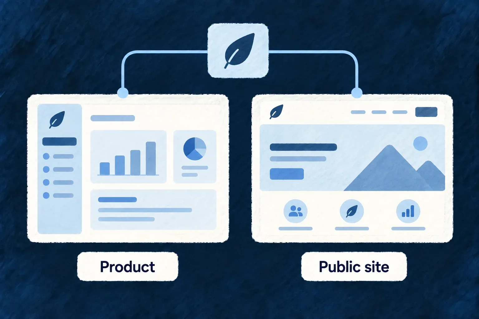
Documentation cards sorted into customer, administrator and developer reading paths
For engineers

The engine’s orientation definition demonstrates the distinction. This selected declaration is framework content metadata, not a standalone application registration:
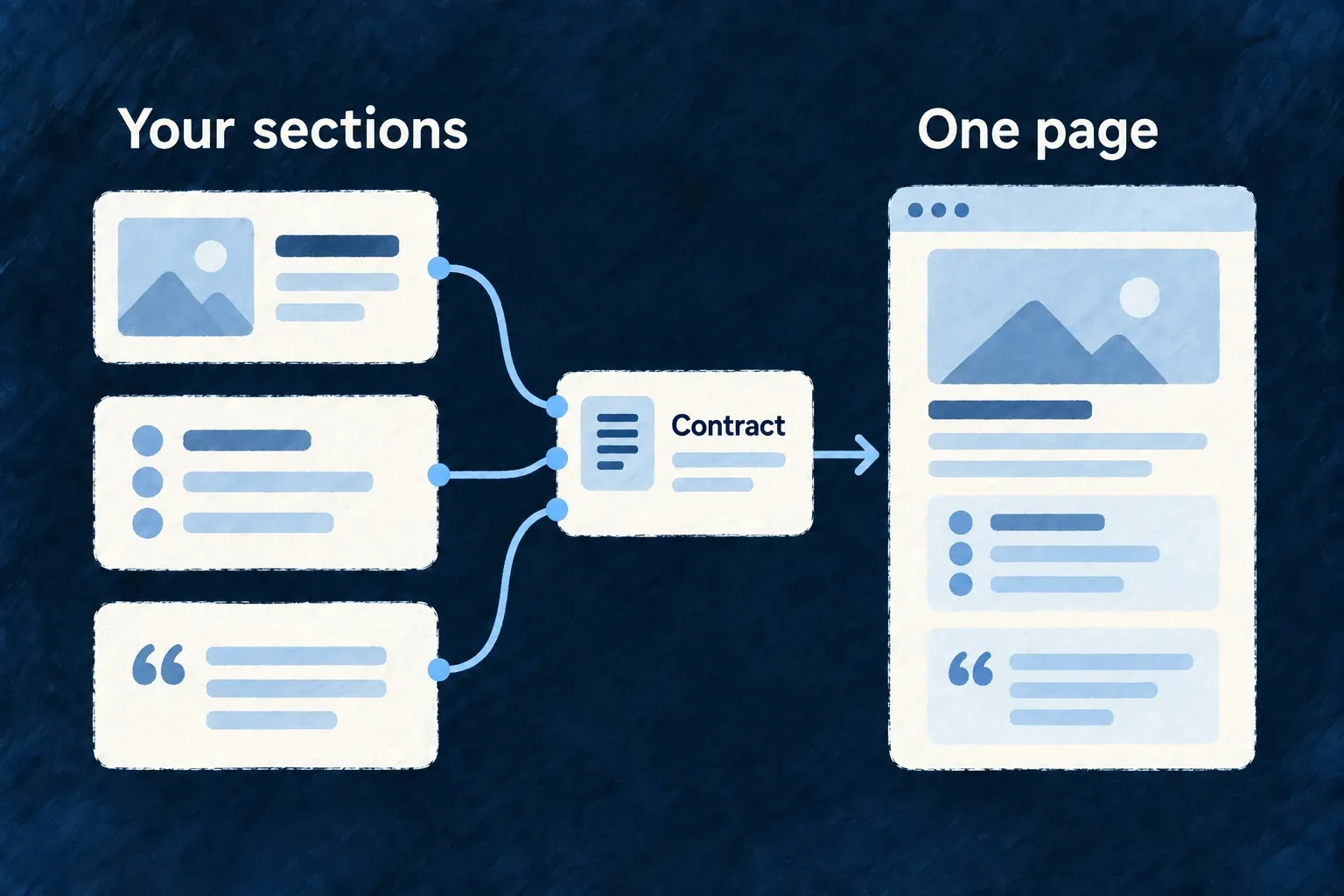
  'technical-documentation:unit/application-orientation': {
    kind: TechnicalDocumentationUnitKind.ORIENTATION,
    readerAudiences: [
      TechnicalDocumentationReaderAudience.APPLICATION_OPERATIONS_STAFF,
      TechnicalDocumentationReaderAudience.CONSUMING_INTERNAL_SERVICE,
      TechnicalDocumentationReaderAudience.EXTERNAL_INTEGRATION_DEVELOPER,
      TechnicalDocumentationReaderAudience.ORGANIZATION_ADMINISTRATOR,
      TechnicalDocumentationReaderAudience.ORGANIZATION_INTEGRATION_DEVELOPER,
    ],
    accessClass: TechnicalDocumentationAccessClass.PUBLIC,
    applicabilityRequirements: [],

The vocabularies come from @wildo-ai/saas-specifications/technical-documentation. Kind answers what the document does; reader audiences answer whom it serves; access class and applicability control different publication decisions. Audience is not an authorization role or a private-content gate.
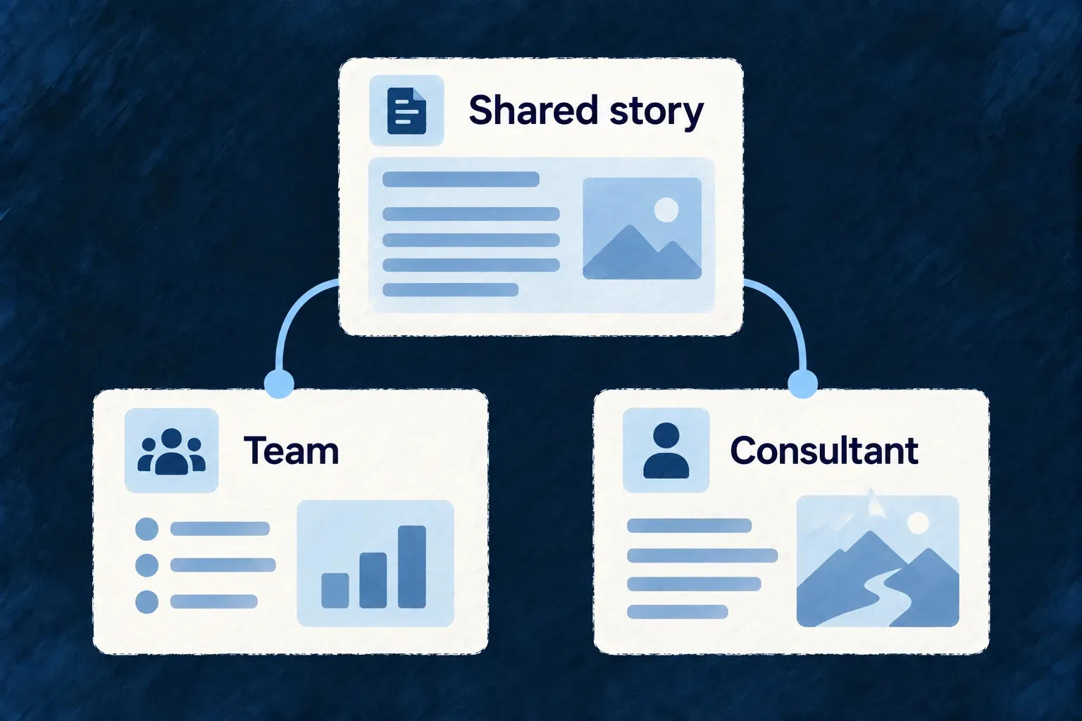
Compose a reading path, not a type list

The engine content catalogue joins this metadata to authored Markdown and related units. The managed renderer builds the portal’s categorized navigation and authored journeys. An application supplies its product/resource facts through the supported projection path; do not add a new unit to an arbitrary local file and assume the managed renderer will publish it.

Use an orientation to explain the product, a how-to for a concrete task and reference material for exact contracts. Verify that the generated navigation leads readers through that sequence and that each page answers its own question without relying on internal framework terminology.

Start with guides for the behavior you inherit Feature

Reusable guides explain common application behavior such as access, administration and integrations. Application facts adapt those guides so the reader sees the product they are using, rather than an unrelated framework manual.

Example: A guide that knows the application’s name and resources

The portal’s orientation introduces the application and its managed objects, then leads a reader into sign-in, administration or integration guidance.

Shared framework guide library filters into an application's own reader library
For engineers

The engine content bundle owns the prose and the stable unit identity. Its opening entry declares both its authored source and the application connection facts it uses:

    managedPath: 'get-started.md',
    unitRef: 'technical-documentation:unit/application-orientation',
    sourceRefs: [
      'saas-technical-doc:engine-content/application-orientation',
      'source:companion-projection:application-connection',
    ],

The surrounding engine catalogue supplies the Markdown body, document kind, audiences and relationships. Companion derivation resolves application names, resource descriptions and other admitted facts before rendering. It rejects unresolved fact tokens rather than displaying template placeholders as product documentation.

Publish only the applicable material

Publication policy evaluates whether the application’s resolved capabilities and evidence support a unit. Included pages become the managed site tree; suppressed material does not remain as a broken destination in a reader’s navigation. Missing evidence and observed inactivity are different states and must not be substituted for each other.

Review the derived portal after a product change. Shared authored guides reduce repeated writing, but do not make a custom business workflow self-explanatory. Application-specific terminology and projected resource semantics still need good source specifications, and custom articles need an accepted publication input.

Help your agent write useful product guidance Mechanism

The authoring guide asks the coding agent to start with the reader’s task and verify the product facts behind every instruction. It turns source knowledge into guidance for customers and administrators rather than a tour of framework internals.

Example: Explain how an administrator invites a colleague

The agent checks the actual invite action, required authority, expected result and recovery path before writing the steps a customer should follow.

An application author consults a writing guide and source evidence to produce a readable help article
For engineers

The installed application-consumer-documentation-authoring skill separates application-consumer writing from framework-developer knowledge. It asks for a source-fact matrix and verification of the steps, terminology, permissions and linked contracts.

Reader questionEvidence to inspectWriting consequence
Where do I start?Existing screen or entry pointName a reachable starting point
Who can do this?Accepted authority and scopeState the actual prerequisite
What happens next?Operation and visible resultExplain the outcome, not the implementation loop
What if it fails?Validation and recovery behaviorGive a useful next action

For a guide that points into API reference, use a semantic target rather than inventing a generated URL. This illustrative target names the normal reference root:

const referenceTarget = {
  section: TechnicalDocumentationApiReferenceSection.API_REFERENCE,
  kind: TechnicalDocumentationApiReferenceTargetKind.ROOT,
};

The target vocabularies are exported by @wildo-ai/saas-specifications/technical-documentation; the publication renderer resolves targets against the emitted reference. This is target data used by the supported documentation link model, not a complete article-registration API.

Keep authoring and publication distinct

A skill can guide writing without creating an application-local input to the managed publication pipeline. The current engine-owned catalogue and projected application facts have their own acceptance path. Confirm where an authored article will be accepted and rendered before treating a repository Markdown file as part of the managed portal. Installing the guide does not itself add that publication input.

Publish grounded material

Keep guidance connected to its evidence Guarantee

Guide claims can point to admitted sources and projected application facts. Publication checks that those references are meaningful for the application before turning them into public material.

Example: Only explain a connection the application exposes

An integration guide uses the application’s resolved connection facts. A page for an unavailable surface is withheld instead of sending customers toward a feature they cannot use.

A guide paragraph has two discreet citations connected to source cards; a third unavailable card remains outside publishedguide
For engineers

An engine-authored unit declares the source facts used by its prose. For example, the orientation connects its authored explanation to the application connection projection:

    managedPath: 'get-started.md',
    unitRef: 'technical-documentation:unit/application-orientation',
    sourceRefs: [
      'saas-technical-doc:engine-content/application-orientation',
      'source:companion-projection:application-connection',
    ],

This is a selected engine catalogue entry. Source references are not arbitrary repository paths: the manifest admits engine content, curated consumer facts and declared companion projections. Their identities allow derivation to check that requested facts exist and are used consistently.

Let publication resolve the claim

The companion assembles the application’s evidence snapshot, substitutes declared facts and applies the unit’s applicability requirements. Policy may include, redact or suppress with a named reason. Links to material that is not published are reconciled during rendering, rather than left as promises the reader cannot follow.

A valid source reference proves an admitted evidence connection, not the editorial quality of a sentence. Keep confidential provenance out of public publication, avoid treating missing observations as a negative result, and review the final rendered statement after substitutions. An integration-specific observation supports that integration; it does not establish every neighboring capability.

Show the product beside the instruction Feature

A real screenshot can make a guide’s instructions easier to recognize. The documentation asset contract distinguishes captured product imagery from a provisional placeholder, so an unfinished capture is not mistaken for proof of the interface.

Example: Prepare a guide before its capture environment is ready

A guide reserves a labelled image position while a capture is pending. Once a configured browser capture succeeds, the resulting product image can replace the provisional asset through publication.

A documentation page pairs written steps with an actual application capture; a separate outlined pending frame is visibly labelled Pending
For engineers

The capture implementation needs application-owned bindings: base URL, semantic target path, authenticated storage state, landmark, font profile and allowed origins. These identify what it should capture and under whose session. A generic page URL alone is insufficient.

The capture seam returns bytes and a receipt without choosing a publication directory:

export interface TechnicalDocumentationCaptureExecutionResult {
  readonly receipt: TechnicalDocumentationCaptureReceiptV1;
  readonly outputBytes: Uint8Array;
}
export interface TechnicalDocumentationCaptureExecutionPort {
  execute(request: TechnicalDocumentationCaptureExecutionRequestV1): Promise<TechnicalDocumentationCaptureExecutionResult>;
}

These interfaces live on the technical-doc companion surface. TechnicalDocumentationCaptureExecutionRequestV1 and its receipt come from the specifications technical-documentation entrypoint. The Node-only Playwright implementation is deliberately separate from ordinary application runtime dependencies; application tooling binds the implementation when a suitable environment exists.

Bind semantic references to the capture environment

This illustrative wiring uses the actual constructor contract from the separate capture package. The resolver functions are application-owned and deliberately remain execution-only:

const bindings = new TechnicalDocumentationPlaywrightCaptureBindings(
  resolveApplicationBaseUrl,
  resolveTargetPath,
  resolveStorageStatePath,
  resolveLandmark,
  resolveFontProfile,
  resolveAllowedOrigins,
);

const capture = new TechnicalDocumentationPlaywrightCapture(bindings);
const { receipt, outputBytes } = await capture.execute(request);

Import the two classes from @wildo-ai/technical-documentation-capture. Supply a validated TechnicalDocumentationCaptureExecutionRequestV1: its definition names the semantic target, authentication-state reference, landmark, locale, viewport, theme, network policy and capture interactions. For example, the target resolver maps the declared target to the actual list route; the auth resolver supplies a temporary authenticated browser state; the landmark resolver supplies the test ID that must be visible before capture. Unknown references must fail resolution rather than capture a convenient default screen.

The bindings can contain secret-tainted storage paths and explicitly reject JSON serialization. The capture returns bytes in memory and a receipt; the publication transaction chooses where to write them. A declared request and a constructed adapter are not evidence that a browser captured the intended user state.

Decide whether provisional imagery may be published

A screenshot request without capture output can resolve to a recognizable placeholder. It remains a required asset with provisional status, not a successful observation. Publication can refuse provisional assets according to its acceptance options. Inspect the actual captured screen and receipt; deterministic diagrams have a separate production path and must not be described as screenshots.

Publish guides as a navigable documentation site Mechanism

Turn the accepted documentation bundle into pages, navigation and search data that belong together. Managed output checks catch missing destinations and malformed artifacts before the portal consumes them.

Example: A guide appears in the right reading journey

A newly included guide has its page, category and related navigation produced together. A removed guide does not leave a sidebar link pointing nowhere.

One document collection produces a readable page, sidebar and search panel in a coherent docs site
For engineers

The companion exposes separate preparation and publication operations. These are route names under its /api/companion base, not commands to send to the application’s customer API:

POST /api/companion/technical-doc/generate-openapi
POST /api/companion/technical-doc/publish-openapi
POST /api/companion/technical-doc/derive-bundles
POST /api/companion/technical-doc/publish-managed

Use the application’s companion tooling and its required request/access contract. OpenAPI publication establishes the reference targets used by guide links. Managed publication renders the accepted content, assets and navigation into the application-owned generated tree.

Inspect the outputs as one set

The Docusaurus renderer creates pages, directory labels and journey sidebars. Markdown escaping preserves code-like prose in MDX; unresolved required reference targets fail rather than produce plausible-looking links. A shared search index describes the published pages.

The managed-tree validator enforces output budgets, public-content sentinels and link integrity. The site consumer requires its output manifest, document tree and sidebar. Keep generated files together during review and deployment; editing an emitted page by hand competes with the next publication. Generation success is artifact evidence, while a rendered browser page is a separate acceptance check.

Continue into documentation with a short-lived session Feature

A configured documentation site can receive a sign-in handoff from the application. It holds a short-lived session for participating documentation interactions while the application remains the owner of authentication.

Example: Open documentation from a signed-in application

The application issues a single-use code for its configured documentation service. The portal exchanges it and continues to the intended local page without asking the reader to repeat the login.

Application sends a single-use pass into a docs session with a small time dial
For engineers

The documentation root mounts DocsAuthProvider when its API origin is configured and passes the docs frontend service name. That name must match the declared target so the backend can validate the exchange. The current Wonder Todos portal includes both the provider and its /auth/exchange route.

This selected route fragment shows why navigation must stay inside the existing SPA tree:

const sessionIsAvailable = typeof apiBaseUrl === 'string' && apiBaseUrl.length > 0;

// Inside the existing Docusaurus Layout and main element:
{sessionIsAvailable ? (
  <AuthExchangePage onSuccessNavigate={(returnPath) => history.push(returnPath)} />
) : (
  <p>This documentation site is not connected to an application.</p>
)}

AuthExchangePage and the provider come from @wildo-ai/saas-technical-doc/runtime. The surrounding Docusaurus route supplies history and apiBaseUrl from its router and configuration. A full reload would discard the in-memory session immediately after exchange; client-side navigation preserves it.

Keep authentication separate from content protection

The backend validates the target and consumes the code. The docs provider keeps the access token in memory with expiry; it does not add persistent session storage or a refresh loop. A new tab or expired session needs a fresh handoff.

Mounting this receiver does not make static documentation private. Protected publication and authorization of an interactive API request are separate concerns. Configure the target’s public origin, API origin and service name, and verify the actual exchange with the intended deployment before claiming a working authenticated journey.

Make the API understandable

Keep the API reference tied to real operations Mechanism

The API contract is derived from the application’s resolved resource operations and authored specifications. That connects endpoint descriptions and request shapes to the mechanisms integrations actually call.

Example: Expose a new business action

A declared action with its inputs and access policy appears in the projected API contract. The reference explains that action from its specification instead of inventing a second handwritten endpoint definition.

Declared resource operations flow into an API document and an endpoint reference with matching rows
For engineers

The application’s documentation configuration supplies its supported API version, resource selection and server addresses. A selected Wonder CRM configuration fragment illustrates those inputs:

export default defineTechnicalDocConfig({
  supportedApiVersion: '1.0.0',
  publicMarketingTitle: 'Wonder CRM — Technical Documentation',
  apiDocResources: 'all',
  apiServers: [
    { url: 'http://localhost:4251', description: 'Local development' },
  ],
  // Existing category and overview settings remain here.
});

defineTechnicalDocConfig is a public root export. The server URL is an origin: operation paths already include the API mount. 'all' includes the eligible core resources in addition to application resources, subject to the resolved feature and publication inputs.

Carry the operation’s meaning into its reference

Wonder CRM’s company specification authors this CREATE description. This selected operation entry uses its existing Op and HTTP-status enums:

[Op.CREATE]: {
  purpose: 'Record a new company.',
  outcome: 'The new company exists, with its identifier and the time it was created.',
  responseStatuses: [{ code: HttpResponseStatusCode.CREATED_201, meaning: 'The record was created and returned.' }],
  errorScenarios: [
    { code: HttpResponseStatusCode.BAD_REQUEST_400, when: 'The payload fails validation.', errorCode: 'VALIDATION_FAILED' },
  ],
  idempotent: false,
  // The specification also supplies request/response examples.
},

The company resource configuration enables CREATE with its shared schema and resolved access policy. Its specification supplies meaning; neither the specification alone nor this excerpt creates an endpoint.

The inspected generated API artifact carries that meaning into the ordinary route:

/api/v1/organizations/{organizationId}/company:
  post:
    operationId: createCompany
    summary: Create company
    description: |-
      Record a new company.

      The new company exists, with its identifier and the time it was created.

This is a selected snapshot of Wonder CRM’s generated api.json, expressed as YAML for reading. The full operation also carries its parameters, request body, security and responses. The snapshot demonstrates the declaration-to-reference join; it does not report an endpoint call made during this website work.

Project, reconcile, then publish

Introspection produces JSON-safe operation projections and the inventory they came from. The service reconciles that inventory against the projections before generating OpenAPI. Specifications supply semantic descriptions; resolved access documents supply operation security. Generation and publication are separate companion operations.

Inspect the generated documents and the browser reference after changing a resource contract. Conservation checks establish that eligible operations were not lost in projection; they do not execute an endpoint or prove the target server is deployed at the configured address. Custom operation documentation still needs meaningful authored input and result descriptions.

Organize the reference around the product Mechanism

Group API resources by the work they support, with names and descriptions readers can recognize. The engine supplies groups for its own resources; the application names the concepts only it understands.

Example: Find customers before learning internal names

A CRM reference puts companies and contacts together under a clear customer heading, instead of asking an integrator to scan an undifferentiated resource list.

Endpoint cards grouped into named user-centric shelves instead of scattered alphabeticalcards
For engineers

Wonder CRM supplies these category entries inside apiReferenceResourceCategories. This is the first entry from its existing configuration:

  apiReferenceResourceCategories: [
    {
      id: 'customer-records',
      label: 'Companies and contacts',
      description: 'The organizations you sell to and the people you deal with at them.',
      resourceNames: ['company', 'contact'],
    },
    // Other application categories follow.
  ],

The resource names are resolved API identifiers, not display labels. The companion merges application assignments with the engine’s specification-derived defaults. An explicit application assignment can replace the default category for a named engine resource when a shared product taxonomy is useful.

Keep the assignment exact

Duplicate category IDs, a resource assigned twice, an unknown resource name or an uncovered published resource are publication errors. The application should normally describe its own resource groups and allow the engine to maintain the engine groups.

After changing a resource or category, regenerate the reference and inspect the category navigation. Good grouping needs human judgment: the validator can detect inconsistent ownership, but cannot decide whether a heading helps a first-time integrator understand the product.

Separate everyday integration from application administration Feature

The reference distinguishes ordinary application operations from operations reserved exclusively for administrators of the application itself. Readers can focus on the contract relevant to their work.

Example: A tenant integration reads the normal API

An integration developer uses organization-scoped operations in the normal reference. Platform-level administration operations appear in their own section; organization administration is not automatically application administration.

A resolved operation registry splits into a regular API reference and an administration reference; two distinct document books
For engineers

The projector examines each operation’s resolved access authorities. Only a non-empty set consisting exclusively of application-administration roles selects the administration reference. Mixed-authority operations remain in the normal reference; scope names alone do not determine the split.

The generator owns one filename map for both formats:

export const OPENAPI_OUTPUT_FILENAMES: Readonly<Record<OpenApiSection, Readonly<{ yaml: string; json: string }>>> = {
  [OpenApiSection.API_REFERENCE]: {
    yaml: 'api.yaml',
    json: 'api.json',
  },
  [OpenApiSection.APPLICATION_ADMINISTRATION_API_REFERENCE]: {
    yaml: 'application-administration-api.yaml',
    json: 'application-administration-api.json',
  },
};

This is the actual generator contract, not an application override. The publication service writes the emitted sections to the stable reference tree and the portal consumes them. A section with no operations is omitted rather than published as an empty promise.

Preserve one classification decision

Do not repartition operations again in the frontend based on guessed role names or URL paths. The renderer should consume the section selected by projection. Separating reference navigation does not add authorization: runtime operation access remains enforced by the backend, and the publication policy governs what documentation may be public.

A coherent experience, with room to make it yours.

A useful interface is more than a collection of screens. Its fields, actions, visual language and navigation should make sense together.

Wildo connects the standard parts to the application model. You decide how people work, what deserves a custom interaction and how the product should feel.

Building a B2B product or an internal tool?

Wildo is not self-service yet. Tell us what you have in mind and we will say plainly whether it fits, and what happens next.