


Wildo.ai Coming soon

Let the framework wire it

Turn resource declarations into standard services, API routes and form behaviour; add custom operations in the same structure.

Services · APIs · forms · application context

A useful application needs more than working components. Its screens need context, its actions need services, its messages need recipients, and its words need to make sense in each language.

Wildo provides those connections around declared resources, registered components and configured services. You choose how your product behaves within that structure, and implement the parts that make it yours.

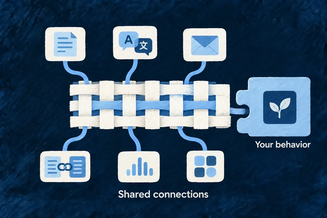
Shared connections carry information between forms, language, messages, records, events and custom behavior.

Configure the middle. Create at the edges.

Make a change without rebuilding its surroundings

A resource declaration gives the application a shared description of its fields, relationships and actions. The engine uses it to assemble standard services, API routes and form behavior. A custom operation can join that structure with its own inputs and implementation.

The value is continuity: adding business behavior does not mean assembling another independent stack of validation, request handling and presentation conventions. Explore the resource system for the contracts behind those connections.

A custom blue action piece slots into an already connected ivory assembly linking a form, a route and a data store. Connections remain calm and complete around the new piece.
  • A contract across layers: Declared fields and actions inform standard services and interfaces.
  • Custom behavior fits in: Application operations join the existing runtime through explicit contracts.
  • Less repeated integration work: Validation, requests and presentation have an established surrounding structure.

Give each screen the context it needs

A screen sits inside an application, a session, an organization and often a particular record or action. Wildo carries that context through its frontend providers and resource managers, so standard views can work with the same records and operation state.

You can choose a component preset, refine a field’s display policy or build a custom view. The shared context gives those choices somewhere to belong. A custom screen can be distinctive while still participating in the application’s data and navigation behavior.

Nested ivory frames representing application, organization and record context surround two distinct blue views of the same object. Fine threads connect the central record to both views, with no dense labels.
  • Context travels with interaction: Views receive application, session, organization and operation context.
  • Shared record lifecycle: Resource managers coordinate data used by connected standard views.
  • Flexible views stay connected: Custom layouts can participate in the application’s existing behavior.

Carry meaning into words and messages

Field and resource specifications supply context for generating labels and translations. Email definitions supply purpose, tone and variable slots for generating templates. The application then loads and uses those prepared assets through its translation and notification systems.

This removes repeated plumbing around language and communication. You still shape the vocabulary, review the wording and decide which events should notify which people.

An ivory meaning sheet branches into translated speech cards and a carefully composed open envelope. Blue paint unifies both outputs.
  • Meaning guides the wording: Specifications provide context for labels and supported translations.
  • Emails with a purpose: Definitions guide template content, tone and variable slots.
  • Prepared assets at runtime: Application services consume the reviewed language and message assets.

Connect events to the right response

WebSocket updates can tell resource managers when to refresh data. Configured notifications can produce messages or email. Webhooks connect declared events and external handlers through their own delivery and verification mechanisms.

These are separate connections with explicit purposes. Choose the response your product needs; the framework supplies the surrounding mechanisms. A record update does not have to become a notification to everyone.

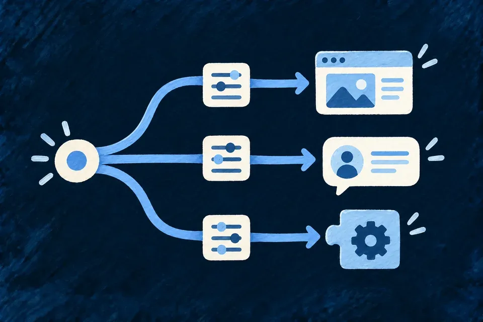
One small blue event ripple branches into three different paths: a refreshed view, a message addressed to a person and a bridge to an external system.
  • Views can stay current: WebSocket events can trigger resource refresh and reconciliation.
  • Notify the right audience: Configured rules connect events with people and delivery channels.
  • Connect external systems deliberately: Webhooks carry selected events through their own delivery mechanisms.

Example: Add an assignment action

A custom assignment operation checks the application’s eligibility rules and changes the responsible person. Its declared contract makes it available through the configured API and interface. Resource updates can refresh connected views; a separately configured notification can tell the new assignee what happened.

Understand the connections you are configuring

Use shared context and explicit extension points

ConnectionWildo providesYour application defines
Resource to APIResource services and operation routingSupported operations, inputs, policies and custom implementations
Resource to screenResource-manager and operation-view contextPresets, display policies, layout and custom views
Specification to languageLabel planning, generation and runtime lookupMeaning, supported languages and reviewed wording
Notification to emailTemplate loading and channel dispatchTrigger, audience, content and template configuration
Event to connected viewWebSocket bridge and resource refresh behaviorApplicable events and views using the shared manager
Event to another systemConfigured webhook handling and deliveryEvent selection, destinations and business handlers

Keep the lifecycles distinct

Label and email generation prepare assets during development. Runtime translation and notification services consume those assets. Regeneration is a deliberate development operation, not an LLM request made whenever someone opens a form or receives a message.

The frontend’s application context carries session, organization, navigation and feature information into resource views. The resource-manager WebSocket bridge reconciles updates through its data lifecycle. Backend access checks remain authoritative: having frontend context does not grant permission.

Add your behavior through the public contract

Custom implementations are registered and validated before the runtime exposes them. A component can use the resource-operation context instead of reconstructing a separate data flow. A notification or webhook requires its own declaration and configuration.

The harness and framework knowledge help a coding agent find those extension points. The aim is to write the application-specific decision while retaining the framework’s surrounding behavior.

Explore the underlying mechanisms

Make the interface feel like one product

Shared components, design configuration and product language give screens a consistent starting point. Change the presentation at the level that owns it, from a color role to a registered component.

Wildo supplies the common rendering mechanisms. You choose the visual character, the words people read and the custom interactions that distinguish the application.

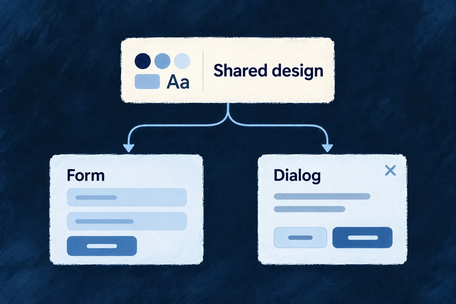
Shared design choices give a form and a dialog a consistent appearance.

Consistency with room for your own choices

Adapt the right part

Choose a theme for shared visual treatment or replace a registered component for a different implementation. The surrounding screens can keep their contracts.

Carry behavior across screens

Shared surfaces and navigation handle recurring focus, scrolling and viewport decisions. Custom content builds on these mechanisms with its own accessible structure.

Give wording a common home

Specifications guide label generation, and the translation tree serves the interface. Review terminology once at its owner instead of inventing it inside each screen.

Example: A new customer screen that belongs to the product

A customer summary uses standard cards and actions, the application’s light and dark palette, and its translated resource labels. A specialist control replaces one registered component. The application owns that control’s behavior while the surrounding screen continues using the shared design system.

For engineers

Start with the application’s existing composition

The frontend module registry combines resource UI behavior, application views and component registrations. Its component loader installs framework presets before application contributions. Design configuration is converted separately, and labels reach the browser through the backend’s i18n service.

These are connected inputs, not interchangeable ways to customize a screen:

Desired changeOwning declarationConsumer
Replace a registered implementationComponent registration with matching slot and presetRuntime wrapper and registry
Change common visual treatmentDesign source configuration and themeUI provider, recipes and tokens
Change a container’s shared behaviorSurface policy at the owning levelSurface and participating descendants
Adapt navigation by viewportNavigation configurationNavigation policy resolver and hosts
Change product wordingLabel units and their specificationsBackend locale publication and frontend i18n helpers
Change allowed browser sourcesSurface/environment CSP configurationGenerated artifact and delivered server policy

Preserve the setup when extending it

Wonder Todos’ frontend/src/modules-registry.frontend.ts resolves its design system with this expression:

export const frontendResolvedDesignSystemConfiguration =
  createDesignSystemConfigurationFromSourceConfig(designSystemConfig);

The resulting configuration is passed through buildFrontendModuleConfigOverrides as designSystemConfiguration. Its component loader separately awaits registerFrameworkFrontendComponents() and then registerFrontendComponentRegistrations(frontendModuleRegistry.componentRegistrations). Keeping those paths distinct allows a theme change without replacing component code, or a component replacement without abandoning application-wide tokens.

Put the three customization paths together

For example, an application can use the resource-reference edit adapter while selecting its own theme. Keep those choices in their actual startup owners:

const designSystemConfig = defineDesignSystemConfig({
  ...existingDesignSystemConfig,
  theme: applicationTheme,
});

const designSystemConfiguration = createDesignSystemConfigurationFromSourceConfig(designSystemConfig);

const componentLoader = async () => {
  await registerFrameworkFrontendComponents();
  await registerFrontendComponentRegistrations(frontendModuleRegistry.componentRegistrations);
  registerApplicationPicker();
};

This is an illustrative composition of the capability examples. Import the design helpers from @wildo-ai/presets-components-models and registerFrontendComponentRegistrations from @wildo-ai/saas-frontend-lib. Keep your application’s existing registerFrameworkFrontendComponents wrapper, which registers the framework defaults; that wrapper belongs to the application. applicationTheme is the recipe override, and registerApplicationPicker is the EDIT-category adapter. existingDesignSystemConfig preserves the application’s tokens and other choices. Pass the resolved designSystemConfiguration into buildFrontendModuleConfigOverrides and this loader into the main provider options.

The adapter preserves the original picker’s labels, value contract and ref. Product wording still comes through its resource/component specifications and published label units; neither a CSS class nor component registration translates it. Update those label sources and run the normal label pipeline when wording changes. The resulting screen combines application styling, a replaced registered implementation and the existing language contract without merging them into one mechanism.

Check the seams that an isolated component cannot prove

A custom component must honor its props, refs and state contracts. A custom surface needs a single accessibility owner. A theme needs its tokens and CSS utilities available. A translated label needs a published unit. A CSP declaration needs the correct delivered header before it affects the browser.

Review the complete screen with keyboard input, long labels, both color modes and a narrow viewport. Shared mechanisms reduce repeated work; the assembled product is still the unit a person experiences.

Choose the building blocks

Start with working interface building blocks Feature

The preset library supplies implementations for controls, content containers and application interfaces. They use the same component contracts and shared styling services as the rest of Wildo.

That gives a new screen familiar behavior without assembling a separate visual toolkit. You still choose the composition and supply the product’s actions and content.

Example: A new screen that belongs to the same product

A customer summary uses the existing cards, buttons and inputs. Its controls pick up the application theme and shared interaction states, while the application decides what the actions do.
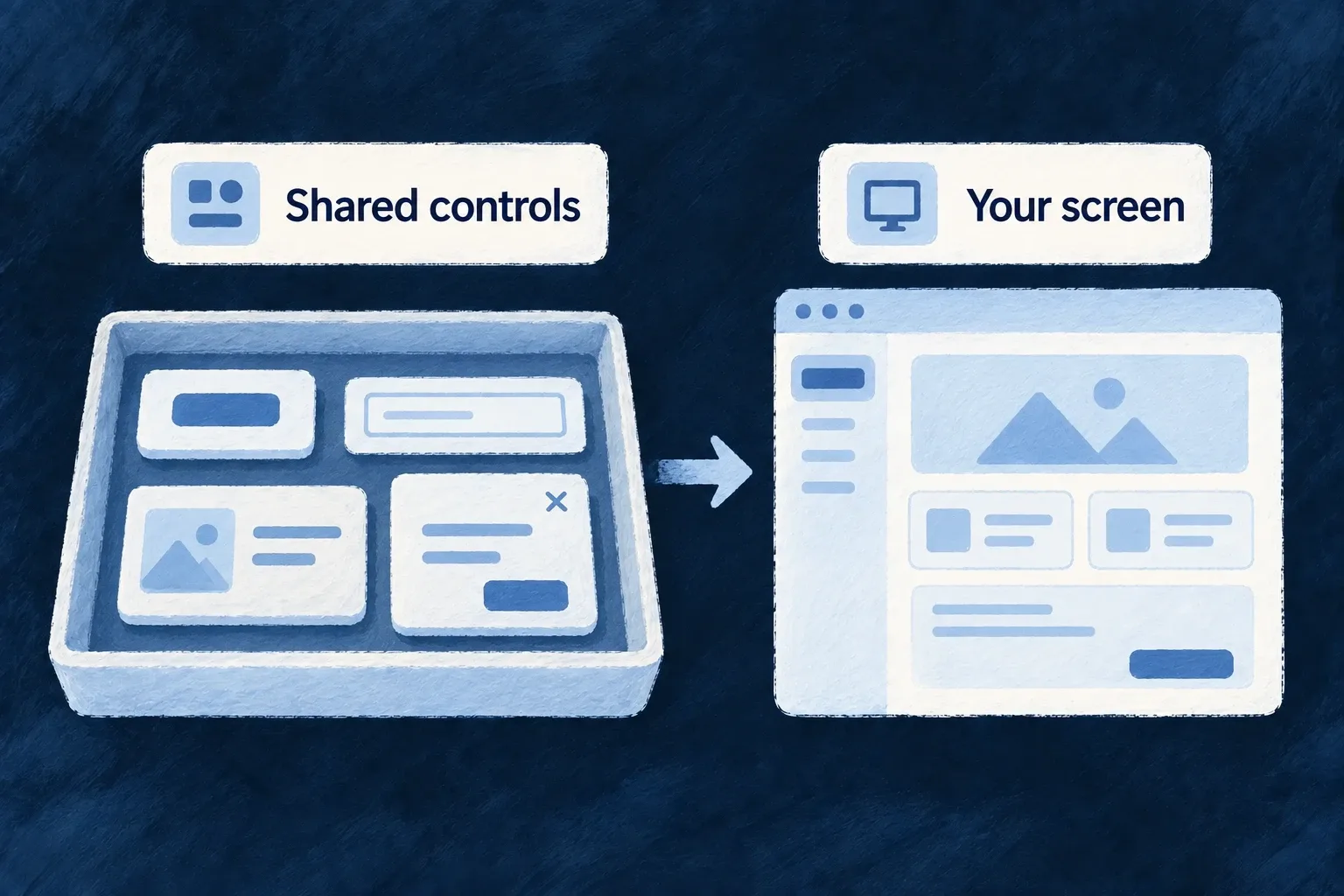
Shared controls assemble into an application screen.
For engineers

Application code consumes wrappers from @wildo-ai/saas-frontend-lib; the presets package supplies their implementations. Wonder Todos’ registerFrameworkFrontendComponents performs this startup sequence after importing the registration functions:

  registerDefaultIcons();
  registerDefaultPresets();
  registerDefaultAnimations();
  registerBuiltinCommonEnums();
  registerFrameworkLayouts();

  // Tier-1 completeness guard. Throws in dev when a registry-resolved
  // FrontendComponentType is missing a default preset; warns in prod.
  // See compound-component-system.md Section 15 for the Tier-1/Tier-2 model.
  assertRegistryCompleteness();

The function is awaited by the application’s component loader before module-specific registrations. Icons, animations and common enum registrations are separate dependencies of the complete interface; registering components alone is not the whole startup sequence.

Keep interaction contracts when composing a screen

The supplied button maps its public variant to a theme recipe. The actual preset then assembles these states:

  const classes = cn(
    STRUCTURE,
    recipe.base,
    recipe.states.hover,
    recipe.states.active,
    recipe.states.focus,
    recipe.states.disabled,
    recipe.states.invalid,
    recipe.sizes?.[size],
    recipe.motion.transition,
    className,
  )

That is why using the same wrapper carries focus, disabled and invalid appearance into another screen. Its loading state disables the native button and adds aria-busy; the application still controls when loading starts, error feedback and the operation itself. The asChild path composes into another element and does not apply the same loading behavior automatically.

The registry completeness check catches missing injectable slots: it throws in development and warns in production unless strict mode is selected. It does not prove the accessibility, correctness or visual fit of your custom composition. Verify the controls in the real screen, including keyboard use and failure states.
Replace the parts that make your product different Mechanism

Wildo’s replaceable components have named slots: a button, a field control or a layout can resolve a registered implementation instead of importing it directly.

Keep the supplied implementation where it fits. Register an alternative where your product needs something different, while preserving the contract used by its callers.

Example: A specialist view inside the application

A planning product adds a focus view for its own workflow. The application registers that view under a stable name, and the configured launcher refers to that name. Standard controls elsewhere keep their existing implementations.

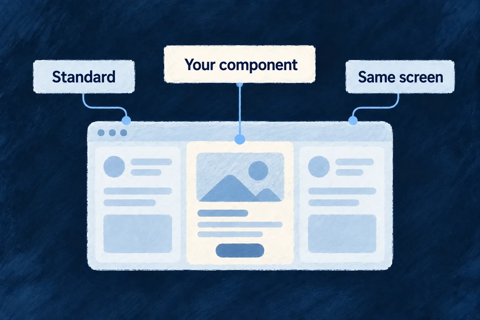
A custom component replaces one part within a shared screen.
For engineers

Wonder Todos registers a custom focus view in frontend/src/modules/example-dev/index.ts. This is the actual selected registration; the surrounding module also contributes its view definitions and shell placement.

    {
      componentRef: FOCUS_HUB_SMOKE_COMPONENT_REF,
      loadComponent: async () => {
        const module = await import('./app-level-views/FocusHubSmokeView.js');
        return module.FocusHubSmokeView;
      },
      preset: CorePresetNames.DEFAULT,
      isConfigurable: false,
    },

componentRef must agree with the view definition or wrapper that requests it. loadComponent returns the React implementation. preset selects the registry key; a replacement must meet the props and ref contract expected by the existing wrapper.

The application’s modules-registry.frontend.ts then registers defaults before its module contributions:

    componentLoader: async () => {
      await registerFrameworkFrontendComponents();
      await registerFrontendComponentRegistrations(frontendModuleRegistry.componentRegistrations);
    },

The module belongs in applicationFrontendModules, which feeds buildFrontendModuleRegistry. The resulting componentLoader is handed to application initialization. These asynchronous imports may form separate bundles, but this loader awaits them at startup; they are not automatically deferred until a screen opens.

Replace the edit category without replacing display

An existing resource-reference field uses one slot with separate EDIT and DISPLAY registrations. This illustrative adapter preserves the existing picker’s behavior while adding a local styling hook. It captures the implementation after defaults load, then replaces only the edit key. The public props and forwarded ref remain intact.

import { forwardRef } from 'react';
import {
  ComponentRegistryService,
  type ResourceFieldEditPreset_ResourceReference_DefaultProps as PickerProps,
  type ResourceFieldEdit_ResourceReferenceRef as PickerRef,
} from '@wildo-ai/saas-frontend-lib';
import {
  FrontendComponentType, CorePresetNames, FrontEndComponentResourceFieldCategory,
} from '@wildo-ai/presets-components-models';

export function registerApplicationPicker(): void {
  const slot = FrontendComponentType.RESOURCES_FIELDS_RESOURCE_REFERENCE;
  const preset = CorePresetNames.DEFAULT;
  const category = FrontEndComponentResourceFieldCategory.EDIT;
  const Original = ComponentRegistryService.resolve(slot, preset, category);
  if (!Original) throw new Error('Register framework components before the picker adapter');

  const ApplicationPicker = forwardRef<PickerRef, PickerProps>((props, ref) => (
    <Original
      {...props}
      ref={ref}
      className={['application-reference-picker', props.className].filter(Boolean).join(' ')}
    />
  ));
  ApplicationPicker.displayName = 'ApplicationPicker';

  ComponentRegistryService.register(slot, preset, ApplicationPicker, {
    category,
    isConfigurable: true,
  });
}

Call registerApplicationPicker() once at the end of the application’s component loader, after framework defaults and module registrations. The generated field’s ResourceFieldEdit_ResourceReference wrapper then resolves this exact slot/preset/EDIT key. Its display wrapper continues resolving DISPLAY, which was not changed. The class is an application-owned hook; define its styling in the application’s stylesheet.

Capturing Original before registering avoids resolving the adapter from inside itself. Do not render the public resolving wrapper inside its own replacement: that would recurse. A completely new picker may replace the captured implementation, but must preserve value changes, disabled/error behavior and the forwarded input/button ref. isConfigurable is metadata, not an overwrite lock; the last registration for a key wins.

Choose the replacement boundary deliberately
ChoiceMeaning
Existing slot and presetReplace that registration; the last registration for the same key wins
Another preset on the slotOffer an explicitly selected alternative
New component referenceAdd a custom view with its own caller and definition
A framework-owned direct rendererUse its supported configuration or extension point; its named specification slot alone does not make it injectable

Direct registry keys also include a field category where applicable. Module contributions merge by componentRef, so two module entries with that same reference do not preserve independent presets merely because their preset names differ.

A missing requested preset does not silently use Default: the resolver shows a development placeholder and renders no component in production. Keep the startup completeness check and exercise the exact preset your screen requests.

Explain when and how a component should be used Mechanism

A component needs more than a name. Its specification explains its purpose, when it fits, the inputs it accepts and how its registered implementations relate to that contract.

Wildo makes this guidance available to development tools and language generation. Application authors can understand a component’s intended use before composing or extending it.

Example: Choose a card for the right reason

A summary card’s specification describes its header, content and action regions, and suggests where that grouping helps. A builder can choose it for a customer snapshot rather than guessing from its export name.

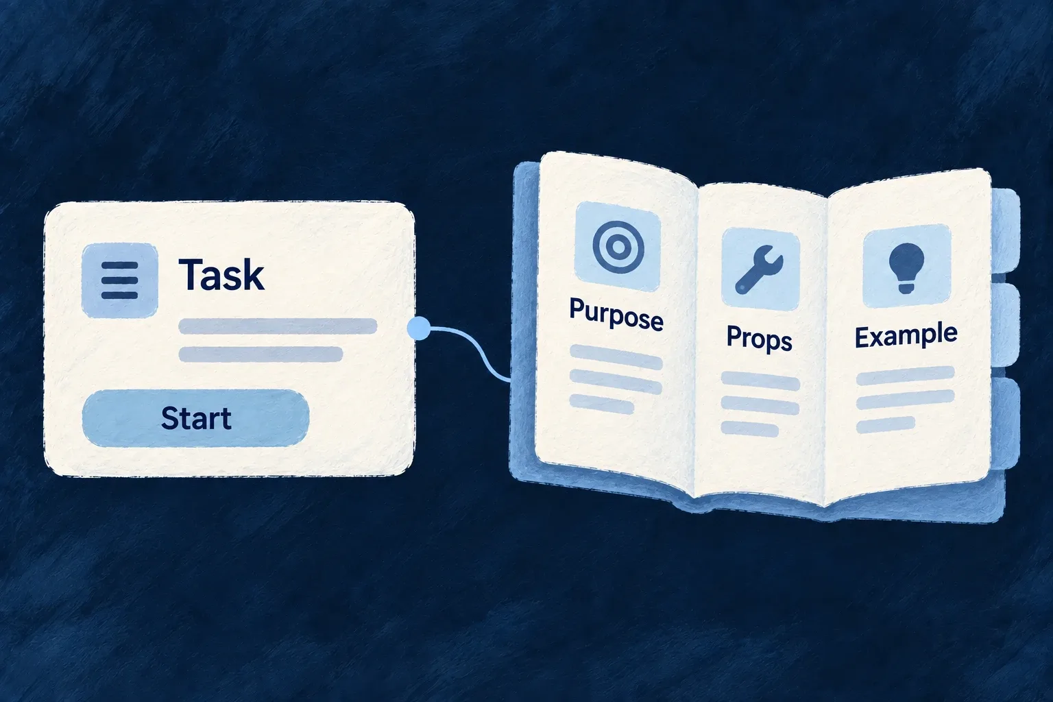
A component is described through its purpose, props and example.
For engineers

The framework’s card specification uses frontendComponentSpecification and names the same LOW_LEVEL_CARD reference used by the runtime. This selected source captures its authoring guidance:

    componentId: 'framework.low-level.card',
    purpose:
      'Group related content with header, title, description, actions, and body regions in a surfaced container.',
    uiRole:
      'Compound card shell: `Card`, `CardHeader`, `CardTitle`, `CardDescription`, `CardAction`, `CardContent`, `CardFooter`.',
    useWhen:
      'Use for summaries, entity snapshots, dashboard tiles, and form sections that need a clear boundary.',
    avoidWhen:
      'Avoid nesting many interactive cards inside tiny lists without spacing; consider table rows instead.',
    compositionNotes: [
      'Sub-components are separate exports that share the same registry preset.',
    ],

The same specification records CardProps, its preset vocabulary, a compound-card usage example and the implementation/registration symbols. Those connections matter: guidance for an old prop or nonexistent preset would mislead the next author even if the prose sounded useful.

Publish the specification to its consumers

An application-owned specification belongs in its specifications package and must be included in the frontendComponentSpecifications companion export. Wonder Todos already publishes the framework’s specification map there. The companion’s component-specification context factory and labelling context loader read that map to provide component meaning and prop information.

RecordResponsibility
Runtime registrationMakes a component implementation available to its callers
Component specificationExplains that contract and the intended use of its presets
Label declaration and generated bundleDefines the wording keys and supplies their values

Writing a specification does not register the React implementation. Keep those separate connections aligned when adding a custom slot or preset. Include a useful composition example and explain constraints that a caller must respect; changing only the visual recipe generally belongs in the theme configuration rather than a new component specification.

Shape a consistent interface

Give the whole interface a consistent visual language Mechanism

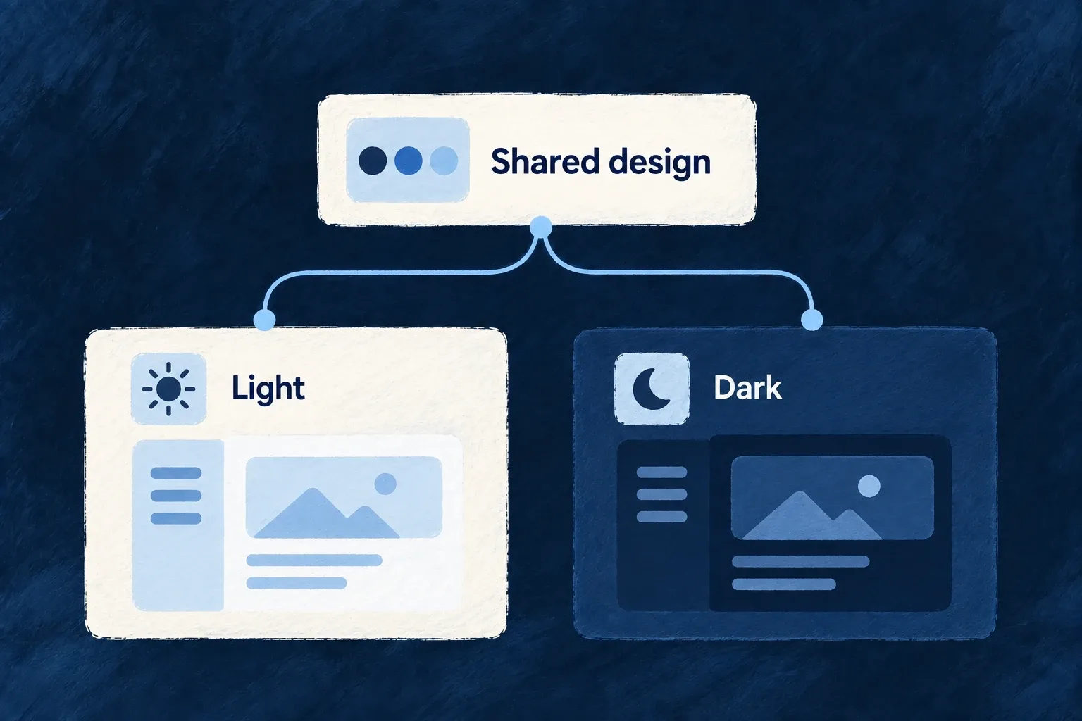
A design system gives recurring choices—colors, surfaces, spacing and typography—a common home. Wildo’s standard components consume those choices across the application.

Light and dark appearances can carry different values without becoming separate sets of screens. You choose the palette and theme, and check the result with your real content.

Example: The same workspace after dark

A customer switches appearance. The workspace keeps its layout and actions while backgrounds, text, borders and interaction colors use the dark palette.

One shared design supplies matching light and dark appearances.
For engineers

Wonder Todos starts from DEFAULT_DESIGN_SYSTEM_SOURCE_CONFIG and overrides semantic groups in frontend/src/config/design-system.config.ts. These are actual selected dark-mode values from its colors block:

    dark: {
      ...DEFAULT_DESIGN_SYSTEM_SOURCE_CONFIG.colors.dark,
      background: 'oklch(0.129 0.042 264)',
      foreground: 'oklch(0.968 0.007 247)',
      primary: 'oklch(0.746 0.16 232)',
      'primary-foreground': 'oklch(0.129 0.042 264)',
      secondary: 'oklch(0.279 0.041 260)',
      'secondary-foreground': 'oklch(0.968 0.007 247)',

The selection omits the rest of the dark palette, light palette and enclosing defineDesignSystemConfig call. Background/foreground pairs describe how content reads; primary and its foreground describe an action pair. A change to one should be evaluated with the other.

The application converts the authored source once:

export const frontendResolvedDesignSystemConfiguration =
  createDesignSystemConfigurationFromSourceConfig(designSystemConfig);

That result is passed as designSystemConfiguration in buildFrontendModuleConfigOverrides. UIProvider applies the resolved tokens and appearance; presets retrieve recipes through useUI. A custom component inherits the system when it consumes those tokens and recipes, not merely because it renders somewhere inside the app.

Separate palette, visual treatment and behavior
ConfigurationControls
Color and surface groupsSemantic values for light and dark modes
Theme recipesHow controls and containers use those values and interaction states
Typography and spacingShared type and layout scales
Surface policiesContainer behavior observed by participating children

Use subtle interaction tints for hover and selection rather than treating every accent as a saturated brand color. Test text, focus indicators, disabled controls, charts and third-party content in both modes; token configuration cannot establish their readability by itself.

Change the visual character without rebuilding screens Mechanism

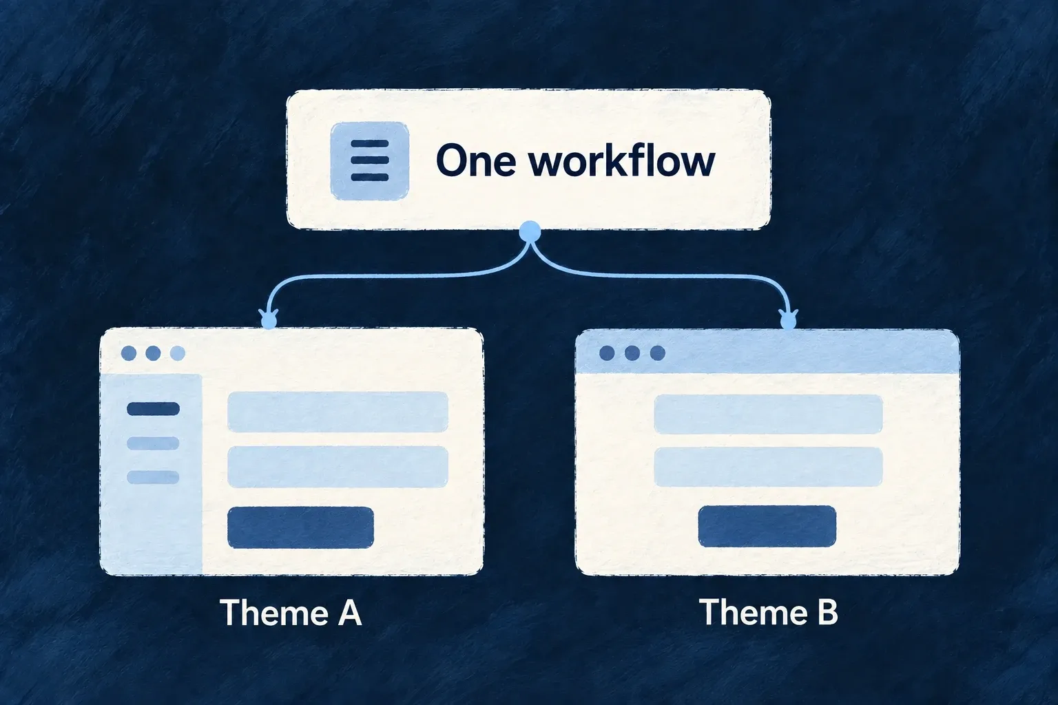
A component theme describes the visual treatment of shared interface behaviors: primary actions, inputs, selected items, containers and text.

Choosing another theme changes how participating components present those behaviors. Your screens keep their structure, and your application can refine selected parts of the theme.

Example: A calmer treatment for the same workflow

A team adjusts the style of cards and primary actions. The customer screen keeps its fields and operations while the shared controls use the updated treatment.

Two visual treatments preserve the same workflow structure.
For engineers

Wonder Todos’ design-system configuration spreads a theme and then sets application choices. This actual selection shows its shell treatment:

    ...defaultTheme,
    // ...glassTheme,
    // ── Continuous shell chrome ("one canvas", Revolut-style) ──
    // Sidebar / menubar / toolbar / status bar / content zones render as
    // TRANSPARENT regions with no separating borders; the fixed
    // `backgroundLayer` below is the single background that flows under the
    // whole app. Selection/hover structure comes from the alpha
    // `surfaces.sunken-accent` washes above, not from opaque slabs.
    shellAppearance: ShellAppearance.CONTINUOUS,
    // Compact rail shows a small centered label under each icon (labels wrap
    // when long) instead of icon-only + tooltip.
    sidebarCompactLabelMode: SidebarCompactLabelMode.ICON_AND_LABEL,

The comments in this source excerpt describe the application’s current design choice. defaultTheme is imported from @wildo-ai/saas-frontend-lib/companion; optional preset themes are exposed through the deliberate @wildo-ai/presets-components/themes entrypoint.

A theme is a ComponentStyleTheme: its semantic recipes provide base classes, state classes, sizes and motion. For example, the button asks for UIBehavior.INTERACTIVE and the variant corresponding to its public variant prop. A card asks for a surface recipe. Neither screen needs a second implementation just to change these recipes.

Change one recipe and show its consumer

For a calmer primary action, override only the primary recipe’s base and hover treatment. This illustrative theme preserves the other variants, sizes, focus/disabled states, motion and required tokens from cozyTheme.

import { cozyTheme } from '@wildo-ai/presets-components/themes';
import { InteractiveVariant, type ComponentStyleTheme } from '@wildo-ai/presets-components-models';

const primary = cozyTheme.interactive[InteractiveVariant.PRIMARY];
export const applicationTheme: ComponentStyleTheme = {
  ...cozyTheme,
  interactive: {
    ...cozyTheme.interactive,
    [InteractiveVariant.PRIMARY]: {
      ...primary,
      base: 'bg-primary text-primary-foreground rounded-lg font-medium text-sm cursor-pointer shadow-none',
      states: {
        ...primary.states,
        hover: 'hover:bg-primary/90',
      },
    },
  },
};

Select applicationTheme in the design source’s theme, then pass the resolved design system to the application provider. The ordinary public button remains the caller:

<Button variant="default" onClick={saveChanges} disabled={!canSave}>
  {saveLabel}
</Button>

Here saveChanges, canSave and the localized saveLabel belong to the application. The button maps default to InteractiveVariant.PRIMARY, requests its UIBehavior.INTERACTIVE recipe and applies its states and size. That is why changing the recipe reaches this button without changing its action. Other interactive variants keep their inherited recipes.

Preserve dependencies when making an override

Spread the chosen theme before overriding its fields. If the theme owns requiredCustomTokens, preserve those when adding your own; otherwise a recipe can reference a CSS variable that was never emitted. The application’s Tailwind setup must include the package sources and required animation utilities so recipe classes actually exist.

Theme material profiles may add their own runtime behavior and fallback choices. A theme swap is therefore a configuration change to verify on real controls, across both appearances and reduced-motion settings. It does not retheme arbitrary third-party markup or replace application-specific styling automatically.

Let containers explain how their content should behave Mechanism

A dialog, a card and the application shell have different responsibilities. A surface policy describes those responsibilities—such as focus handling, scrolling or content presentation—in a form participating children can observe.

Keep visual choices in the theme and shared behavior in the policy. A local exception can then change the behavior without making nearby components infer it from CSS.

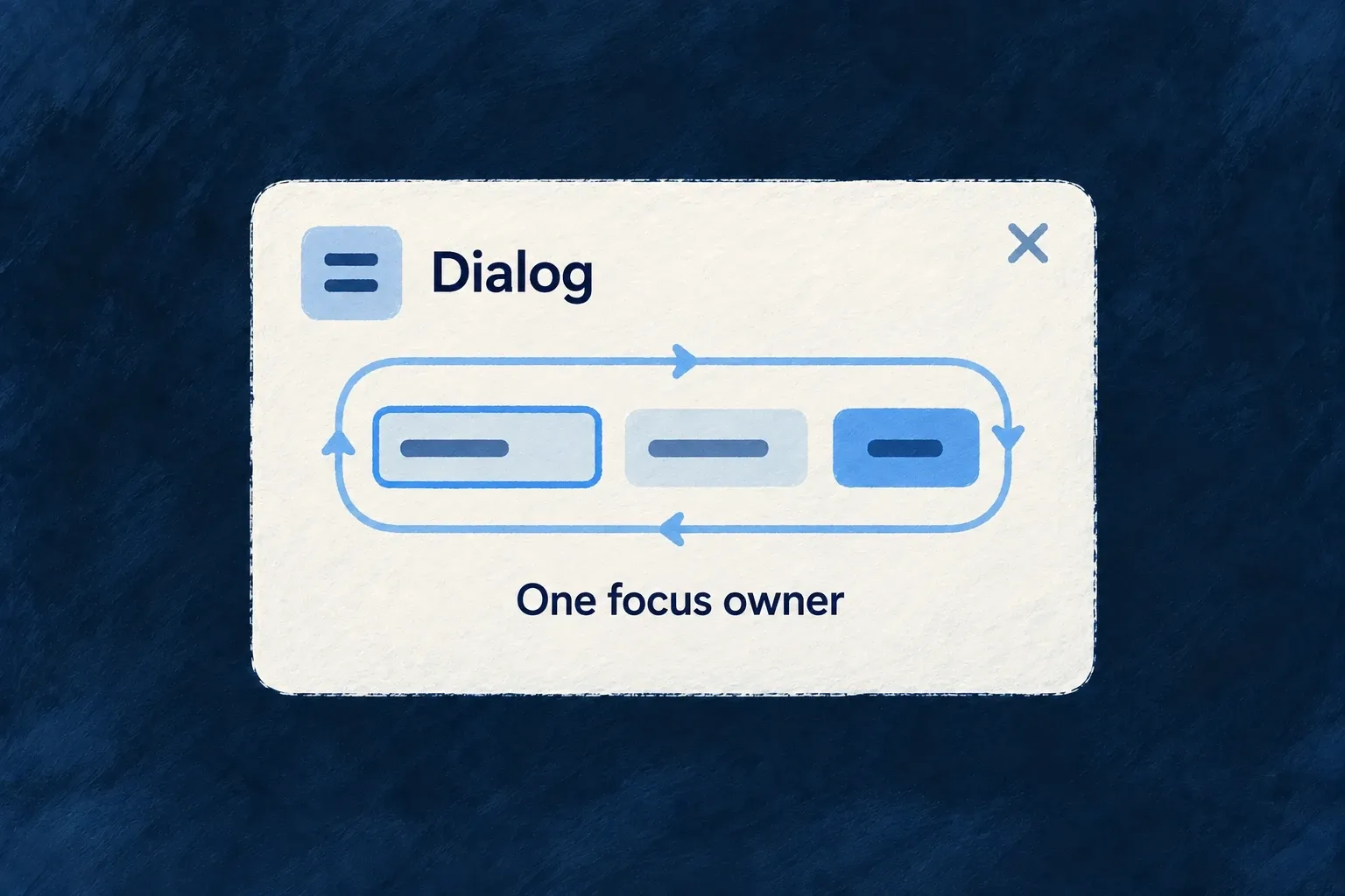
Example: A dialog with one focus owner

A dialog keeps keyboard interaction inside its active content while it is open. When the host dialog already manages focus, the inner surface leaves that job to the host instead of installing a second trap.

One dialog owns the keyboard-focus cycle within its controls.
For engineers

Wonder Todos assigns the main landmark to its canonical shell in design-system.config.ts:

  surfacePolicies: {
    [SurfaceVariant.SHELL]: {
      a11y: {
        landmarkRole: 'main',
      },
    },
  },

This is a selected configuration block. The shell default does not claim main, allowing an application to choose its owner. A nested shell used only as layout context must avoid claiming a second main region.

Surface merges framework defaults, theme policy, application policy and its call-site policyOverride, in that order. The result is available through useSurfacePolicy; supported values are also emitted as CSS variables and attributes. Current Surface is exported from @wildo-ai/saas-frontend-lib.

Make inheritance an explicit choice

This illustrative composition gives the parent a single-line text policy and lets its child opt into that policy. useSurfacePolicy exposes the resolved value to participating child components; merely nesting arbitrary HTML does not apply truncation to it.

import { Surface } from '@wildo-ai/saas-frontend-lib';
import { SurfaceVariant } from '@wildo-ai/presets-components-models';

<Surface variant={SurfaceVariant.BASE}
  policyOverride={{ content: { textTruncation: 'ellipsis-line' } }}>
  <Surface variant={SurfaceVariant.BASE}
    policyOverride={{ content: { textTruncation: 'inherit' } }}>
    {content}
  </Surface>
</Surface>

content represents application content using the framework’s policy-aware text primitives. With inherit, the child resolves the parent’s value. With reset, it resolves the framework default for that slot instead. Omitting a slot uses the normal variant/theme/application policy chain; nesting alone is not an instruction to copy every parent value.

Give a dialog one behavior owner

When adapting a dialog primitive that already owns focus trapping and scroll lock, use Surface on its content root with asChild and a11yManagedByHost. The existing host must supply a labelled dialog and keyboard/focus behavior; the flag delegates those responsibilities, it does not implement them.

<Surface variant={SurfaceVariant.BASE} asChild a11yManagedByHost
  policyOverride={{ a11y: { landmarkRole: 'none' } }}>
  <DialogContent aria-labelledby={titleId}>
    <DialogTitle id={titleId}>{dialogTitle}</DialogTitle>
    {content}
  </DialogContent>
</Surface>

This is an adapter fragment inside an already configured dialog root. DialogContent and DialogTitle denote that host’s primitives; titleId, the localized title and content belong to the application. Use the host’s public API rather than duplicating its focus handlers. The framework’s standard dialog already composes its own Surface, so do not add a second wrapper around it merely to repeat this pattern.

Connect policy to the CSS consumers

The runtime’s stylesheet contract requires:

@import "tailwindcss";
@import "tw-animate-css";
@plugin "@wildo-ai/saas-frontend-lib/tailwind";

The plugin translates policy variables into layout and presentation rules. Animation utilities supply overlay transitions; duration tokens alone do not create their keyframes.

Policy concernWhere the effect is applied
Focus and scroll containmentSurface’s shared handlers, unless a11yManagedByHost delegates them to the host
Landmark and accessible nameThe container that owns the region, with header or explicit labelling
Content and automatic field presentationParticipating text, table and generated-field components
Portal target and mobile shapeOverlay hosts and portal adapters

A policy is not global CSS that transforms arbitrary children. Use the framework’s participating primitives, and adapt third-party containers deliberately. For a local visual tweak use classes; for a change children must understand use policyOverride, without setting the same property through both paths.

Make the experience usable

Adapt the interaction to the space available Mechanism

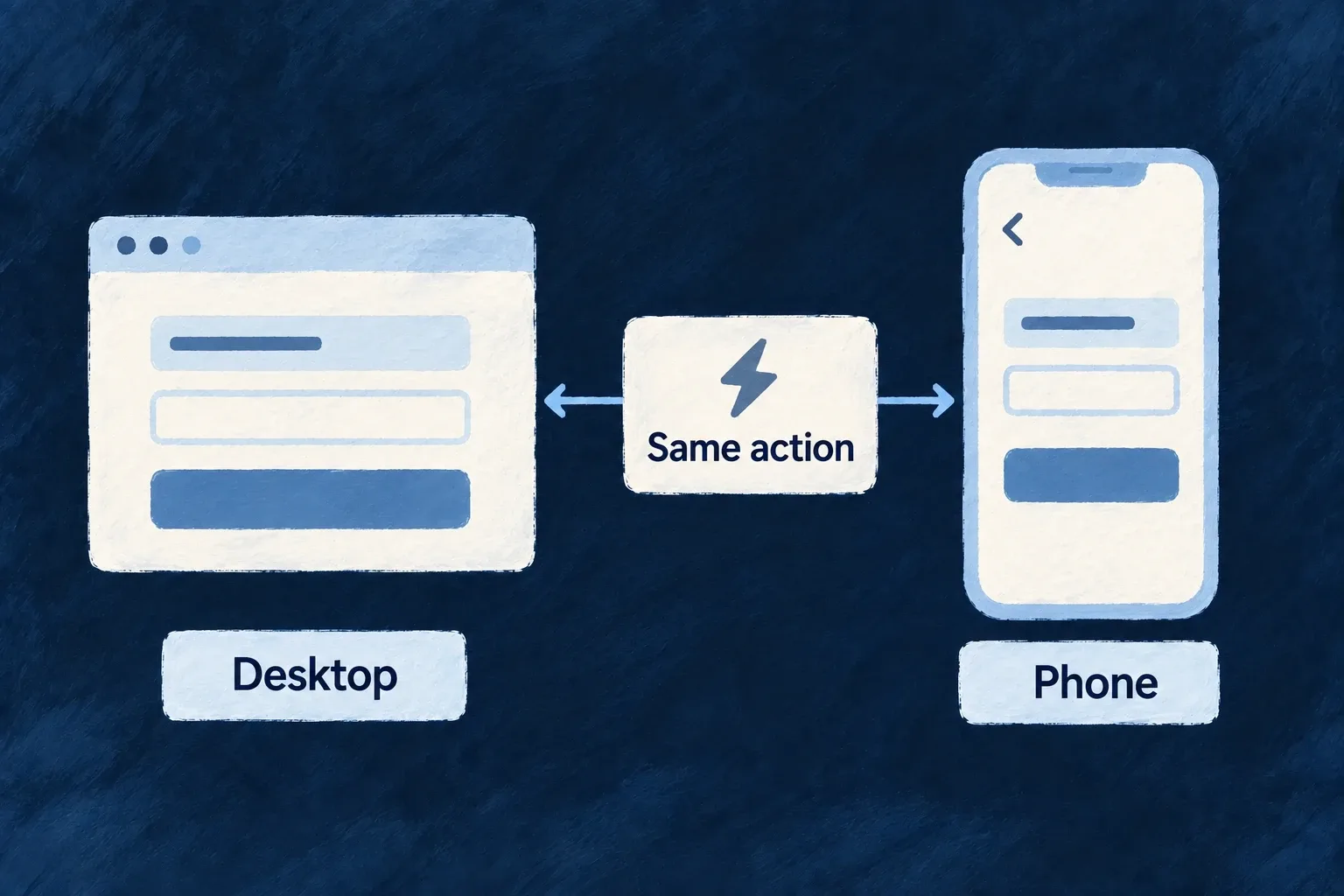
A phone may need a full screen where a desktop uses a dialog. Wildo exposes shared viewport, touch and motion-preference information so components and navigation can make those choices together.

You decide which interactions should change. The same business action can keep its meaning while using a presentation that fits the available space.

Example: Edit in a dialog, or on a full screen

A desktop opens an edit form over the current record. On a phone, the configured action pushes a full screen so the form has room and back navigation returns to the record.

The same action adapts its layout between a desktop and a phone.
For engineers

Wonder Todos’ frontend/src/config/navigation.config.ts overrides mutation navigation on mobile:

  [ViewportBreakpoint.MOBILE]: {
    transitions: {
      [CoreResourceOperation.CREATE]:  NavigationTransition.PUSH,
      [CoreResourceOperation.UPDATE]:  NavigationTransition.PUSH,
      [CoreResourceOperation.DELETE]:  NavigationTransition.PUSH,
    },
  },

This is a selected block from the application’s NavigationLayout. Its normal primary-zone create, update and delete transitions are overlays; the mobile block selects push. The layout is connected through buildFrontendModuleConfigOverrides, so the navigation resolver consumes it when choosing the destination.

Use the same viewport vocabulary in custom components

The framework defines the named breakpoints centrally:

export enum ViewportBreakpoint {
  MOBILE = '<md',               // Mobile (< 768px)
  VERT_TABLET = '<lg',          // Vertical tablet (768–1023px)
  DESKTOP = '>=lg',             // Desktop (>= 1024px)
}

ComponentsViewportProvider supplies the breakpoint, width, touch capability, reduced-motion preference and platform information; useUI exposes them to participating components. Touch uses the coarse-pointer media query, and reduced motion has its own media query—it is not inferred from screen width.

The navigation policy resolver applies its declared viewport cascade, while the content-area host uses a mobile composition rather than retaining desktop panel splits. A custom component must still consume the relevant signal and implement its intended adaptation. Verify intermediate widths, long translations and keyboard interaction as well as a phone-sized screenshot.

Carry accessible behavior into everyday controls Guarantee

Keyboard focus, control names and dialog behavior belong to the interface’s building blocks. Wildo supplies shared mechanisms so standard screens can use them consistently.

Your application still chooses meaningful labels, content, contrast and custom interactions. Accessibility is something to preserve and verify as the product changes.

Example: An icon that still has a name

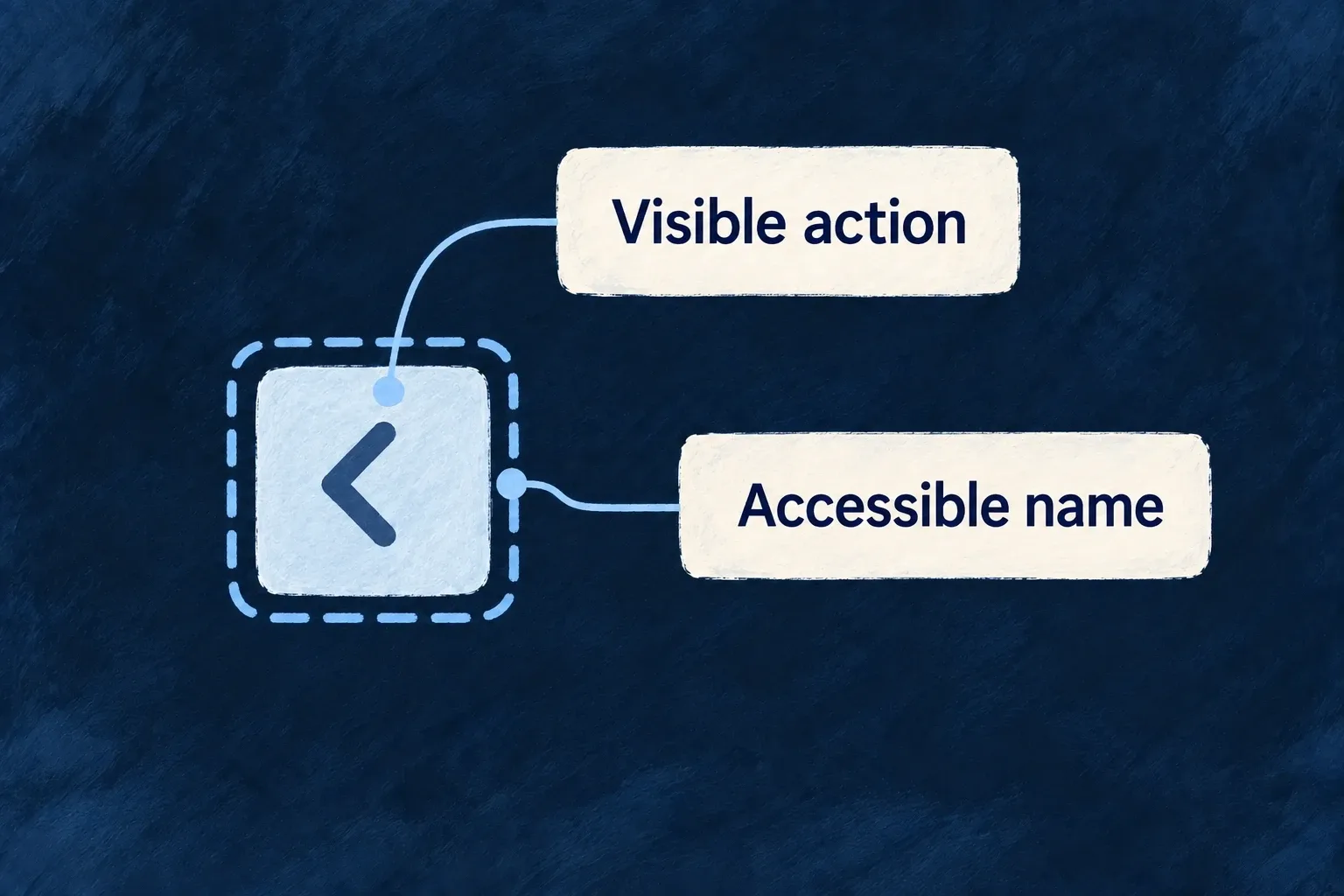
A carousel’s previous button shows an arrow visually and provides a translated “Previous slide” label for assistive technology. The action has a name even when its visible design is compact.

A visible previous action has keyboard focus and an accessible name.
For engineers

The actual carousel preset requests its component labels and waits for readiness before rendering:

  const { tComponent, isReady } = useI18n({
    component: FrontendComponentType.LOW_LEVEL_CAROUSEL,
  })
  const previousLabel = tComponent(FrontendComponentType.LOW_LEVEL_CAROUSEL, 'previousSlide')

  if (!isReady) return null

The same component puts previousLabel in a sr-only span inside the button. The icon is not the name. This connects language loading, control semantics and the visual preset rather than asking each screen to recreate that connection.

Keep inactive navigation out of the tab order

The navigation content host keeps inactive stack entries mounted and applies inert={!isTop}. Their state survives without leaving hidden controls reachable. Custom hosts must preserve that distinction; opacity alone does not remove keyboard interaction.

Surface activates its shared handlers from the merged policy. This exact runtime excerpt shows why a host-managed dialog does not install a second handler:

const shouldActivateFocusTrap = !a11yManagedByHost
  && (policy.a11y?.focusTrap === 'on-mount' || (modal && policy.a11y?.focusTrap === 'when-modal'));
const shouldActivateScrollContainment = !a11yManagedByHost
  && modal
  && policy.a11y?.scrollContainment === 'lock-body';

useSurfaceFocusTrap(surfaceNodeRef, shouldActivateFocusTrap);
useSurfaceBodyScrollLock(shouldActivateScrollContainment);
Put each responsibility at its owning layer
ResponsibilityShared mechanismApplication decision
Visible keyboard focusTheme focus recipes and shared ring utilitiesKeep contrast visible in the chosen palette
Dialog interactionShared focus/scroll handling or an explicitly responsible hostSupply meaningful dialog titles and usable actions
Main regionShell surface policySelect one canonical owner rather than duplicate landmarks
Loading feedbackShared status and loading-state primitivesDescribe the actual operation and recovery path
Motion preferenceViewport preference plus participating recipesMake custom animation respect the same preference

Wonder Todos opts its canonical shell into a11y.landmarkRole: 'main'. Framework content shells explicitly opt out so nested layout regions do not compete for that role. When a Radix/Vaul host already manages focus or scroll, a11yManagedByHost prevents the surface from installing a second handler.

Use wrappers and their complete label contracts when replacing a component. A custom button that retains only the visual classes can lose its name, keyboard behavior or loading semantics. Test the resulting user journey with keyboard navigation, zoom, assistive technology and both appearances; the shared mechanisms are a foundation, not an automatic conformance claim.

Give every interface word a shared home Mechanism

Labels belong to the application’s language tree rather than being scattered through screens. Components and resource interfaces request the words for their own context.

That keeps a field, action or recurring control consistently named and makes another language available without duplicating the screen. The application supplies the supported languages and reviewed wording.

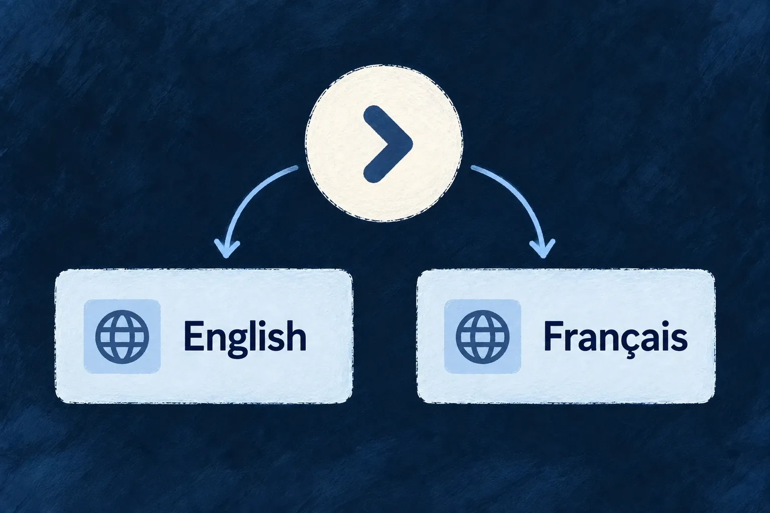
Example: One control, two languages

The carousel’s next action reads “Next slide” in English and uses its French bundle when the language changes. Its button and interaction remain the same.

One interface action can be labelled in English and French.
For engineers

The carousel is a concrete example of the runtime contract:

  const { tComponent, isReady } = useI18n({
    component: FrontendComponentType.LOW_LEVEL_CAROUSEL,
  })
  const previousLabel = tComponent(FrontendComponentType.LOW_LEVEL_CAROUSEL, 'previousSlide')

  if (!isReady) return null

The hook requests the component’s subtree. isReady prevents showing a key while that request is still loading. The returned text is placed in the control’s screen-reader label.

The corresponding current English bundle is:

export const labels = {
  "components": {
    "LOW_LEVEL_CAROUSEL": {
      "previousSlide": "Previous slide",
      "nextSlide": "Next slide"
    }
  }
} as const;

The generated file lives under backend-api/src/engine/i18n/components. The backend serves label trees; it does not invoke language generation during a user request. I18nProvider loads core sections initially, requests other sections or keys as needed, and merges the configured fallback language beneath the active language.

Select the helper that matches the meaning

Use component helpers for component-owned words and resource/field/operation helpers for business interfaces. Register shared enums through registerCommonEnum so recurring values have one named vocabulary; field-specific overrides remain a separate choice.

A custom component must request and render its labels just like a preset. Avoid deriving a user-facing label from an identifier: it loses the authored meaning and cannot replace translation. A missing translation should be corrected in the owning language bundle and generation inputs, not patched by a second string in the screen.

Prepare interface wording from its meaning Tool

Wildo’s development tooling prepares labels from the application’s structure and the meaning recorded in its specifications. Translation carries that context into other languages.

The output is a set of application-owned language files that can be reviewed before delivery. The running interface reads those files; it does not invent copy while people use it.

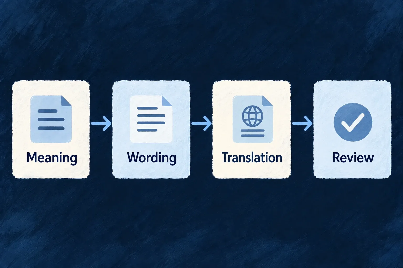
Example: A new action with the right words

A product adds an approval action and explains its purpose in the specification. The label pipeline discovers the action, prepares its primary-language wording and translates the selected unit with the same context.

Meaning informs wording, translation and human review.
For engineers

From the application’s Wildo CLI context, with its development companion running, inspect the label plan:

wildo generate labels plan --list

The planner derives units from the connected application registries: resources, components and other supported label owners. This command reads the plan without calling the language model. Confirm the new unit is present before spending a generation run on it.

For example, after confirming the application’s resource:todos unit, the CLI supports:

wildo generate labels --units resource:todos
wildo generate translate --units resource:todos --locales fr

These are command examples using the actual CLI flags, not a claim that generation was run here. The first command uses appPreferences.languages.defaultLanguage; the second targets French. The companion requires its configured model/provider access for generation.

Follow the output into the running application

The companion writes one TypeScript label file per unit and locale under the backend’s owner-scoped i18n tree. The backend’s label loading consumes those files at startup. Translation receives the primary wording and the specification context rather than inferring meaning solely from a key.

StageWhat to review
SpecificationPurpose, audience and terminology actually describe the user action
PlanExpected unit and keys are discovered through the registries
Primary wordingLabels are concise, accurate and appropriate to the intended audience
TranslationMeaning, placeholders and terminology are preserved
Rendered screenLong labels fit; accessible names and empty states remain useful

Incremental runs skip unchanged work. --force asks to regenerate the selected units; use it deliberately because reviewed wording may change. Generation reduces repetitive authoring, but the application team remains responsible for reviewing the published language.

Set browser permissions

Keep browser permissions aligned with deployment Mechanism

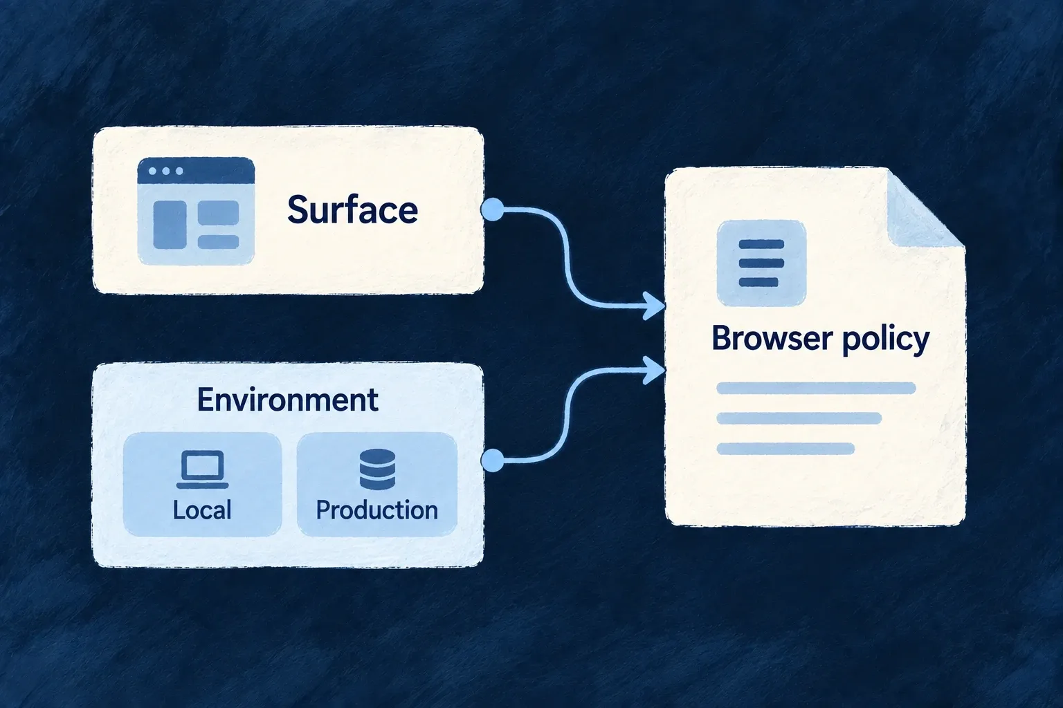
A browser surface needs permission to contact its services and load its assets. Wildo combines the surface’s policy with environment settings and declared provider requirements, then produces the artifacts used to serve it.

The application, website and documentation can have different needs without maintaining unrelated policy strings. You choose the allowed connections and whether a policy reports violations or enforces them.

Example: Local development and production use different origins

A development application may contact a localhost API. Its production deployment uses its configured production origin, while documentation and website surfaces receive the policy intended for each of them.

Surface and environment inputs determine a browser policy.
For engineers

Wonder Todos declares the application surface in wildo.saas.config.ts with this selected service block:

    app: {
      path: './frontend',
      serviceName: 'wonder-todos-app',
      defaultPort: 4242,
      frontendType: AppFrontendType.SAAS_APP,
      csp: {
        enabled: true,
        reportOnly: true,
      },
    },

This actual example is report-only: it reports violations instead of blocking requests. Its local infrastructure configuration separately adds the required backend origin and PDF worker sources:

    app: {
      extraDirectives: {
        'connect-src': ['http://localhost:4241'],
        // PDF.js parses documents on a Web Worker, and the worker asset is emitted
        // same-origin by the bundler (resolved through `import.meta.url`, never a
        // CDN). Bundlers may instantiate it through a blob shim, so both sources are
        // required — without them a PDF field renders an empty viewer and the only
        // signal is a CSP violation in the console.
        'worker-src': ["'self'", 'blob:'],
      },
    },

The selected block comes from the infrastructure csp map. Website and technical-documentation surfaces have their own service configuration rather than inheriting the app’s permissions accidentally.

Emit the policy for the intended deployment

The owning CLI entrypoint is:

wildo dev sync-csp --env local --service app

This command example names the service key from the declaration above. The resolver combines the surface baseline, authored posture, environment overrides and available declared-provider footprints. It writes src/generated/csp.generated.json and updates the nginx marker regions used for the served header. Browser-surface adapters consume the generated artifact rather than recomputing a separate policy.

Use the actual deployment environment for release preparation. Validate the served header and real asset/API/provider requests before changing report-only to enforcement. A generated file proves what was emitted; the server must still deliver it, and report-only mode never establishes request blocking. Keep generated nginx regions and artifacts under their owning CLI workflow rather than hand-editing them.

Flexibility is more useful when the connections hold.

The shared structure carries context and coordinates standard behavior. Your application gives that structure its purpose, its decisions and its experience.

Building a B2B product or an internal tool?

Wildo is not self-service yet. Tell us what you have in mind and we will say plainly whether it fits, and what happens next.