
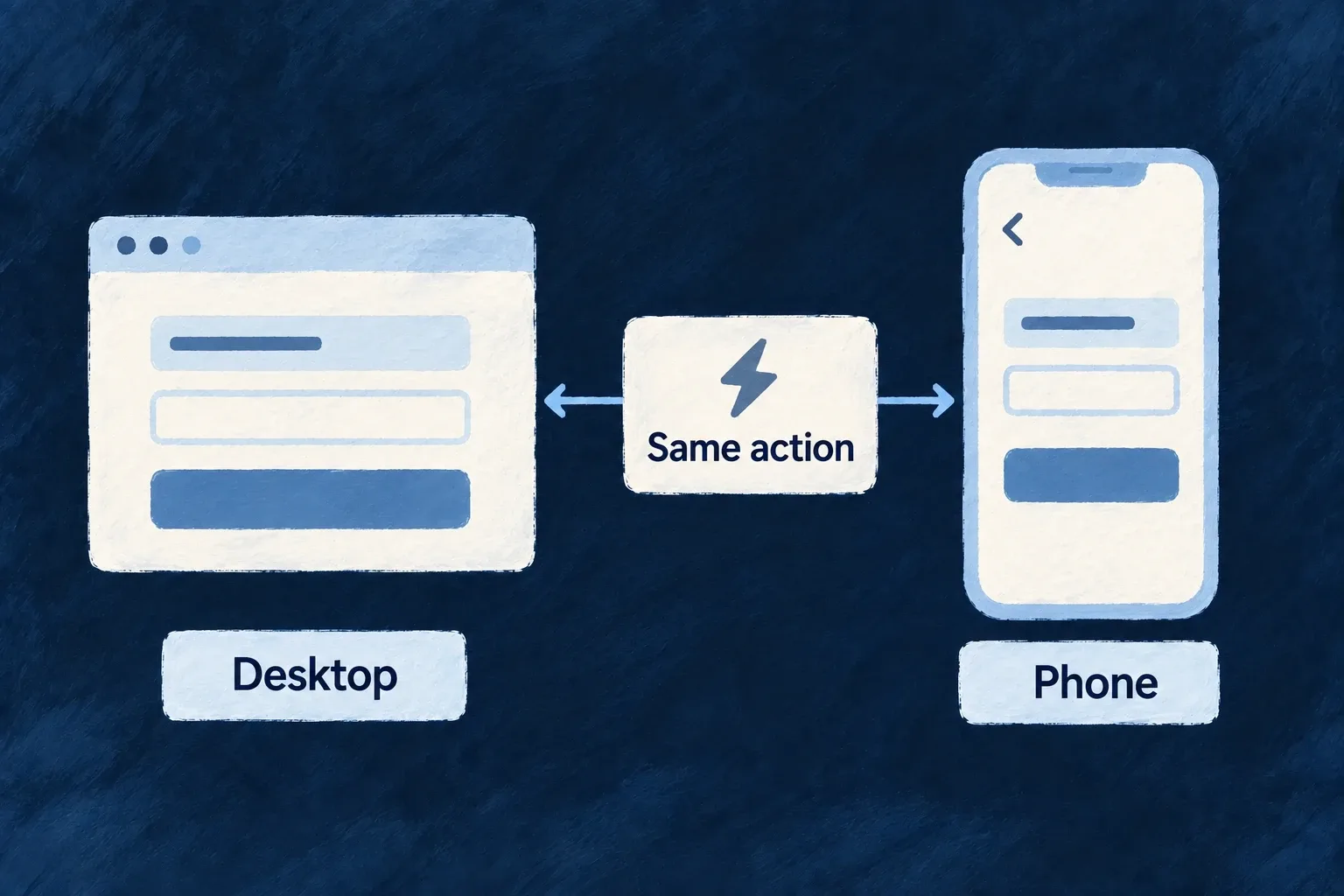
Adapt the interaction to the space available
A phone may need a full screen where a desktop uses a dialog. Wildo exposes shared viewport, touch and motion-preference information so components and navigation can make those choices together.
You decide which interactions should change. The same business action can keep its meaning while using a presentation that fits the available space.
Example — Edit in a dialog, or on a full screen
A desktop opens an edit form over the current record. On a phone, the configured action pushes a full screen so the form has room and back navigation returns to the record.
For engineers
Wonder Todos’ frontend/src/config/navigation.config.ts overrides mutation navigation on mobile:
  [ViewportBreakpoint.MOBILE]: {
    transitions: {
      [CoreResourceOperation.CREATE]:  NavigationTransition.PUSH,
      [CoreResourceOperation.UPDATE]:  NavigationTransition.PUSH,
      [CoreResourceOperation.DELETE]:  NavigationTransition.PUSH,
    },
  },
This is a selected block from the application’s NavigationLayout. Its normal primary-zone create, update and delete transitions are overlays; the mobile block selects push. The layout is connected through buildFrontendModuleConfigOverrides, so the navigation resolver consumes it when choosing the destination.
Use the same viewport vocabulary in custom components
The framework defines the named breakpoints centrally:
export enum ViewportBreakpoint {
  MOBILE = '<md',               // Mobile (< 768px)
  VERT_TABLET = '<lg',          // Vertical tablet (768–1023px)
  DESKTOP = '>=lg',             // Desktop (>= 1024px)
}
ComponentsViewportProvider supplies the breakpoint, width, touch capability, reduced-motion preference and platform information; useUI exposes them to participating components. Touch uses the coarse-pointer media query, and reduced motion has its own media query—it is not inferred from screen width.
The navigation policy resolver applies its declared viewport cascade, while the content-area host uses a mobile composition rather than retaining desktop panel splits. A custom component must still consume the relevant signal and implement its intended adaptation. Verify intermediate widths, long translations and keyboard interaction as well as a phone-sized screenshot.