
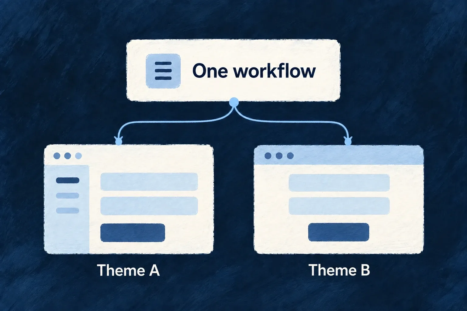
Change the visual character without rebuilding screens
A component theme describes the visual treatment of shared interface behaviors: primary actions, inputs, selected items, containers and text.
Choosing another theme changes how participating components present those behaviors. Your screens keep their structure, and your application can refine selected parts of the theme.
Example — A calmer treatment for the same workflow
A team adjusts the style of cards and primary actions. The customer screen keeps its fields and operations while the shared controls use the updated treatment.
For engineers
Wonder Todos’ design-system configuration spreads a theme and then sets application choices. This actual selection shows its shell treatment:
    ...defaultTheme,
    // ...glassTheme,
    // ── Continuous shell chrome ("one canvas", Revolut-style) ──
    // Sidebar / menubar / toolbar / status bar / content zones render as
    // TRANSPARENT regions with no separating borders; the fixed
    // `backgroundLayer` below is the single background that flows under the
    // whole app. Selection/hover structure comes from the alpha
    // `surfaces.sunken-accent` washes above, not from opaque slabs.
    shellAppearance: ShellAppearance.CONTINUOUS,
    // Compact rail shows a small centered label under each icon (labels wrap
    // when long) instead of icon-only + tooltip.
    sidebarCompactLabelMode: SidebarCompactLabelMode.ICON_AND_LABEL,
The comments in this source excerpt describe the application’s current design choice. defaultTheme is imported from @wildo-ai/saas-frontend-lib/companion; optional preset themes are exposed through the deliberate @wildo-ai/presets-components/themes entrypoint.
A theme is a ComponentStyleTheme: its semantic recipes provide base classes, state classes, sizes and motion. For example, the button asks for UIBehavior.INTERACTIVE and the variant corresponding to its public variant prop. A card asks for a surface recipe. Neither screen needs a second implementation just to change these recipes.
Change one recipe and show its consumer
For a calmer primary action, override only the primary recipe’s base and hover treatment. This illustrative theme preserves the other variants, sizes, focus/disabled states, motion and required tokens from cozyTheme.
import { cozyTheme } from '@wildo-ai/presets-components/themes';
import { InteractiveVariant, type ComponentStyleTheme } from '@wildo-ai/presets-components-models';

const primary = cozyTheme.interactive[InteractiveVariant.PRIMARY];
export const applicationTheme: ComponentStyleTheme = {
  ...cozyTheme,
  interactive: {
    ...cozyTheme.interactive,
    [InteractiveVariant.PRIMARY]: {
      ...primary,
      base: 'bg-primary text-primary-foreground rounded-lg font-medium text-sm cursor-pointer shadow-none',
      states: {
        ...primary.states,
        hover: 'hover:bg-primary/90',
      },
    },
  },
};
Select applicationTheme in the design source’s theme, then pass the resolved design system to the application provider. The ordinary public button remains the caller:
<Button variant="default" onClick={saveChanges} disabled={!canSave}>
  {saveLabel}
</Button>
Here saveChanges, canSave and the localized saveLabel belong to the application. The button maps default to InteractiveVariant.PRIMARY, requests its UIBehavior.INTERACTIVE recipe and applies its states and size. That is why changing the recipe reaches this button without changing its action. Other interactive variants keep their inherited recipes.
Preserve dependencies when making an override
Spread the chosen theme before overriding its fields. If the theme owns requiredCustomTokens, preserve those when adding your own; otherwise a recipe can reference a CSS variable that was never emitted. The application’s Tailwind setup must include the package sources and required animation utilities so recipe classes actually exist.
Theme material profiles may add their own runtime behavior and fallback choices. A theme swap is therefore a configuration change to verify on real controls, across both appearances and reduced-motion settings. It does not retheme arbitrary third-party markup or replace application-specific styling automatically.