
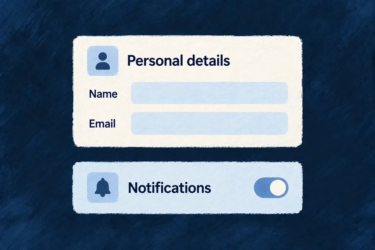
Give fields a clear visual hierarchy
How a field is framed matters as much as its control. Labels, help text, required indicators and errors should form a predictable whole.
Wildo separates that surrounding presentation from the value editor, and supplies section containers for grouping related information. Choose the hierarchy the task needs, from a compact row to a guided sequence.
Example — Keep settings easy to scan
A notification setting places its label and explanation beside a switch. A personal-details form puts labels above its text inputs. Both retain the same error and help conventions.
For engineers
Choose field framing independently of its value
The field’s edit configuration accepts chromeMode; its display configuration has a corresponding reading mode. This current framework vocabulary shows the meaningful editing choices:
export const EditChromeMode = {
  /** Label above, control below, description + error below control (default). */
  STACKED: 'stacked',
  /** Label + description left, control + error right (settings page style). */
  SETTINGS_ROW: 'settings_row',
  /** Control left, label + description right (switch/checkbox style). */
  INLINE: 'inline',
  /** Generous spacing, heading-size label (onboarding, OTP, wizard). */
  RELAXED: 'relaxed',
  /** No label/description, just control + error (dense mode). */
  COMPACT: 'compact',
  /** No chrome at all — bare control output. */
  HIDDEN: 'hidden',
} as const;
export type EditChromeMode = typeof EditChromeMode[keyof typeof EditChromeMode];
STACKED suits ordinary forms. SETTINGS_ROW separates a setting’s explanation from its control. INLINE suits a switch or checkbox whose control precedes the label. RELAXED increases emphasis for focused steps. Compact and hidden chrome should be deliberate choices: the surrounding application must still provide an understandable accessible name.
FormFieldChrome owns the required marker, label association, descriptions, error display and save-state indicator. A preset implements the interactive content; recreating all that framing inside the preset risks duplicate labels and inconsistent feedback.
Carry a field choice into its named section
This illustrative update to a todo’s existing resourceUIBehavior joins decorated fields to a layout. Keep its other fields and operations. sh is the callback’s schemaShape; FormLayout, FormField and Section are public frontend components. EditChromeMode and SectionMode come from @wildo-ai/zod-decorators.
fields: {
  title: sh.title.stringUI({
    edit: { chromeMode: EditChromeMode.STACKED },
  }),
  description: sh.description.stringUI({
    edit: { chromeMode: EditChromeMode.SETTINGS_ROW },
  }),
},
layout: {
  refs: { sections: ['details'] },
  edit: () => (
    <FormLayout>
      <Section name="details" appearance={SectionMode.CARD}>
        <FormField name="title" />
        <FormField name="description" />
      </Section>
    </FormLayout>
  ),
},
The form reads the field’s decorated edit configuration. The title keeps its label above the input; description uses a settings row. Both still pass through FormFieldChrome for labels, errors and save feedback. The details reference must also exist in the resource specification’s section labels; layout.refs makes the named section discoverable but does not supply its words. Publish the corresponding labels through the application’s usual i18n pipeline.
A section’s own chromeMode can supply a common default. An explicit field choice takes precedence, so grouping fields does not erase their individual presentation.
Group fields using the layout contract
A ContentSectionContainer consumes section descriptors and one mode-specific configuration. Each descriptor carries a stable ID, resolved title and content; the mode decides whether those sections form tabs, a grid, an accordion or another supported arrangement.
For resource templates, named Section entries also belong in layout.refs and the resource specification’s matching text slots. Those references let labels and layout refer to the same section. Use plain layout containers when there is no real section to name.
Keep nested composition intentional
A single embedded surface normally needs a solo section appearance such as CARD, DEFAULT or GHOST. Container modes organize sibling sections; a section hidden behind a custom component is not automatically grouped by its parent template. Accordion mode defaults to one open section; an expandable collection instead reveals additional items. Choose the behavior, not just the silhouette.