
Give the whole interface a consistent visual language
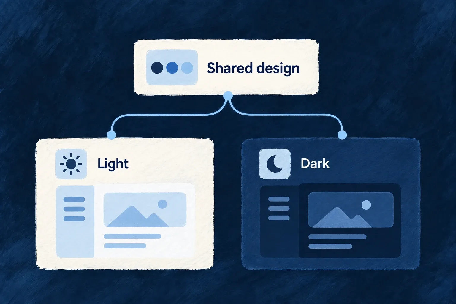
A design system gives recurring choices—colors, surfaces, spacing and typography—a common home. Wildo’s standard components consume those choices across the application.
Light and dark appearances can carry different values without becoming separate sets of screens. You choose the palette and theme, and check the result with your real content.
Example — The same workspace after dark
A customer switches appearance. The workspace keeps its layout and actions while backgrounds, text, borders and interaction colors use the dark palette.
For engineers
Wonder Todos starts from DEFAULT_DESIGN_SYSTEM_SOURCE_CONFIG and overrides semantic groups in frontend/src/config/design-system.config.ts. These are actual selected dark-mode values from its colors block:
    dark: {
      ...DEFAULT_DESIGN_SYSTEM_SOURCE_CONFIG.colors.dark,
      background: 'oklch(0.129 0.042 264)',
      foreground: 'oklch(0.968 0.007 247)',
      primary: 'oklch(0.746 0.16 232)',
      'primary-foreground': 'oklch(0.129 0.042 264)',
      secondary: 'oklch(0.279 0.041 260)',
      'secondary-foreground': 'oklch(0.968 0.007 247)',
The selection omits the rest of the dark palette, light palette and enclosing defineDesignSystemConfig call. Background/foreground pairs describe how content reads; primary and its foreground describe an action pair. A change to one should be evaluated with the other.
The application converts the authored source once:
export const frontendResolvedDesignSystemConfiguration =
  createDesignSystemConfigurationFromSourceConfig(designSystemConfig);
That result is passed as designSystemConfiguration in buildFrontendModuleConfigOverrides. UIProvider applies the resolved tokens and appearance; presets retrieve recipes through useUI. A custom component inherits the system when it consumes those tokens and recipes, not merely because it renders somewhere inside the app.
Separate palette, visual treatment and behavior
| Configuration | Controls |
|---|---|
| Color and surface groups | Semantic values for light and dark modes |
| Theme recipes | How controls and containers use those values and interaction states |
| Typography and spacing | Shared type and layout scales |
| Surface policies | Container behavior observed by participating children |
Use subtle interaction tints for hover and selection rather than treating every accent as a saturated brand color. Test text, focus indicators, disabled controls, charts and third-party content in both modes; token configuration cannot establish their readability by itself.